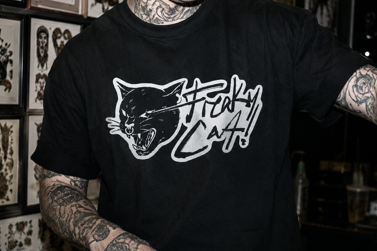
Freaky Cat
maegraphics · 2026
Freaky Cat
Brand Identity · Graphic Design
Freaky Cat is a tattoo and piercing parlor based in Los Angeles. Unapologetically grunge, punk, and edgy. The brand needed an identity as raw and unbothered as the people who walk through the door.
Built on
attitude.
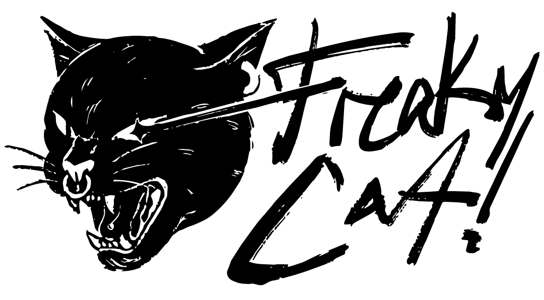
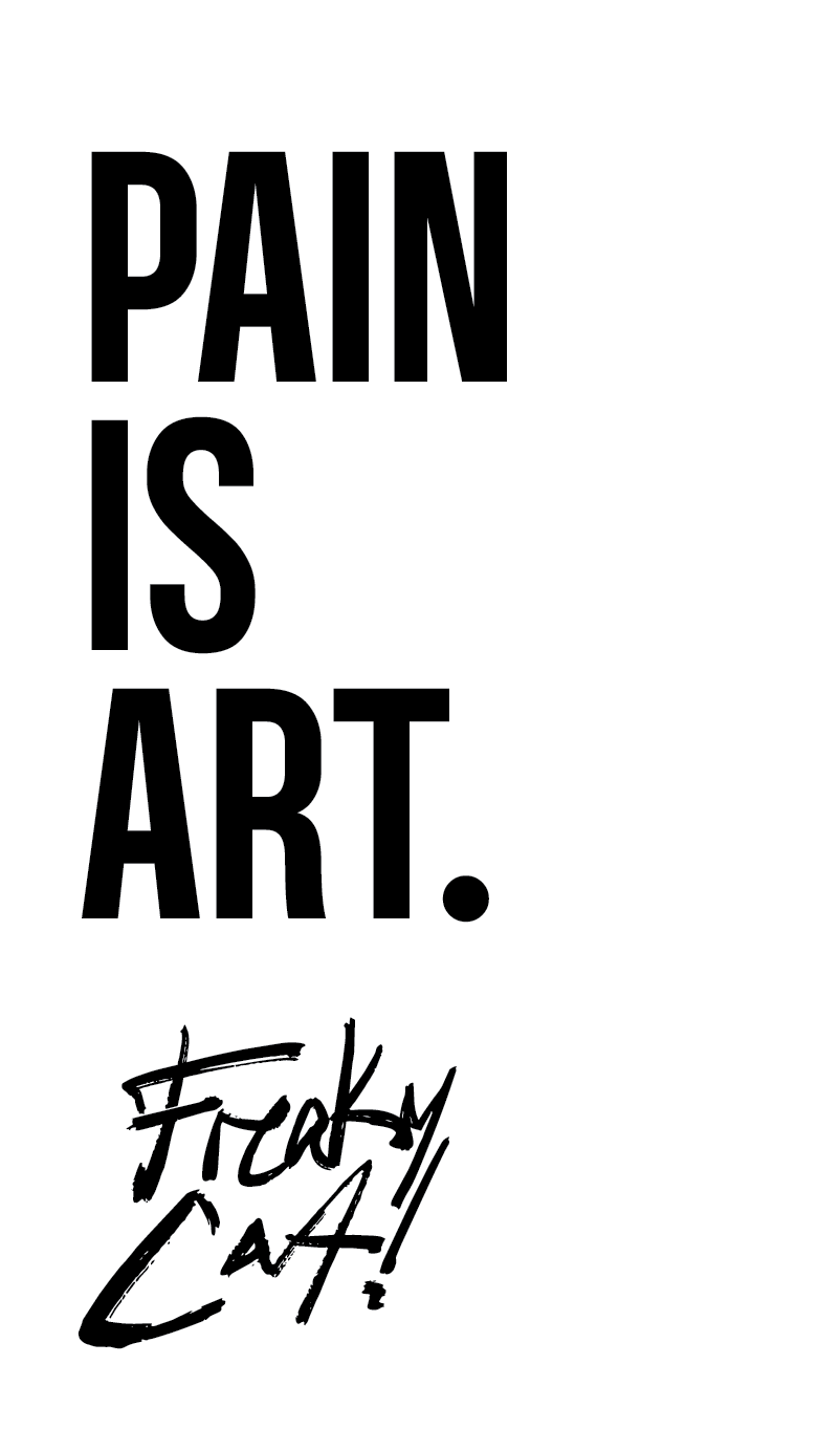
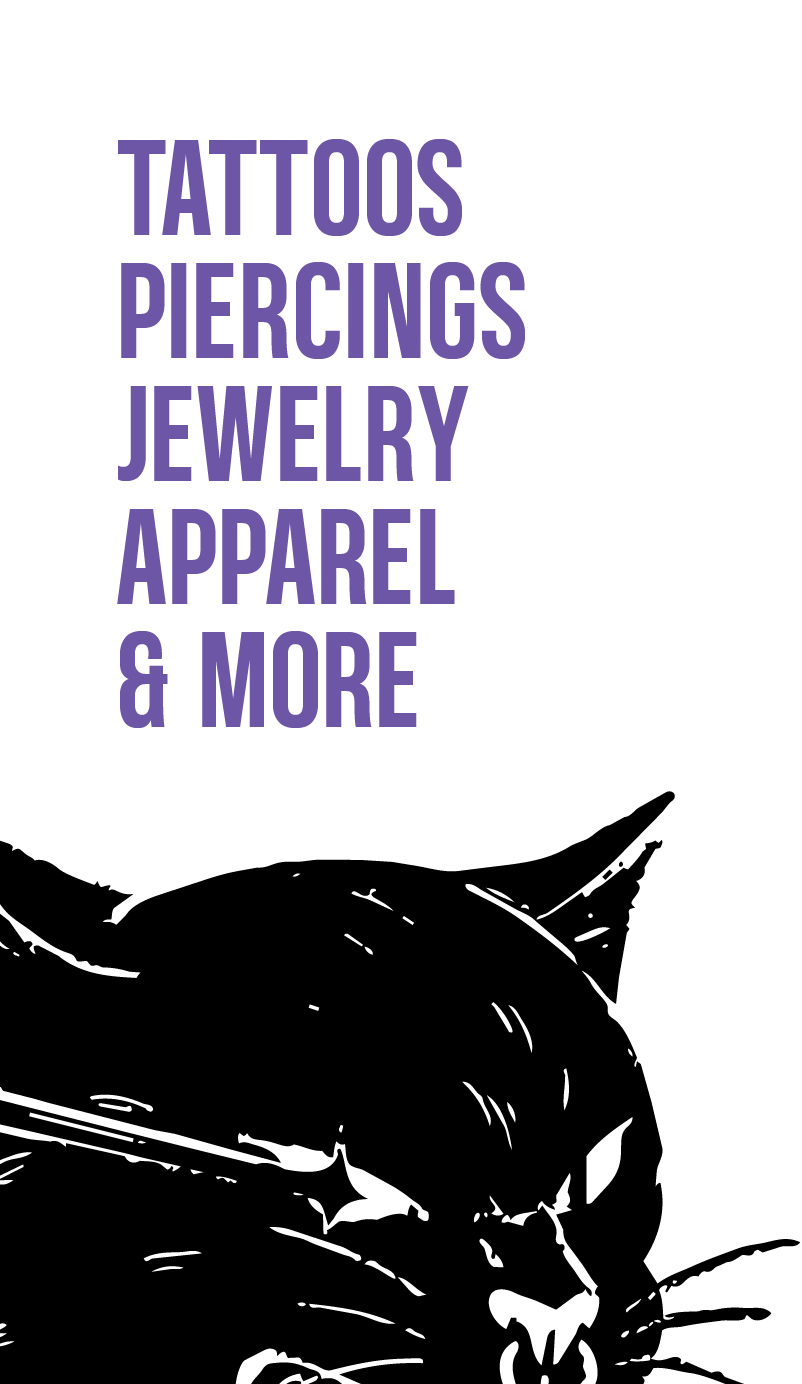
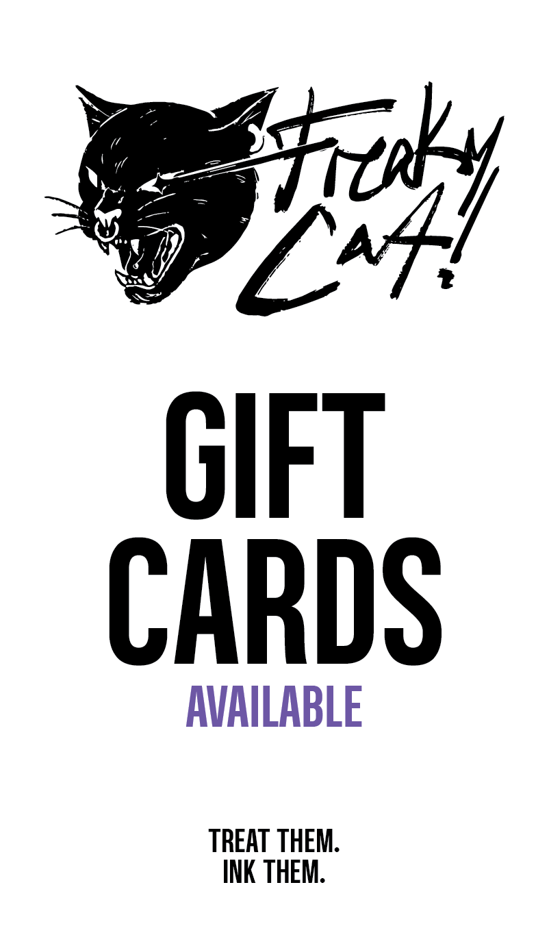
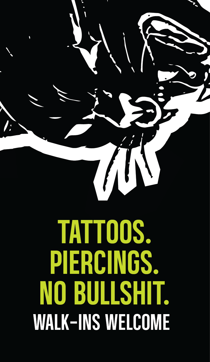
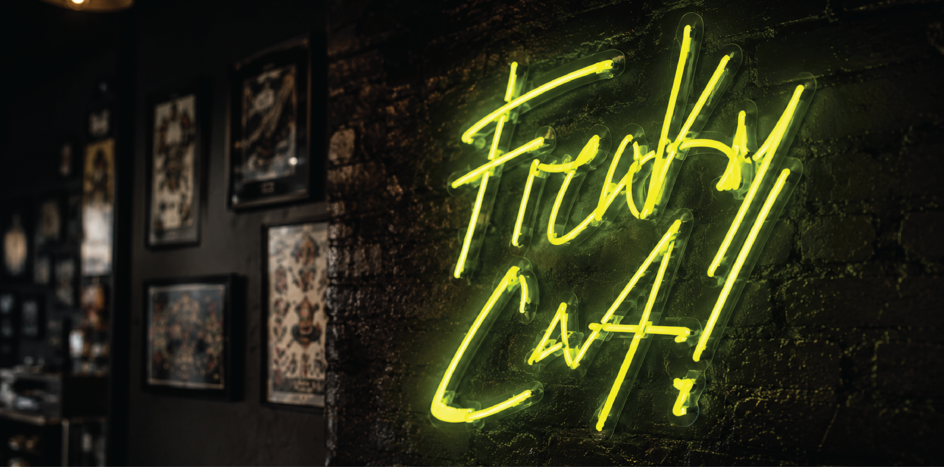
The Freaky Cat logo is hand-illustrated and built on attitude. A snarling black cat with a nose ring, paired with rough brushstroke lettering. It nods to traditional tattoo flash art while feeling completely current. Designed to work across merch, signage, digital, and skin.
The Challenge
Tattoo parlors in LA are a dime a dozen. Freaky Cat needed to stand out without trying too hard. The identity had to feel earned, not manufactured. Too polished and it loses the grit. Too rough and it stops being usable.
The Approach
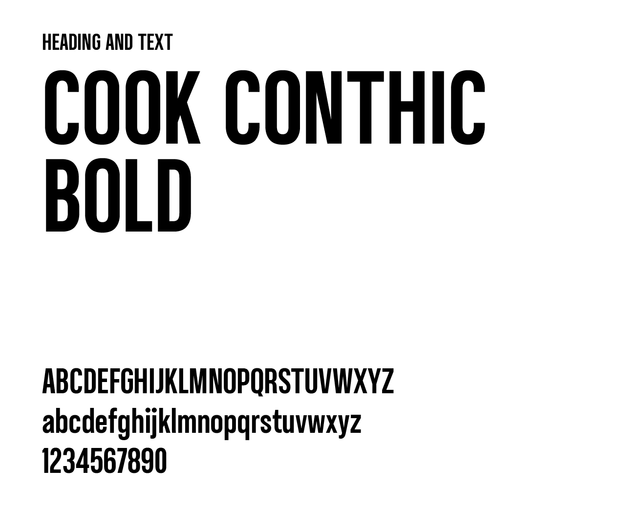
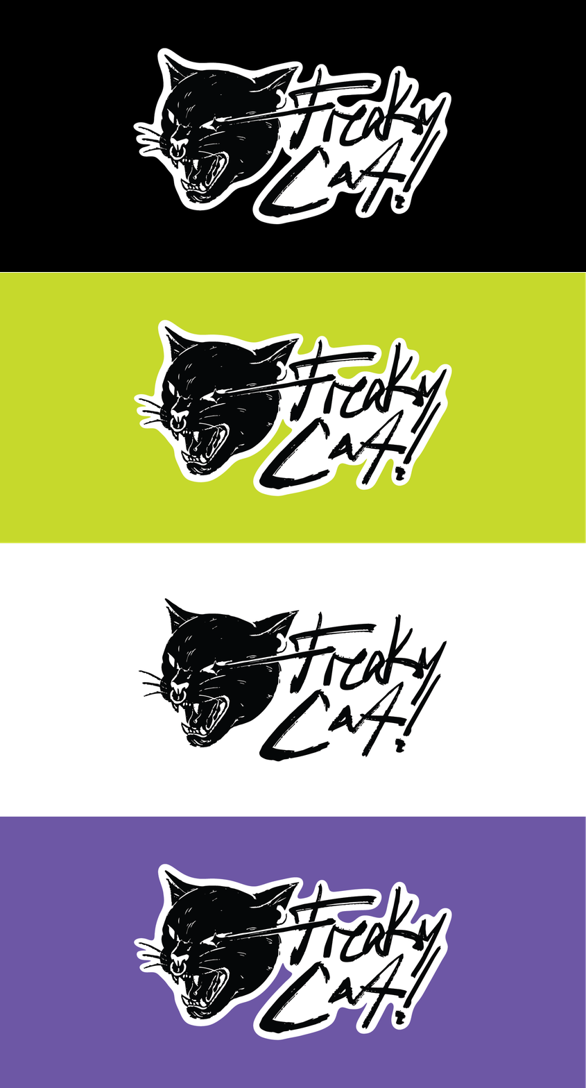
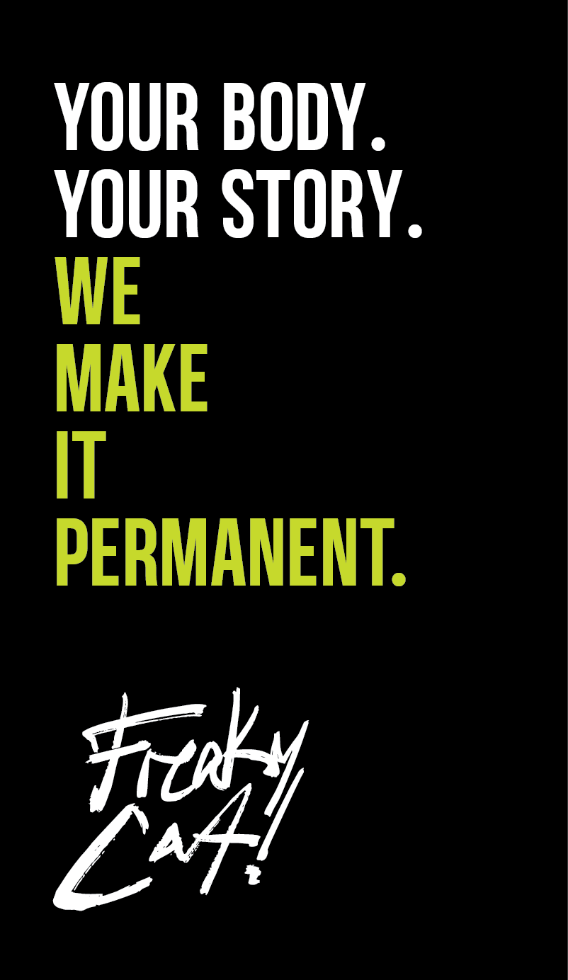
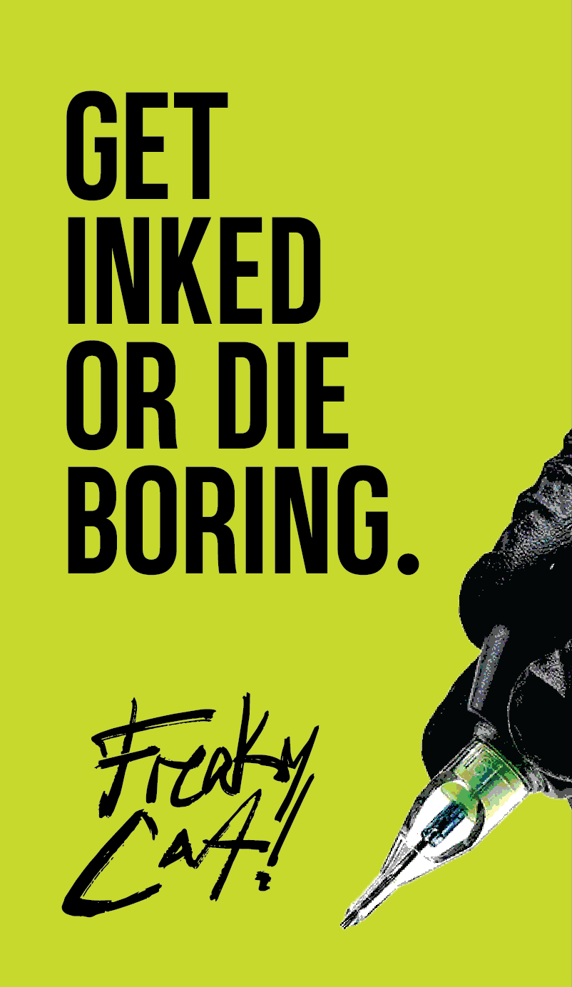
I started with the illustration. Once the cat had the right energy, the rest followed naturally. The palette pushed past the usual black and white of tattoo culture with Venom green and Cursed purple giving it something unexpected. Cook Conthic Bold kept the type heavy and direct.
Cook Conthic Bold
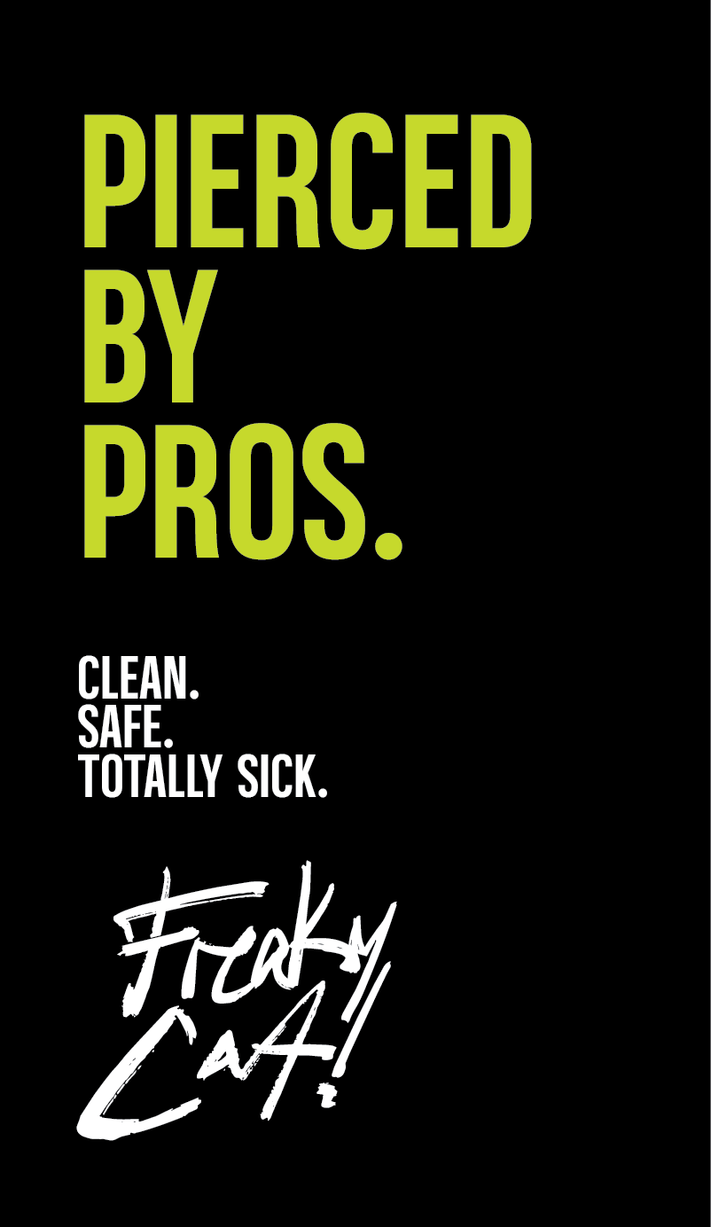
Condensed, heavy, and unapologetic. It punches hard in large format and stays legible at small sizes. Paired with the hand-lettered script of the logo mark, the system balances structure with raw energy.
Venom
#c6d92c
RGB 198 / 217 / 44
CMYK 9 / 0 / 80 / 15
Abyss
#010101
RGB 1 / 1 / 1
CMYK 0 / 0 / 0 / 100
Ghost
#ffffff
RGB 255 / 255 / 255
CMYK 0 / 0 / 0 / 0
Cursed
#6d57a5
RGB 109 / 87 / 165
CMYK 34 / 47 / 0 / 35
The palette pushed past the usual black and white of tattoo culture. Venom green and Cursed purple give it something unexpected without losing the edge.
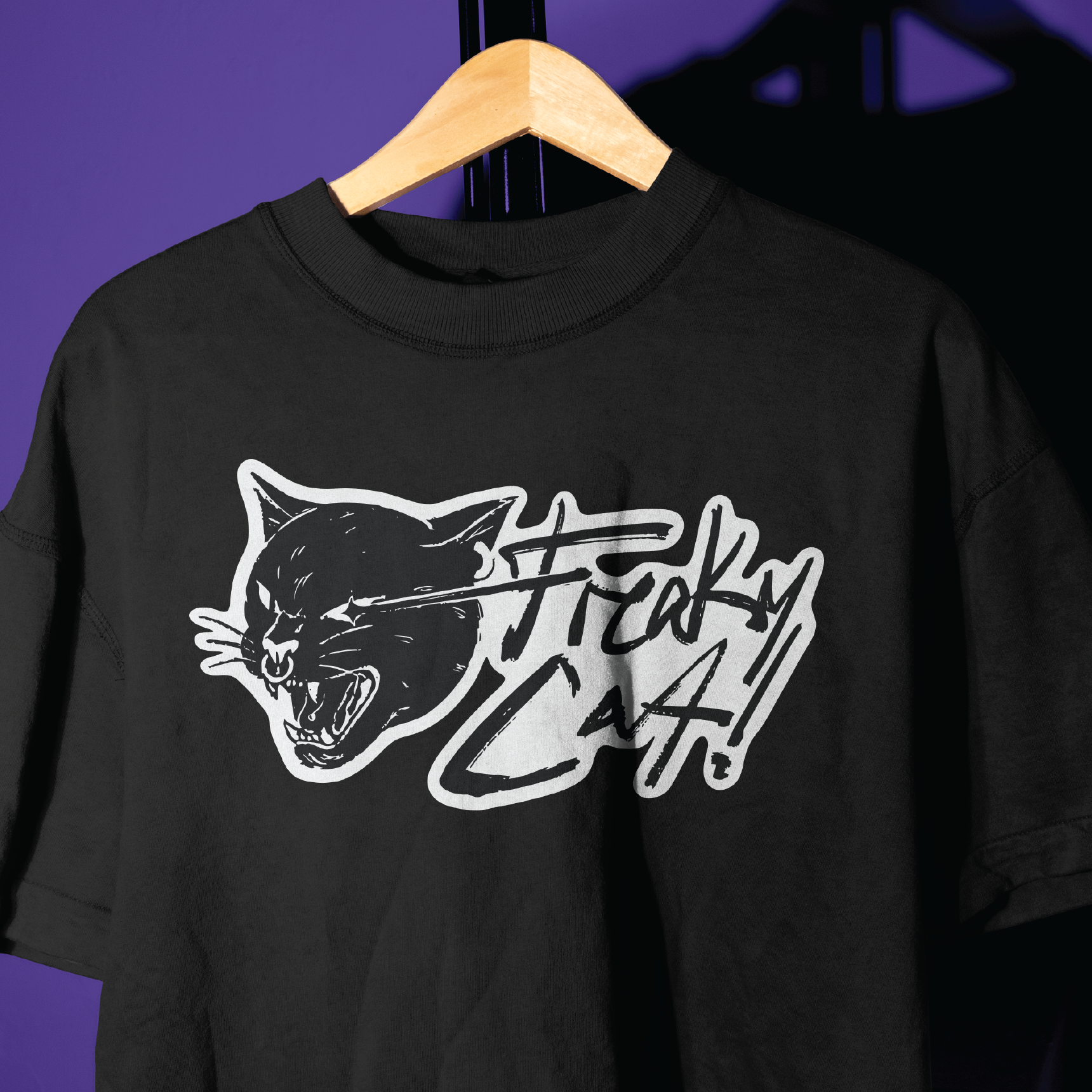
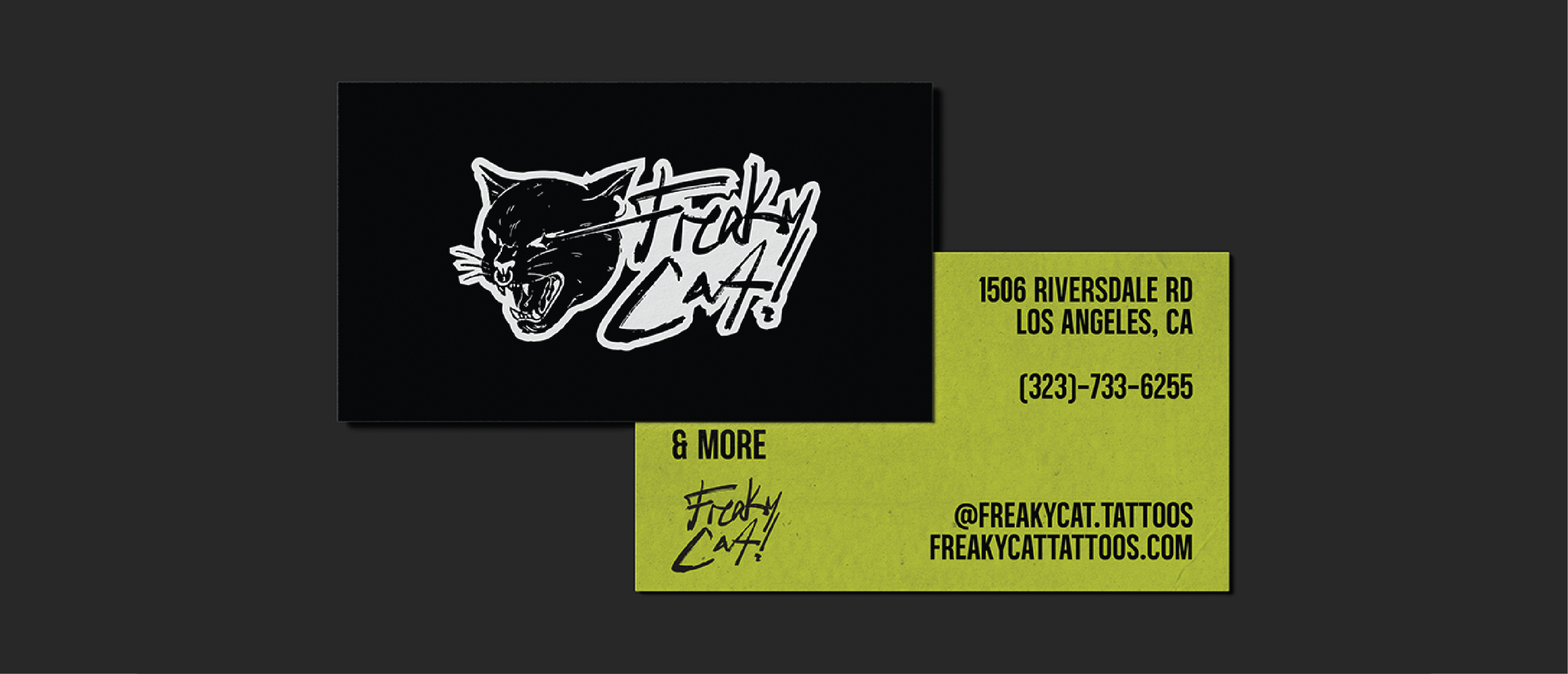
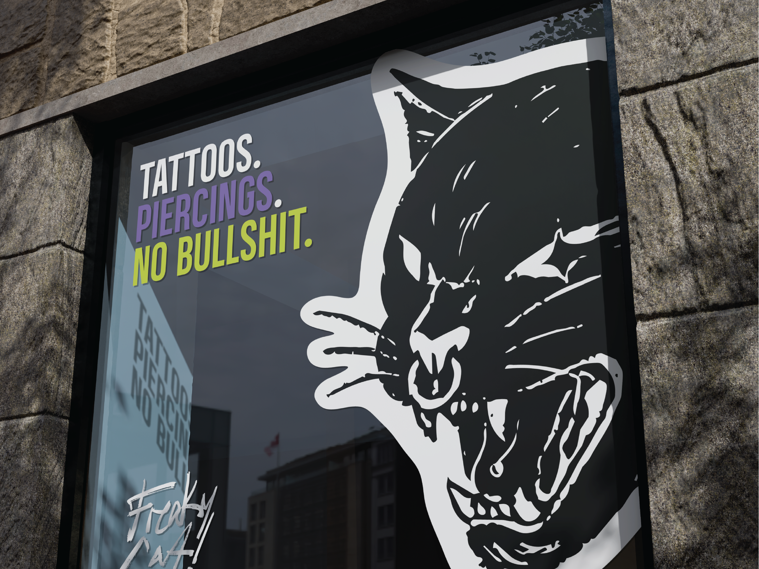
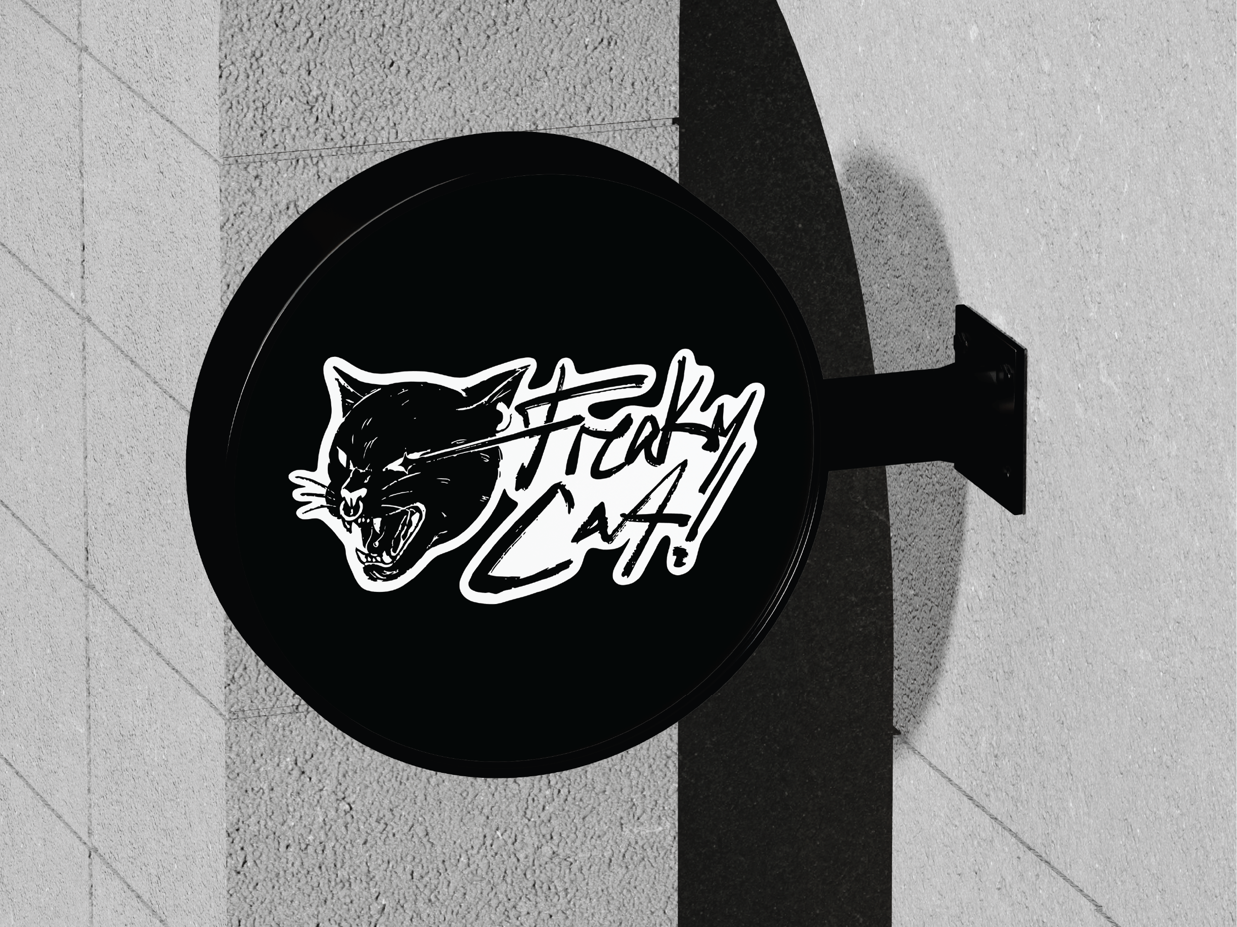
"A brand that stops blending in."
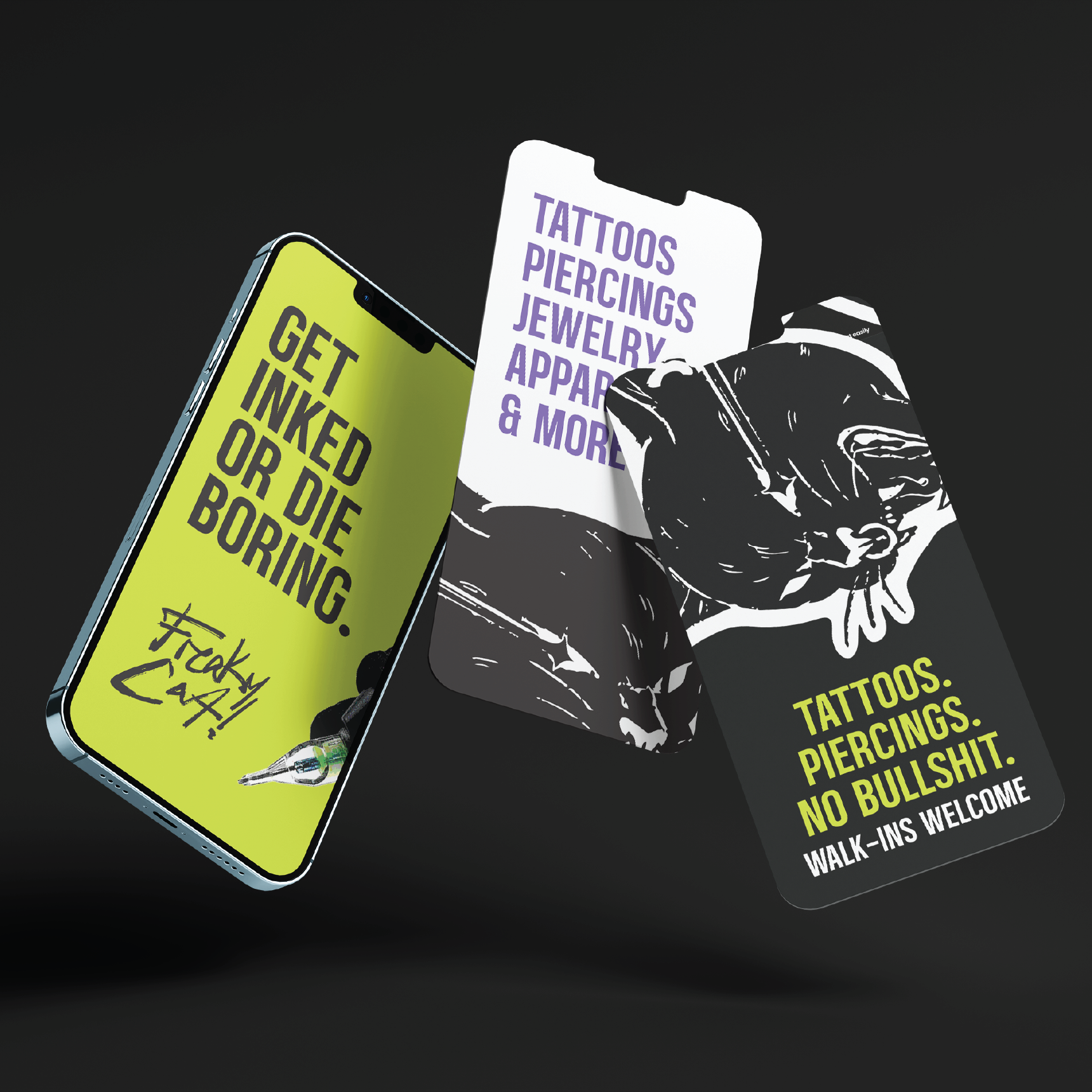
Freaky Cat launched with an identity that actually looks like them. The logo works on a business card and a neon sign. The merch sells itself. The social templates gave the team a voice they could run with. This is what it looks like when a brand stops blending in.