Matcha Mania
maegraphics · 2025
Matcha Mania
Brand Identity · Festival Design · Motion Graphics
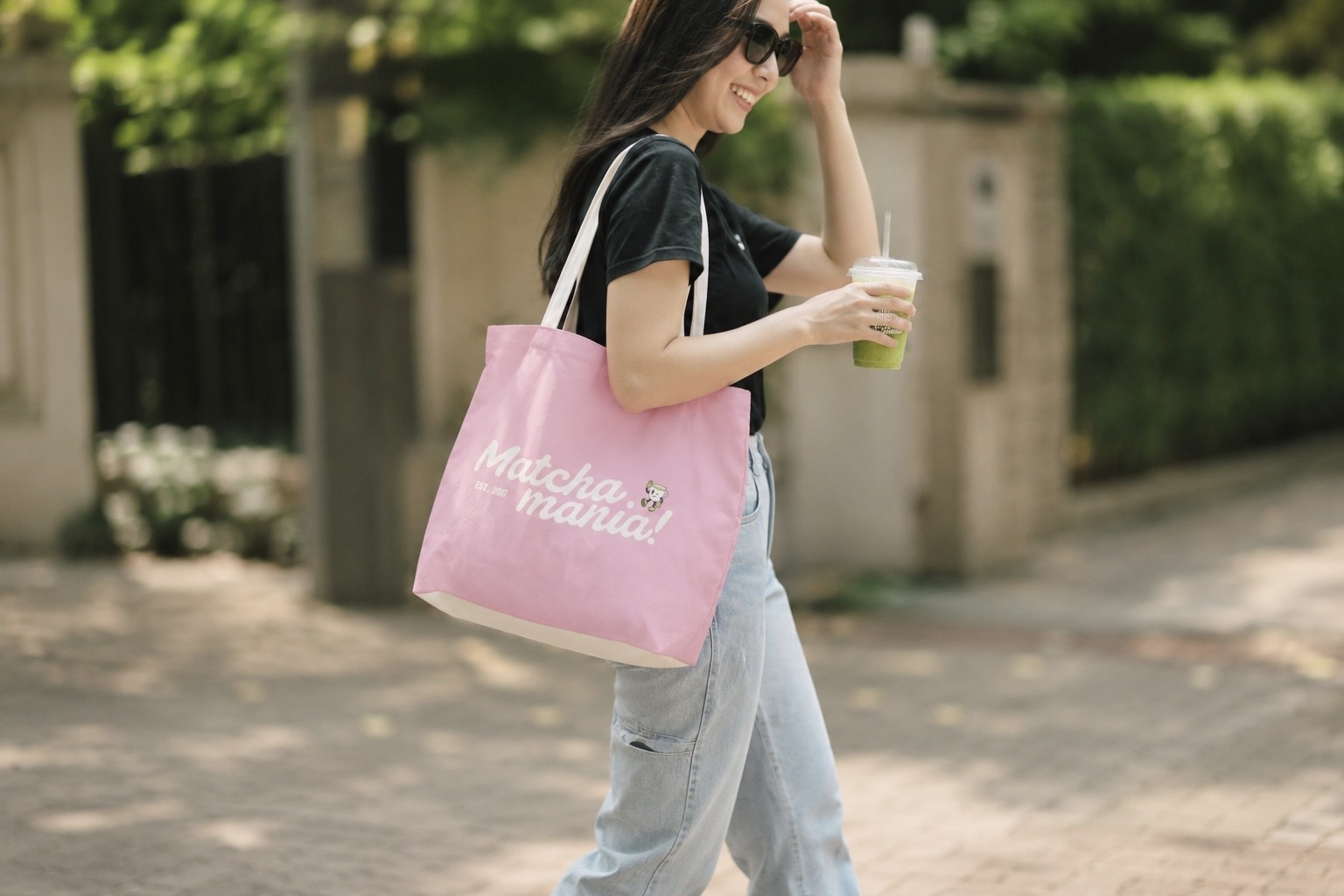
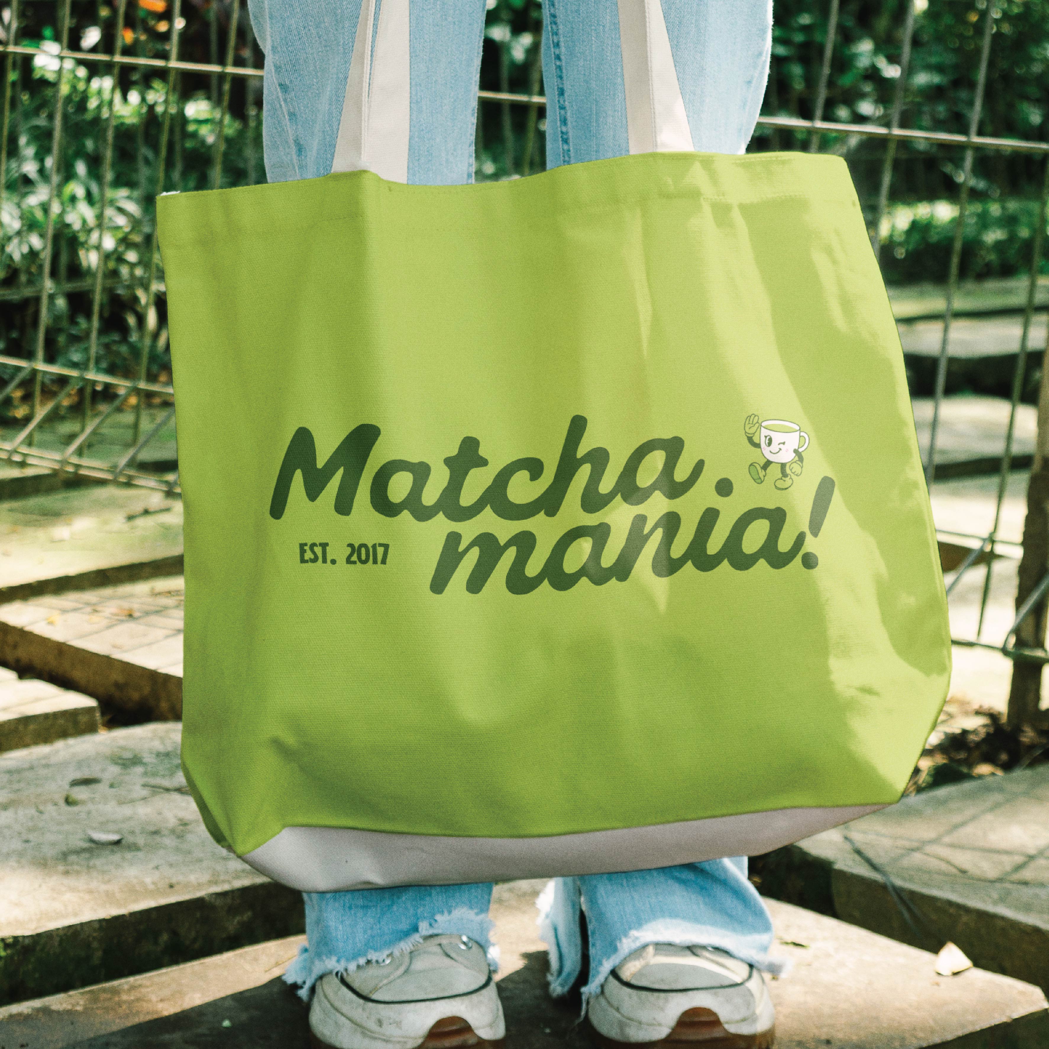
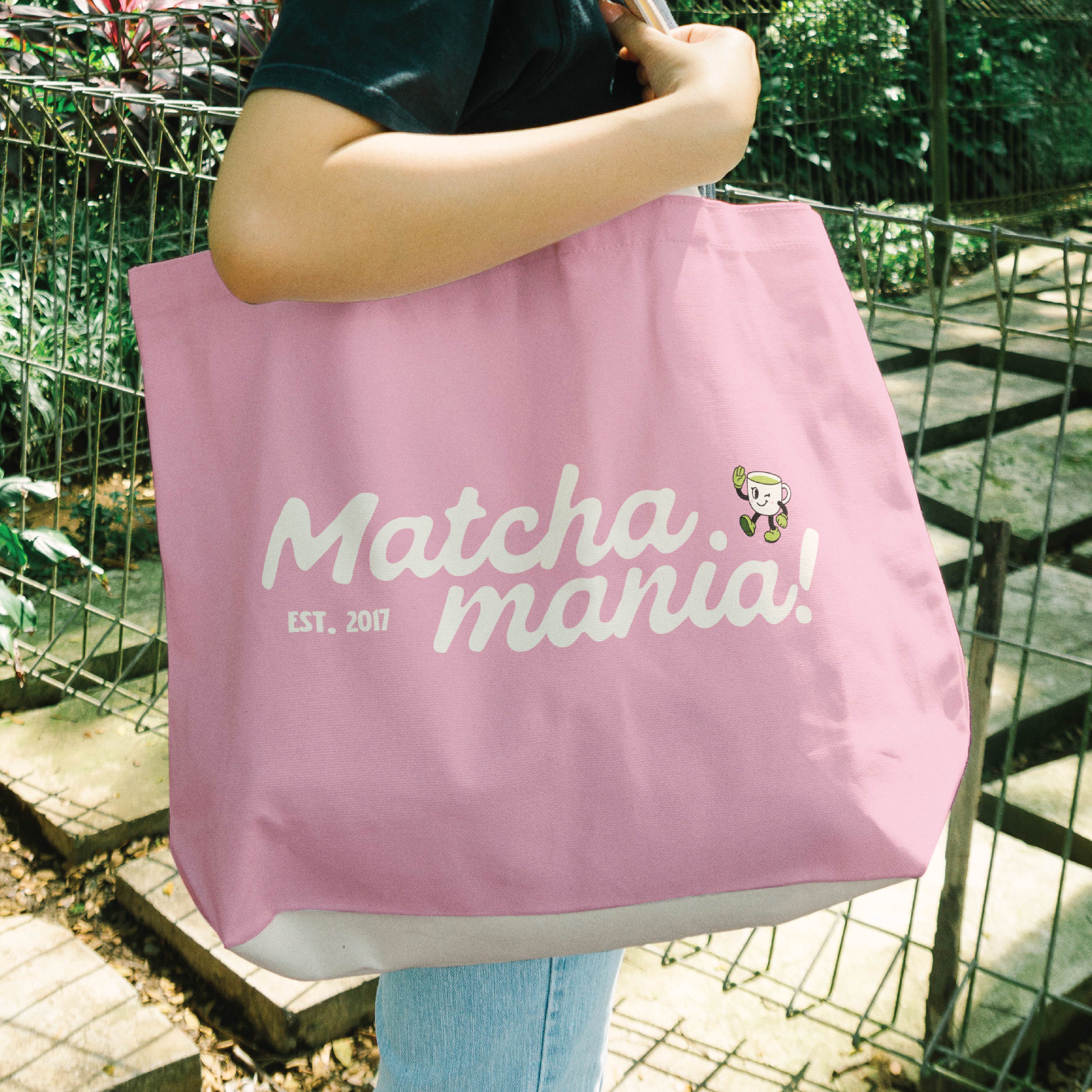
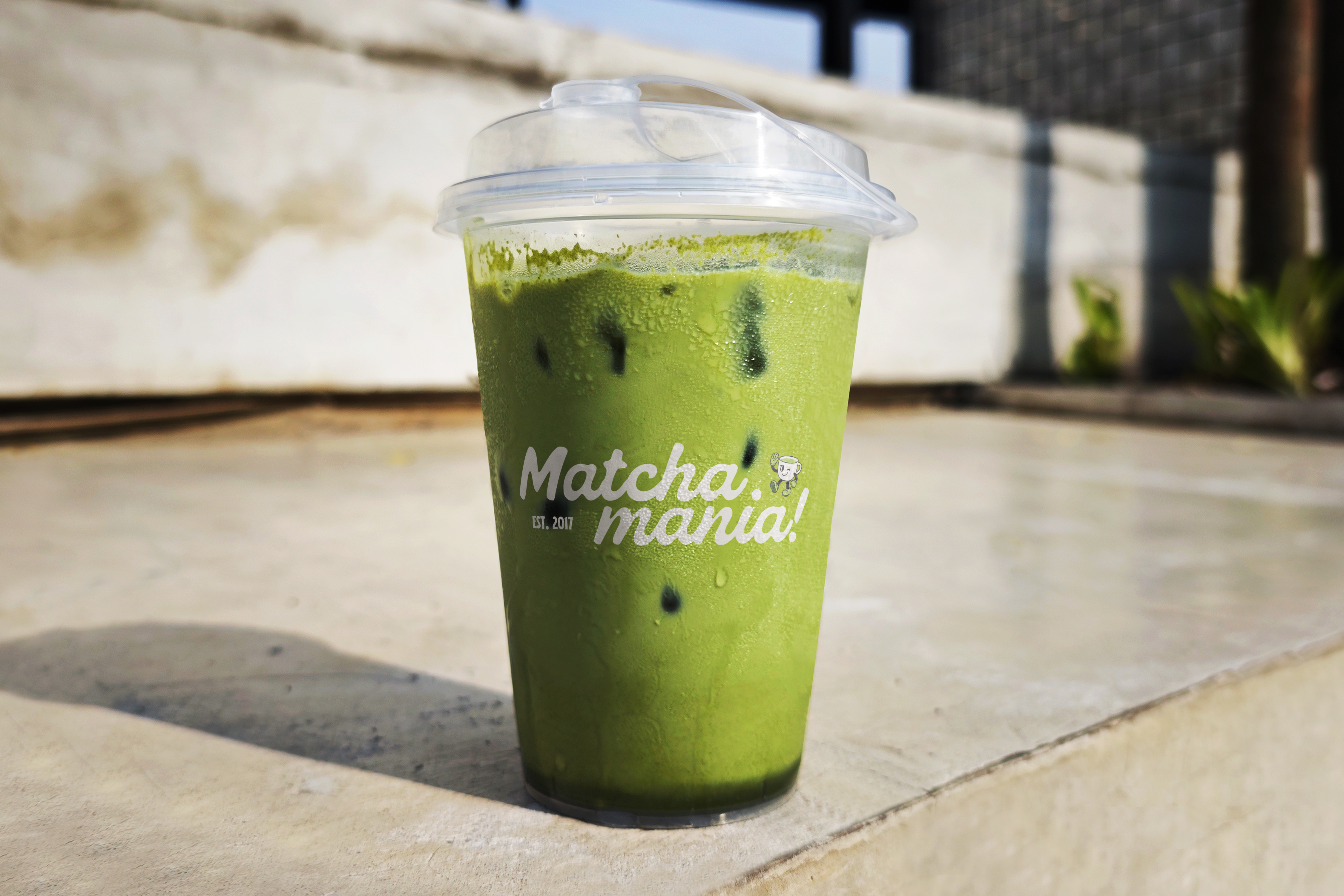
Matcha Mania is a matcha festival brand rooted in good energy, good tea, and great design. I developed the full visual identity logo, mascot, color palette, motion graphics, tickets, merch, and everything in between. The kind of brand that's just as fun to look at as it is to experience.
Cha-Cha lives at
the heart of it.
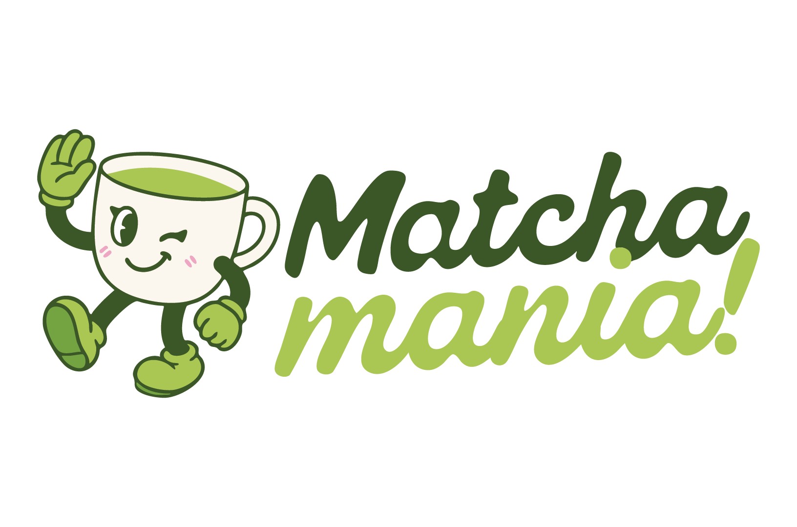
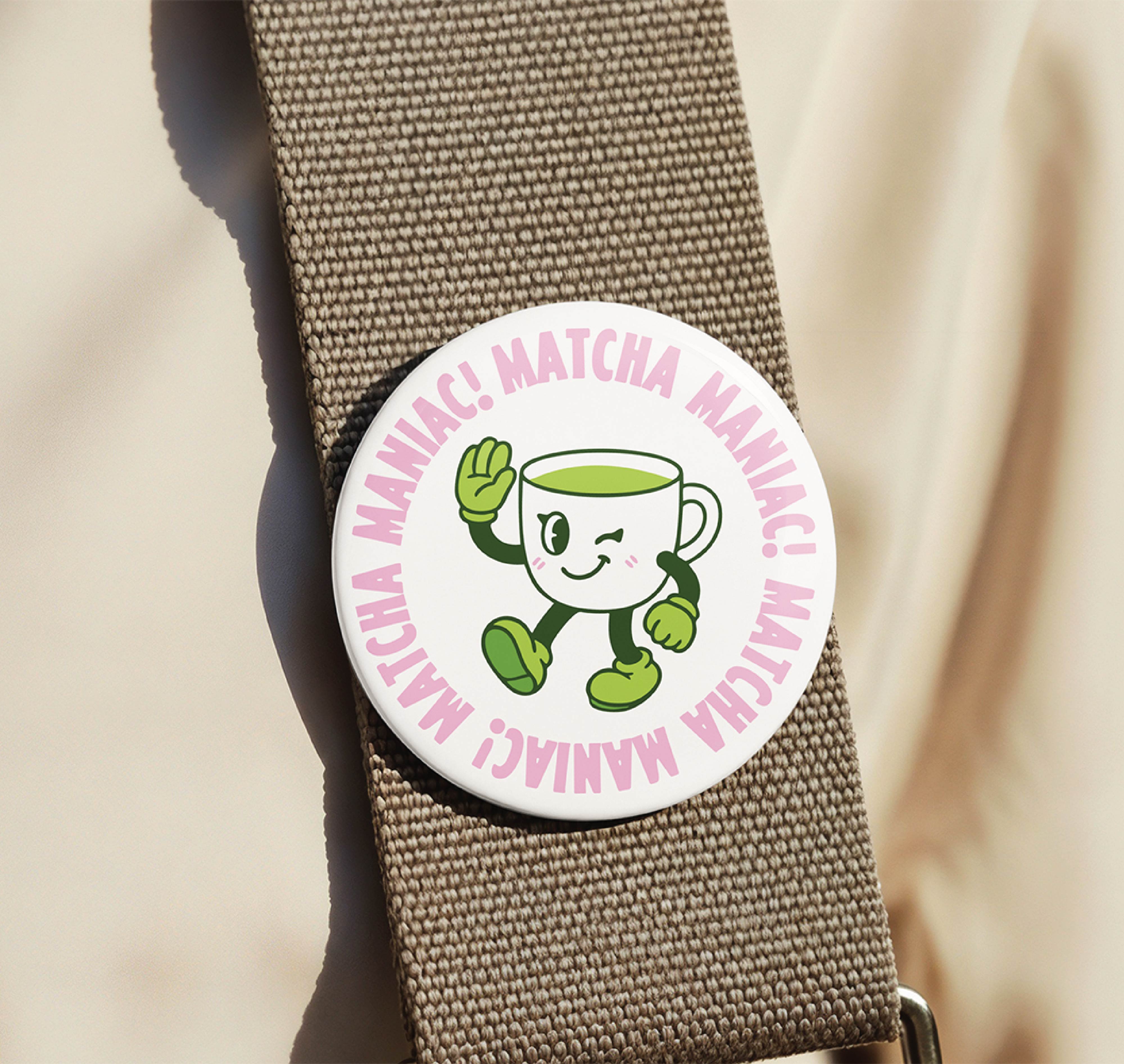
The logo pairs the Matcha Mania wordmark with Cha-Cha, the brand's mascot a winking, walking cup of matcha with way too much personality. Together they're the face of everything: cups, tickets, posters, merch. Playful but polished, recognizable from across a festival ground.
The Challenge
Festival branding has to work everywhere at once small print on a ticket stub, huge on a stage banner, looping on a screen, stitched on a tote bag. The challenge was building something with enough personality to pop in a crowd without falling apart when scaled.
The Approach
I started with Cha-Cha. Once the mascot had a personality, everything else followed the bubbly script font, the green and pink palette, the way the brand feels feminine and fun without being soft. Motion was designed in from the start so the brand could live just as naturally on a screen as it does on paper.
Verdant
#3B5728
RGB 59 / 87 / 40
CMYK 32 / 0 / 54 / 66
Sprout
#73A240
RGB 115 / 162 / 64
CMYK 29 / 0 / 60 / 36
Limeleaf
#AAC653
RGB 170 / 198 / 83
CMYK 14 / 0 / 58 / 22
Rosette
#ECA6C0
RGB 236 / 166 / 192
CMYK 0 / 30 / 19 / 7
Ivory
#FAF3EB
RGB 250 / 243 / 235
CMYK 0 / 3 / 6 / 2
Deep forest greens anchor the identity, while Limeleaf and Sprout bring energy and warmth. Rosette adds an unexpected playful softness, and Ivory keeps everything light and breathable.
Folkies Vantage
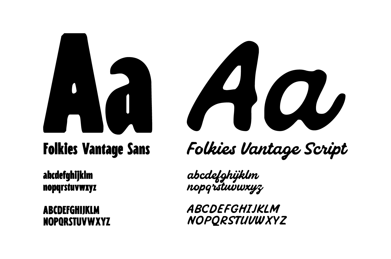
Folkies Vantage Sans and Script do the heavy lifting the sans keeps things grounded and readable while the script brings that handcrafted, hand-lettered energy Matcha Mania lives in. Structured but never stiff.

Motion Graphics
Animated loops were built for social media, digital signage, and screen displays at the festival. The brand doesn't just sit still it moves the way matcha energy feels.

Ticket Designs
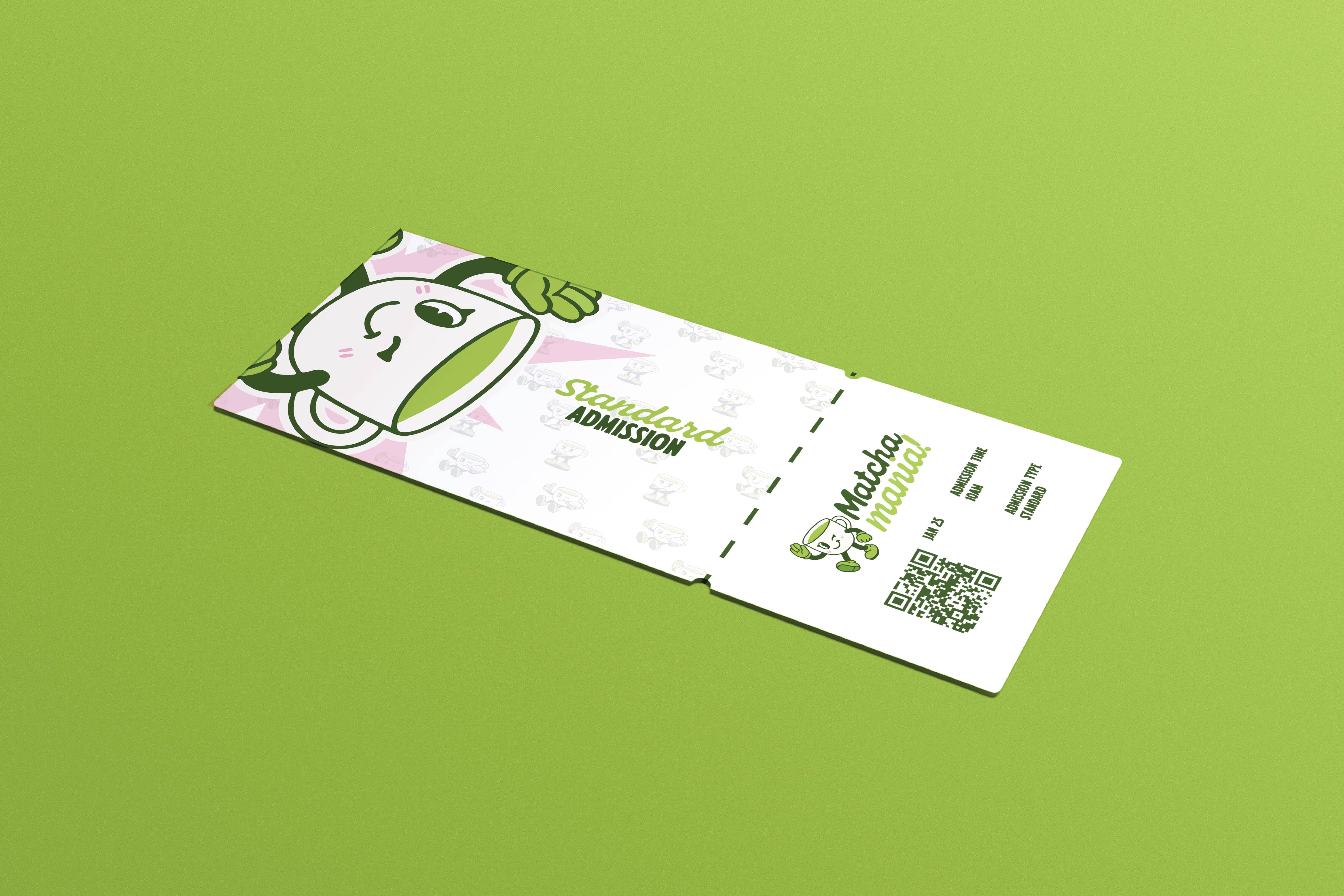
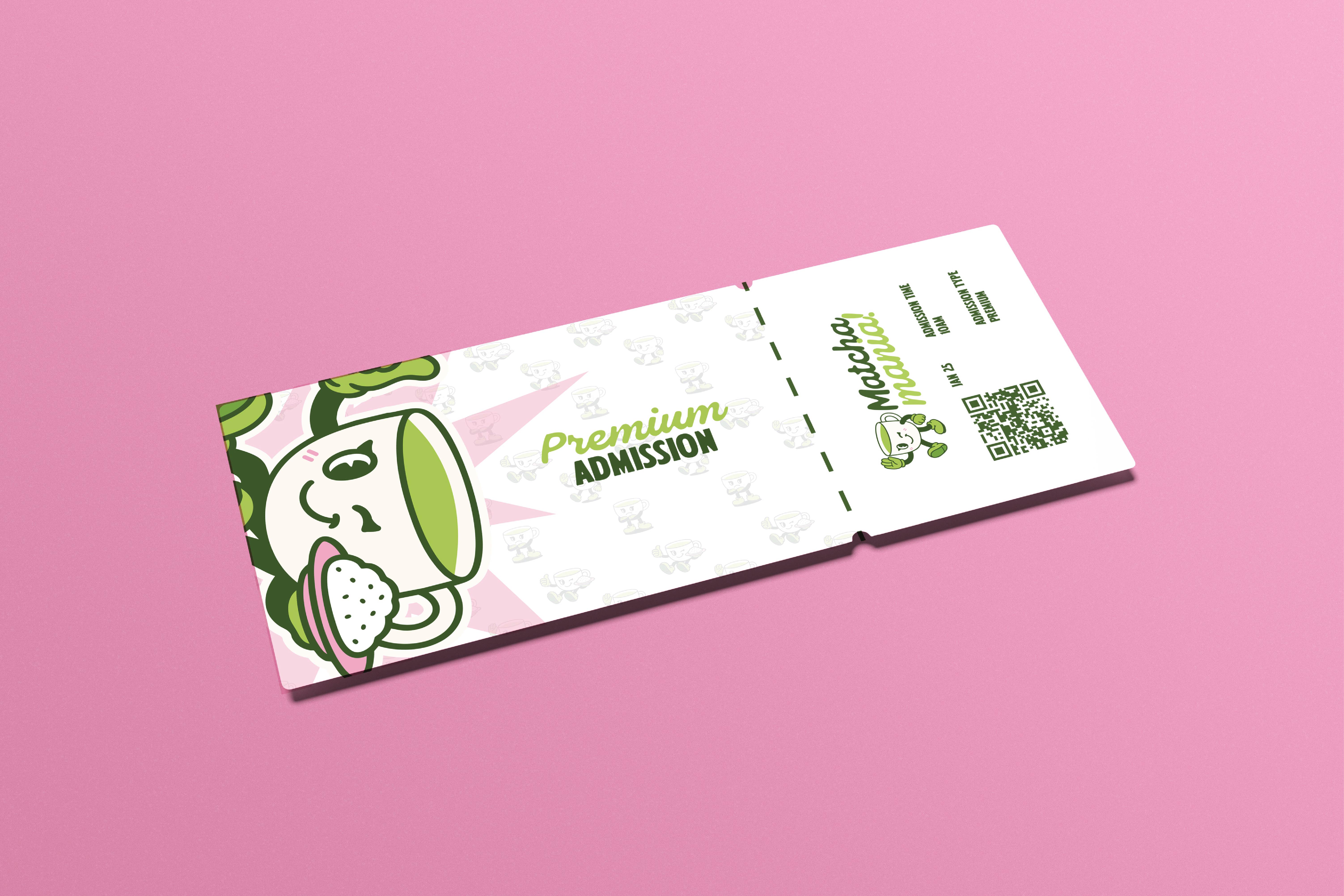
Two tiers, two personalities. Standard Admission on soft green, Premium on pink. Both feel less like entry passes and more like something you'd actually keep.
Loud
on purpose.
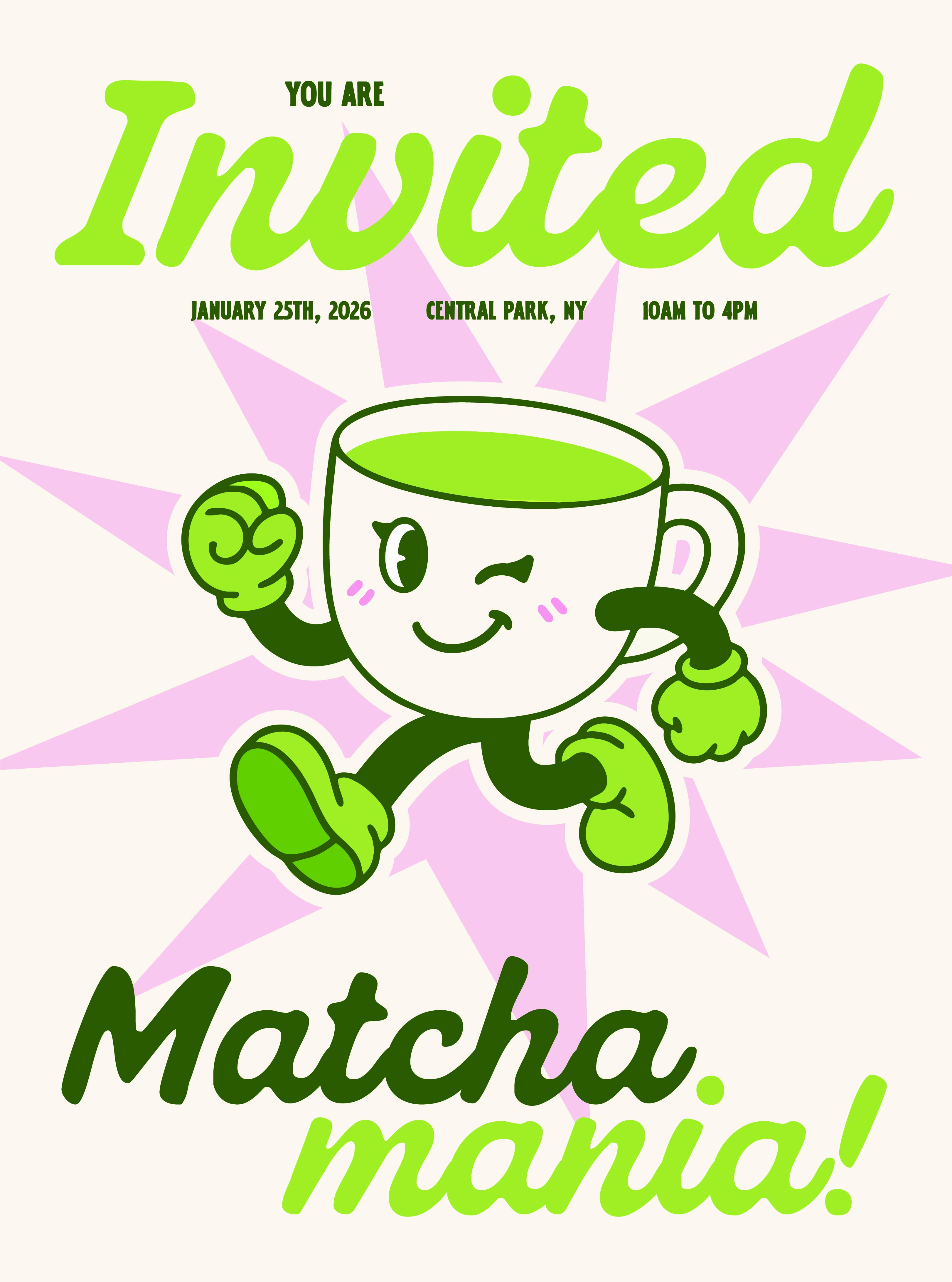
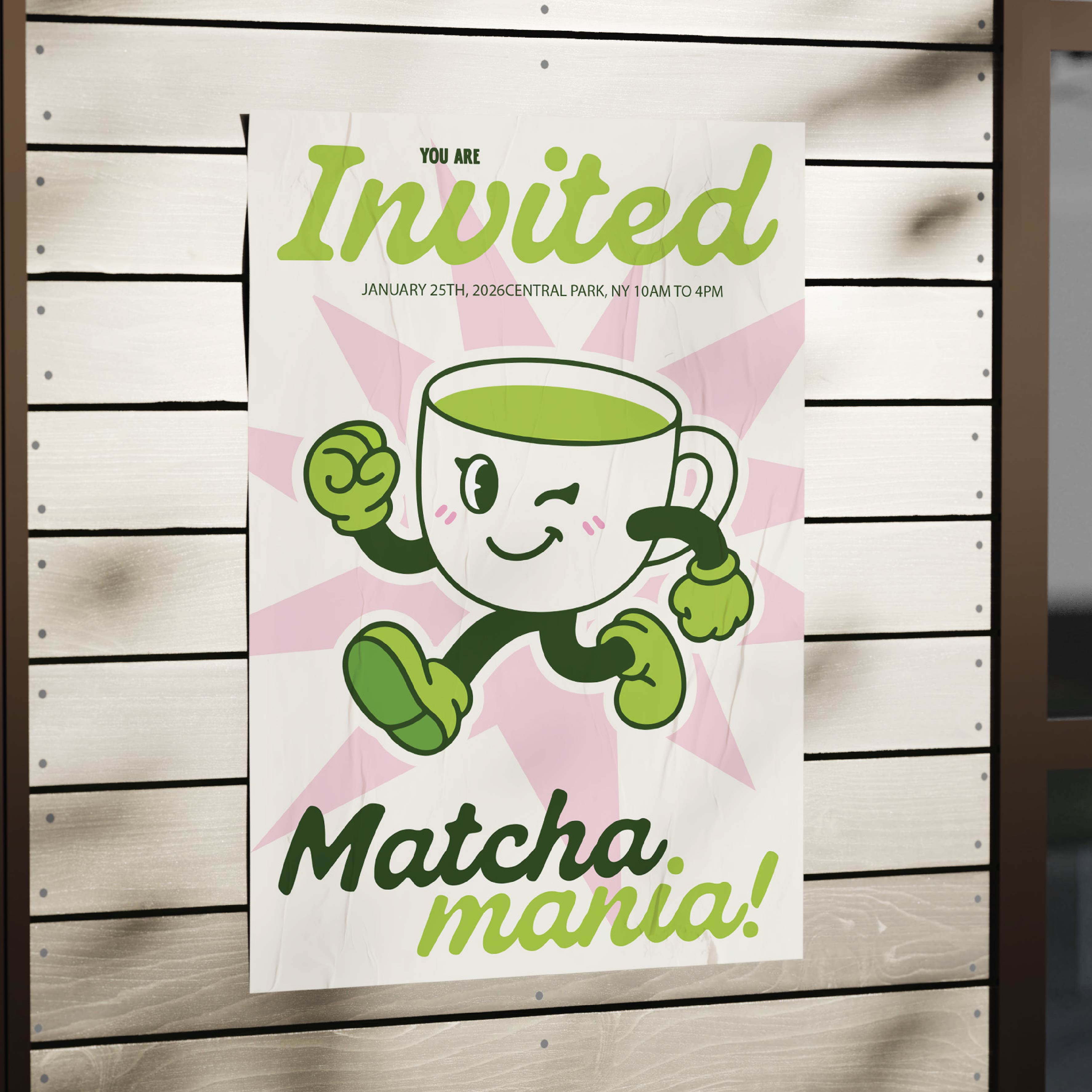
Cha-Cha front and center, mid-stride, winking at you. "You Are Invited" in that signature Folkies script. It doesn't ask for attention. It just has it.
"A brand that doesn't just show up. It shows out."
What started as a brand brief turned into a full world. Every deliverable the logo, the mascot, the tickets, the totes, the motion, the poster felt like it belonged to the same universe. Cha-Cha became the heart of it, and the palette gave the team a language they could actually use. Matcha Mania doesn't just have a brand. It has a vibe.