Mavmedia
maegraphics · 2025
Mavmedia
Brand Identity · Graphic Design
Mavmedia is a full-service media and production company that moves fast and shows up big. I built their entire visual identity from the ground up: logo, color system, motion assets, merch, and everything that makes a brand feel real. Bold, sharp, and built to last.
Simple. Sharp.
Unmistakable.
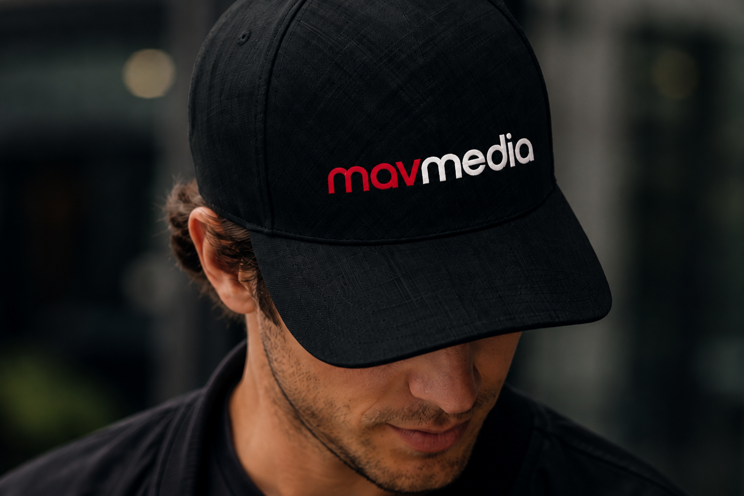
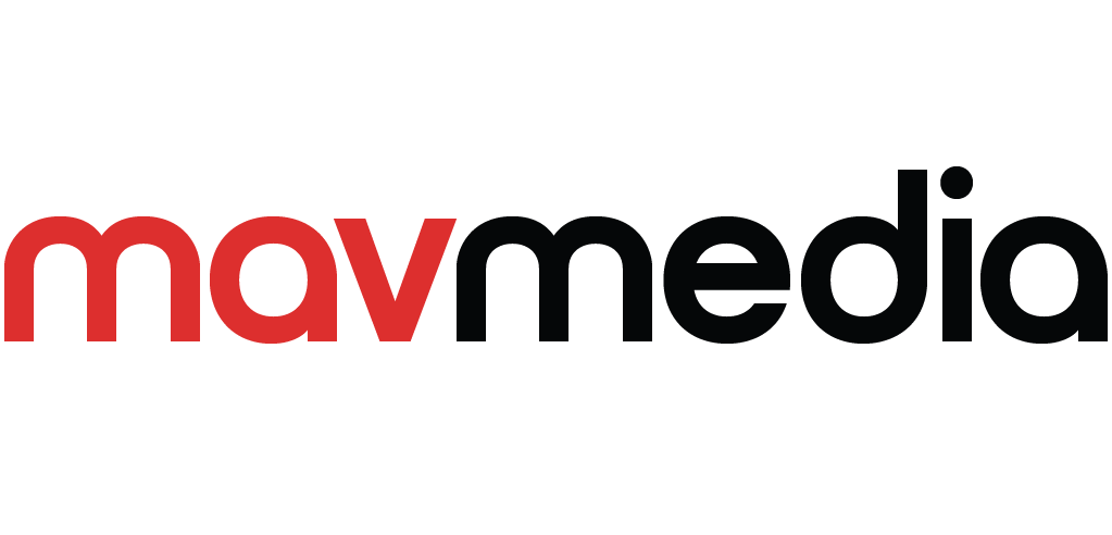
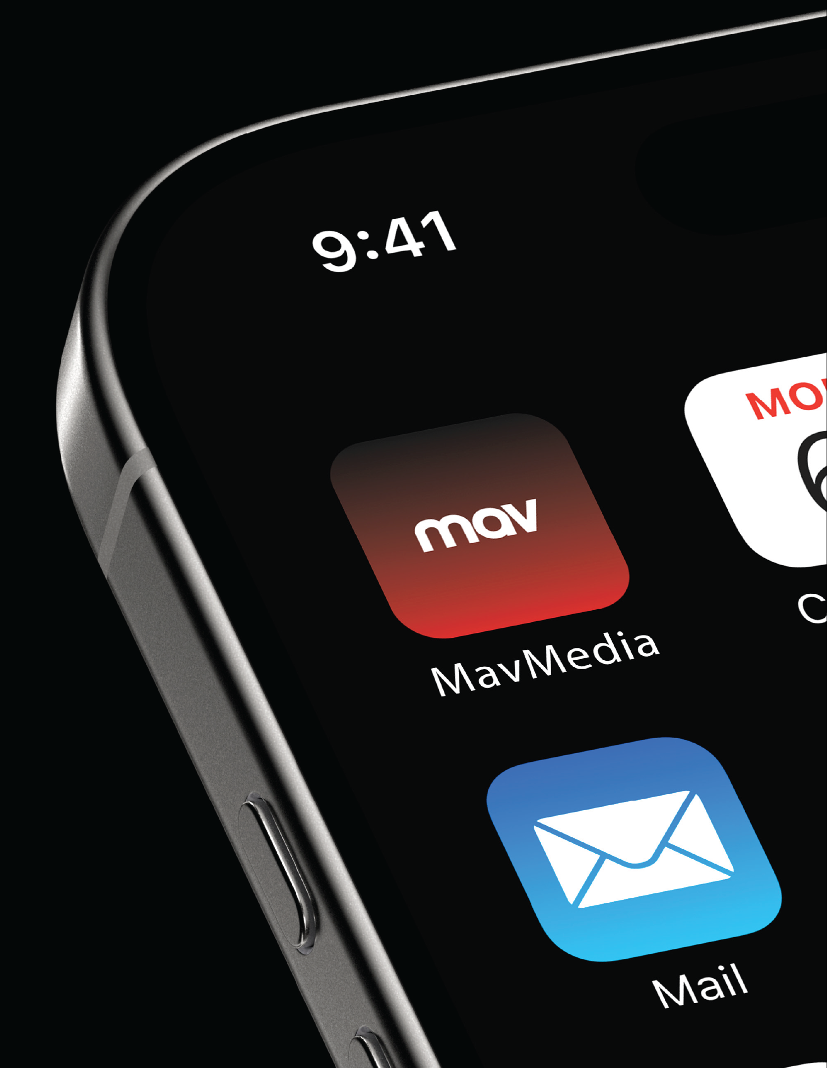
The Mavmedia wordmark is deceptively simple. Rounded, approachable, but with a confidence that hits. "mav" in red, "media" in black or white depending on the context. It reads instantly whether it's on an app icon, a hoodie, or a wall.
The Challenge
Media brands live across a lot of surfaces: app stores, social feeds, video thumbnails, merch, signage. The identity needed to hold its own in all of them without needing to be explained. It had to feel like a brand people already know.
The Approach
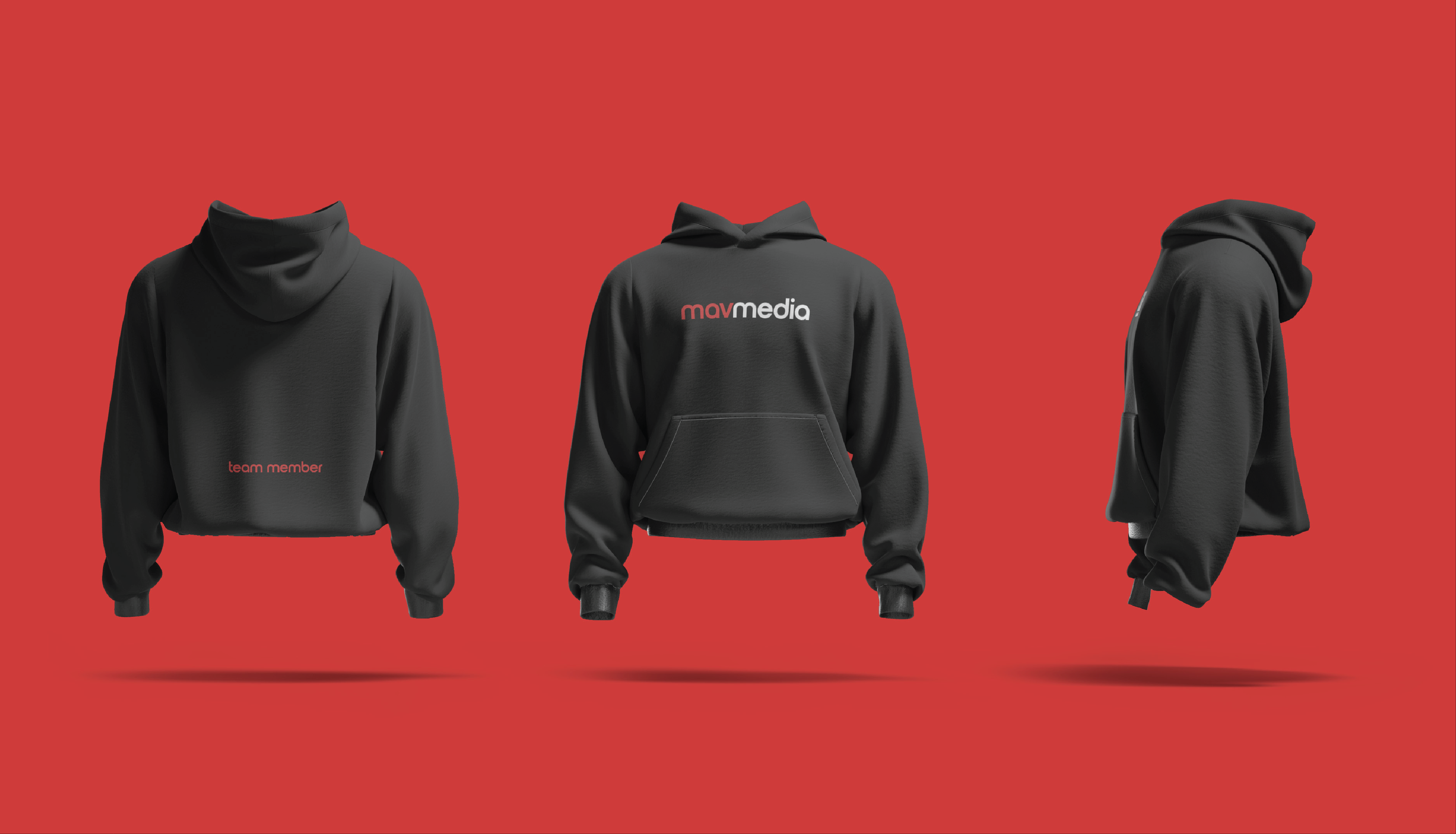
I stripped it back to what matters: a strong mark, a ruthless color palette, and a type system with no room for ambiguity. Then I pushed it into every format I could: gradient animations, app icons, branded merch, signage mockups. If it survived all of those, it made the cut.
Black
#010101
RGB 1 / 1 / 1
CMYK 0 / 0 / 0 / 100
Red
#DB312B
RGB 219 / 51 / 41
CMYK 8 / 94 / 96 / 0
Gradient
#010101 to #DB312B
Three colors. Black that's basically void, red that demands to be seen, and a gradient that lives between them like heat. No room for anything soft. This palette means business.

Same mark,
different moods.
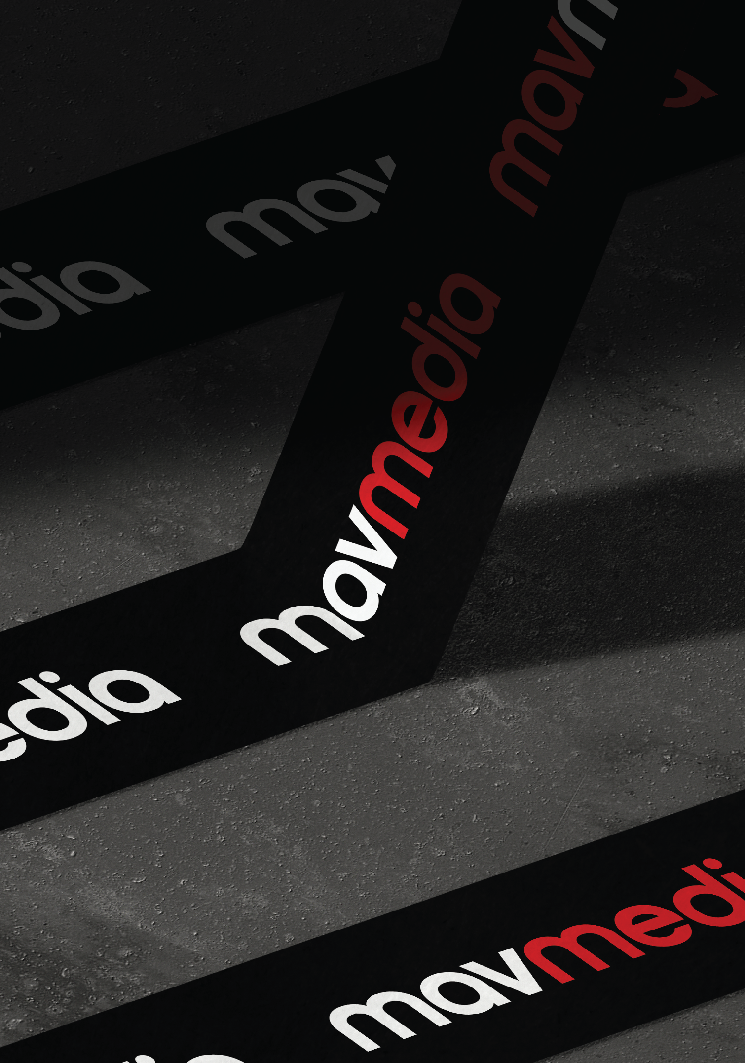
The logo doesn't flinch on any background. White on black is the default: clean, authoritative. Black on red flips the energy. The gradient variant lives in motion and digital, where the brand gets to breathe and move.


"Bold enough to own any room it walks into."
Mavmedia went from no identity to a full brand system that actually feels like them: fast, confident, no fluff. The mark works on a phone screen and a conference room wall. The merch looks like something people actually want to wear. That's the goal every time: make a brand that earns its place wherever it shows up.