Cake
Social
Concept identity for a custom cake studio
A cake shop for every occasion, not just the big ones. The identity had to feel like an heirloom and read like a party invitation at the same time.
Type
Concept, design brief
Service
Brand identity, print and packaging
Year
2026
Designer
Katrina Dodds
Process
Piped, not
typeset.
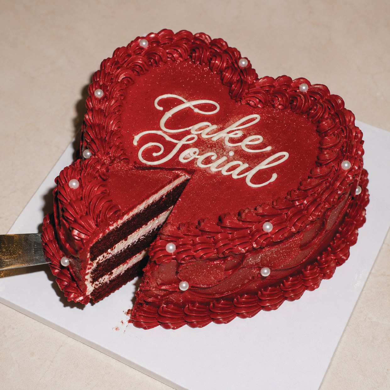
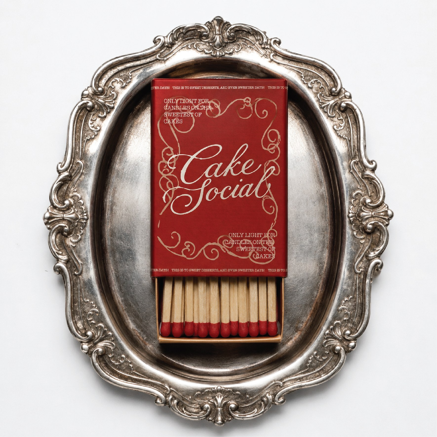
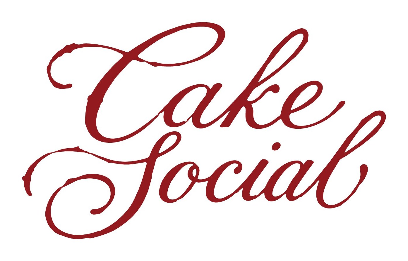
Custom cake studios mostly brand themselves one of two ways: airy pastel minimalism, or a script so delicate it disappears at small sizes. Cake Social goes the other direction and commits to a single deep red. The wordmark is custom script lettering with the swell and drag of a piping bag rather than a pen, which means it can be piped onto an actual cake in buttercream and still be the logo. That is the test the mark had to pass, and it is why nothing about it is typeset.
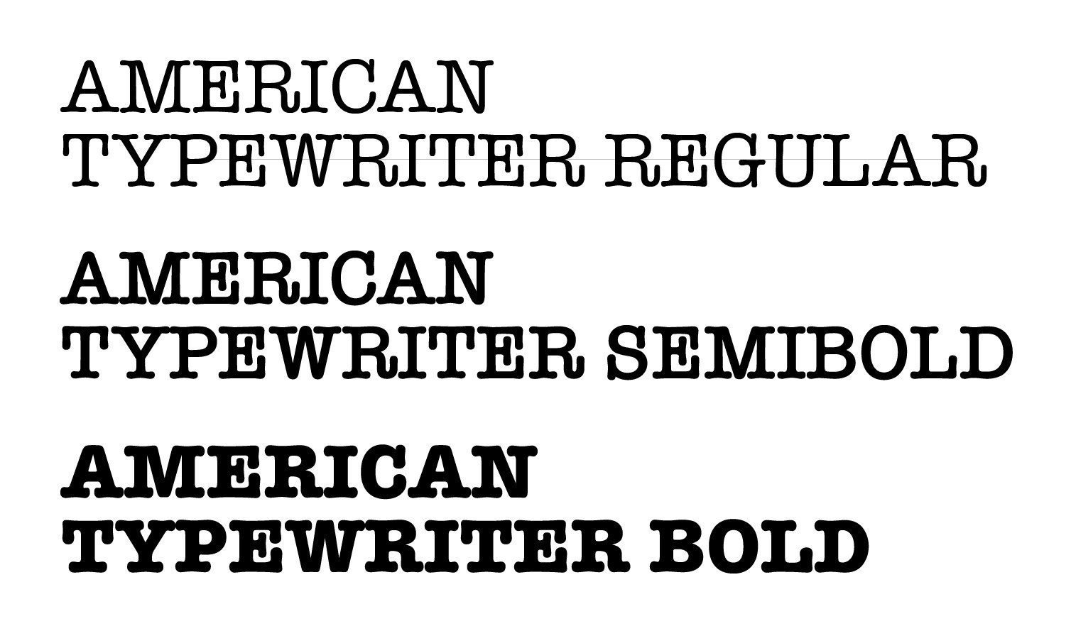
Around it, American Typewriter does all the practical work. A slab serif is an odd partner for something this ornate, and that is the point: it keeps the brand from tipping into wedding stationery. The voice does the rest. Every piece talks like a person who is slightly too excited about cake, which is what stops the deep red and the silver trays from reading as formal.
Logo & mark
A wordmark you
can pipe.
Custom script lettering with the weight distribution of buttercream rather than ink. It reduces to a CS monogram for anything too small to carry the full name.
Primary lockup
The two words stack rather than sit on one line, so the descender of Cake and the ascender of Social interlock. That vertical lockup is what lets the mark drop onto a square: a matchbox, a napkin, the top of a cake.
Typography
American
Typewriter
Three weights, and nothing else. The slab serifs and rounded terminals keep the supporting type warm enough to sit under the script without feeling like a different brand.
It is a deliberately unglamorous choice next to the lettering. That contrast is what stops the whole thing reading as wedding stationery.
Color palette
One red,
two softeners.
The red does everything load-bearing. Light pink and beige exist to give it somewhere to sit, so the brand can go rich on a matchbox and quiet on a napkin without changing its mind.
Red
- HEX
- #911A1D
- RGB
- 145, 26, 29
- CMYK
- 0, 82, 80, 43
Light Pink
- HEX
- #F4C2DA
- RGB
- 244, 194, 218
- CMYK
- 0, 20, 11, 4
Beige
- HEX
- #F2EADE
- RGB
- 242, 234, 222
- CMYK
- 0, 3, 8, 5
Invitation
This is not a drill,
there is cake involved.
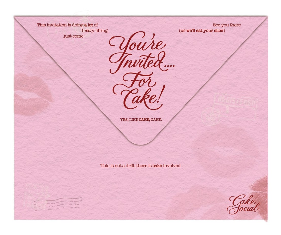
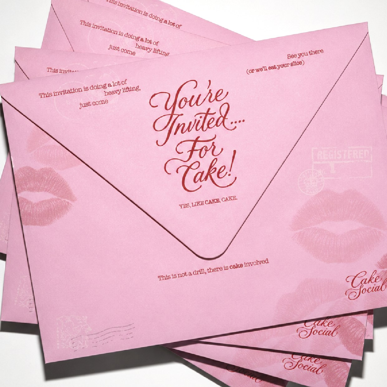
The envelope carries the whole voice before anything is opened. Lipstick prints and postal marks sit in the pink as a tint, so the red is only ever spent on words.
Copy
Every corner is doing a job. This invitation is doing a lot of heavy lifting, just come. See you there, or we'll eat your slice. Yes, like cake, cake. The jokes are the reason the piece works: without them it is just a pink envelope.
In the pile
Recognisable
face down.
Stacked, the envelopes still identify themselves. The lip print bleeds off the corner and the wordmark sits bottom right, so the brand survives being half covered by the next one in the pile.
That is the realistic condition for a mailed piece, and it is worth designing for rather than only checking the flat artwork.
Collateral
Front says who.
Back says why.
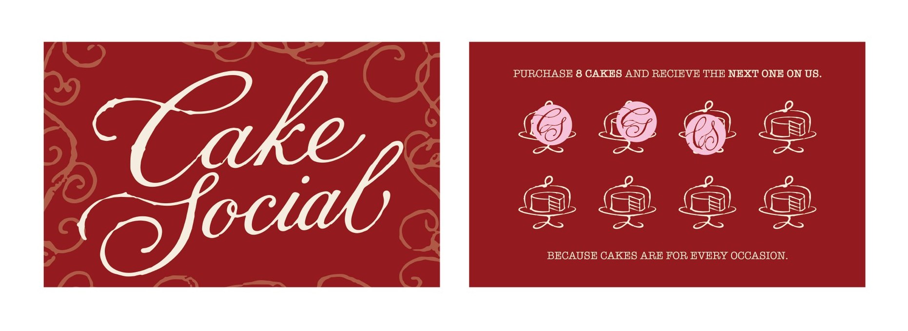
The face of the card is the wordmark on red over a tone-on-tone flourish pattern, with no contact details at all. Everything practical happens on the reverse.
Loyalty
Because cakes are for
every occasion.
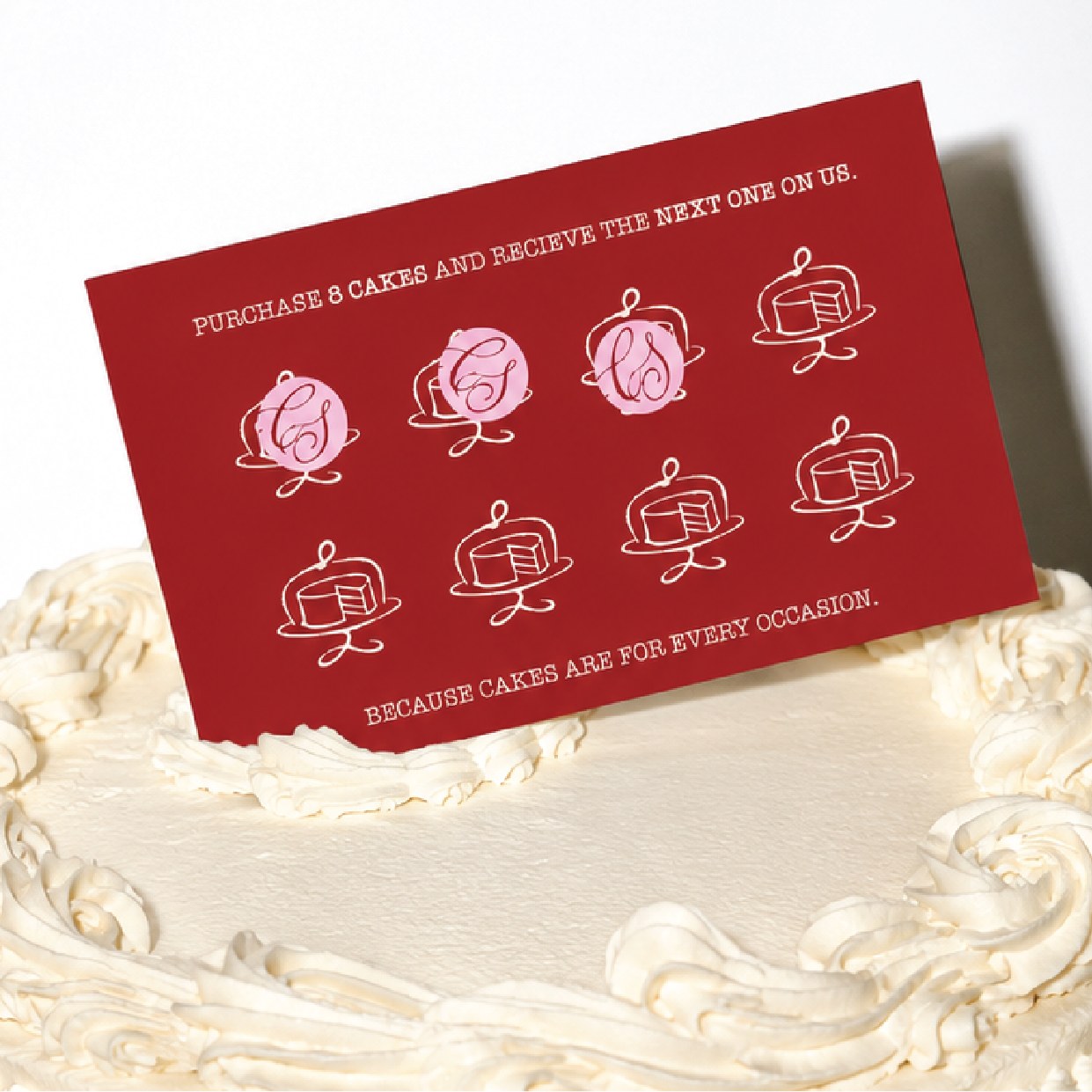
Eight line-drawn cake stands, stamped with a pink CS as they are earned. Buy eight, the ninth is on us.
The line the card closes on is the actual strategy: it argues that a cake does not need a wedding to justify itself, which is the whole reason a studio like this can exist.
Napkins
Life's too short
for boring cake.
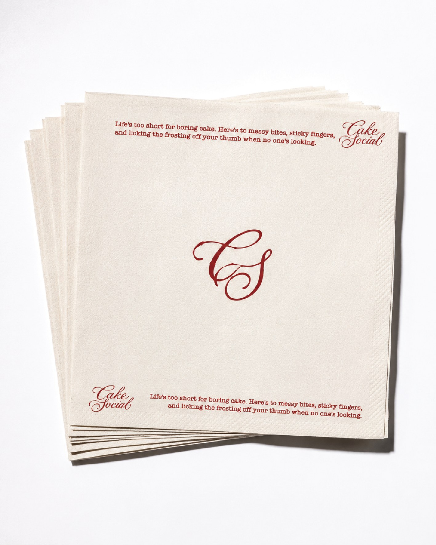
The monogram sits alone in the centre, with the voice running along two opposite edges so it reads whichever way the napkin is picked up.
Here's to messy bites, sticky fingers, and licking the frosting off your thumb when no one's looking. It is the only piece in the set that admits cake is eaten rather than photographed.
The product
The logo,
in buttercream.
The test the wordmark was drawn to pass. Piped onto a heart cake in white icing at cake scale, the lettering keeps its weight distribution and stays legible with a slice already gone.
Photography direction
Flash on,
manners off.
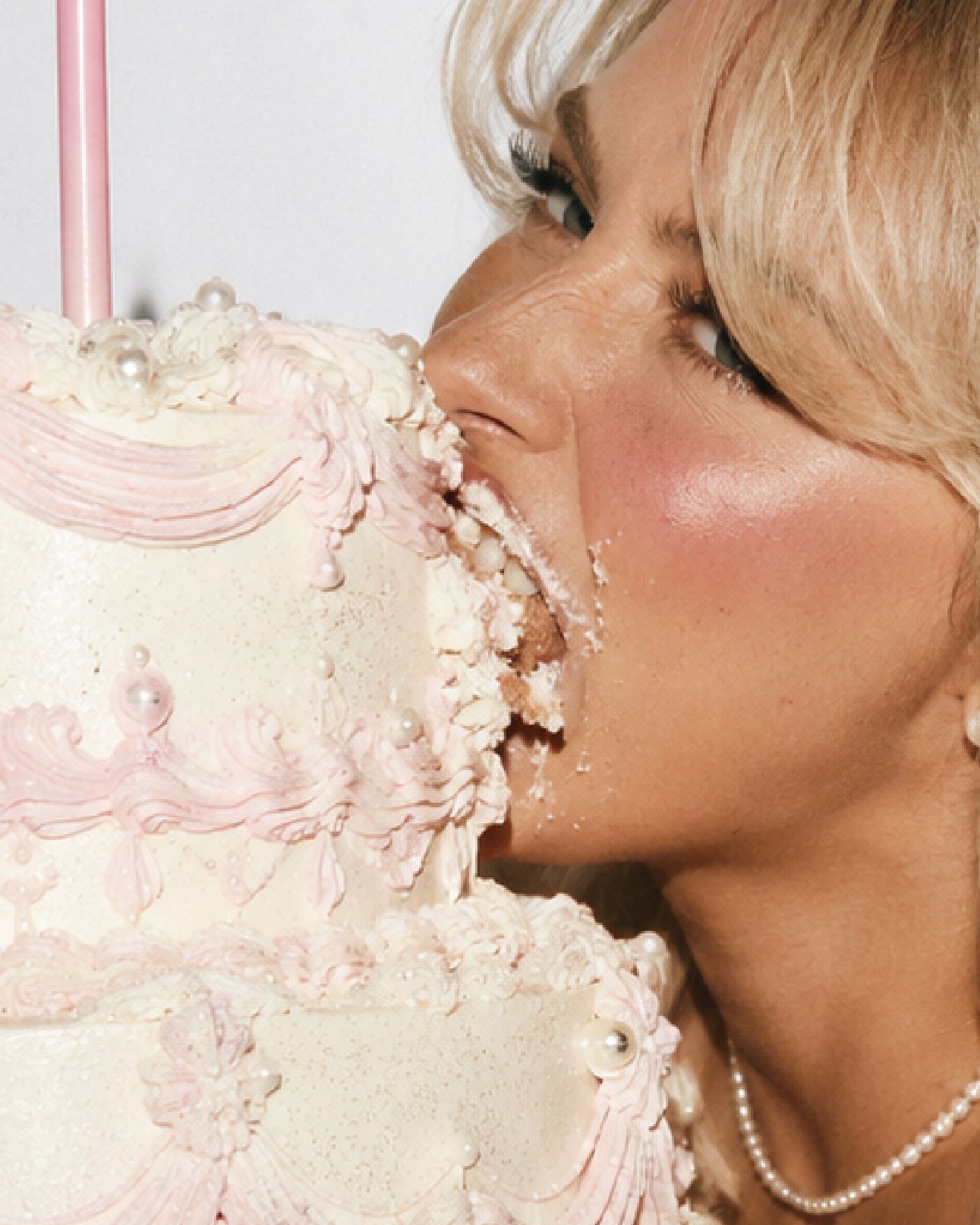
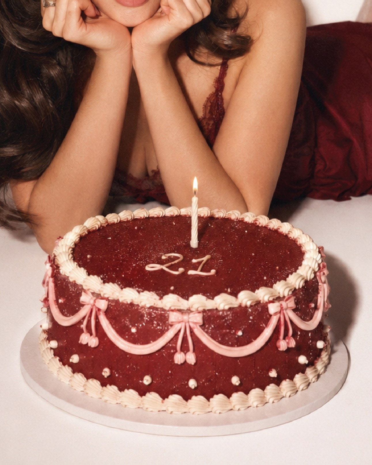
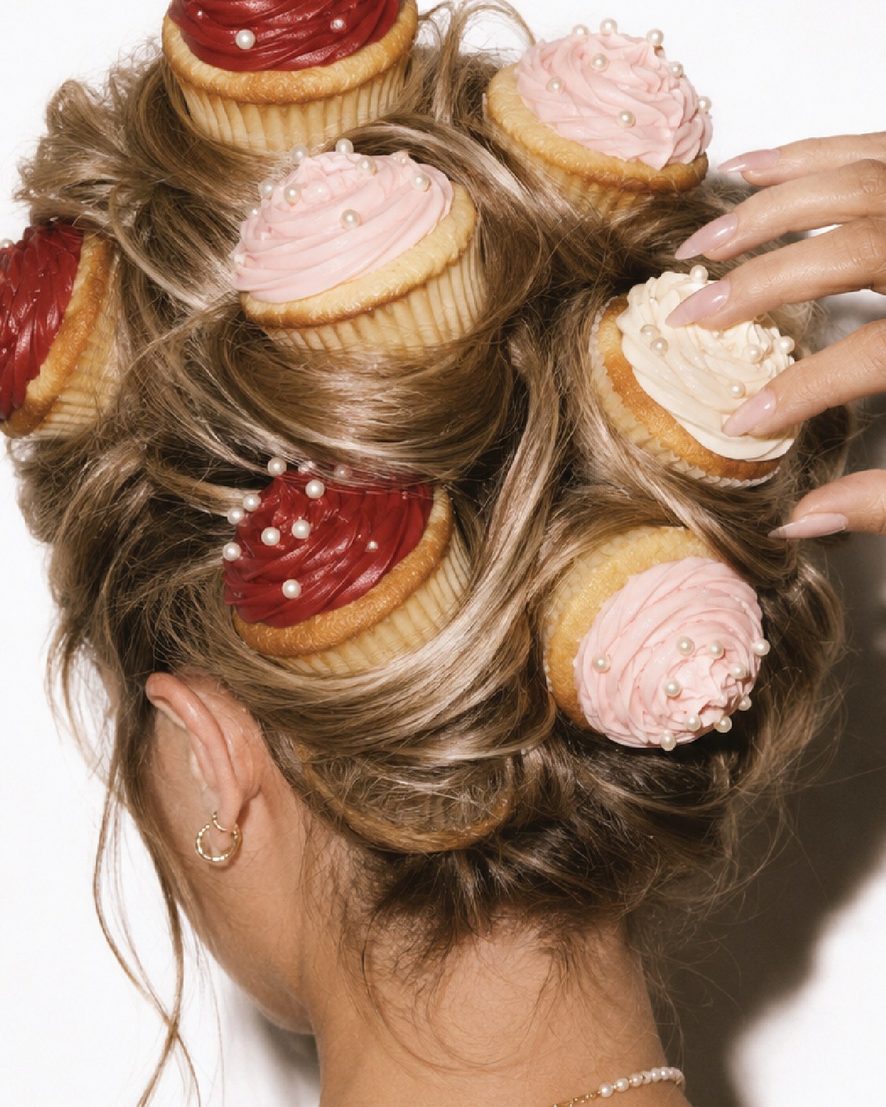
Direct flash, close crops, and cake being eaten rather than displayed. The styling stays vintage, all pearls and bows and shell borders, but the behaviour in frame never is. That gap is where the brand's humour actually lives.


Direction
Three rules for anyone shooting this brand. Get close enough that the frosting texture reads. Let the cake be damaged. Keep the palette in shot without staging it, so the red and the pink arrive through what people are wearing and eating rather than through a backdrop.