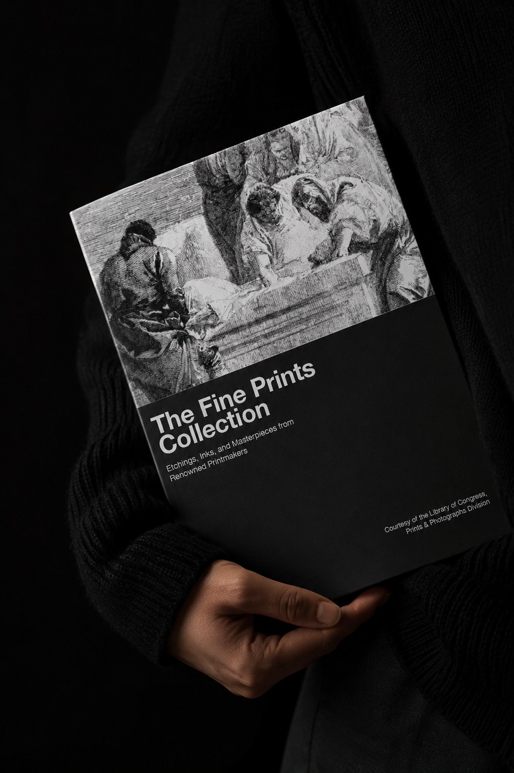
A person in black holding the printed Fine Prints Collection catalog, the Tiepolo etching and title on its cover catching the light

The Fine
Prints Collection

Self-initiated exhibition catalog

A fourteen page catalog built around the Library of Congress Prints and Photographs Division. Five centuries of etchings, engravings and lithographs, set in two colors and asked to hold together as one book.
Type

Self-initiated

Service

Editorial design and typesetting

Year

2024

Designer

Katrina Dodds

Process

Let the plates
do the talking.

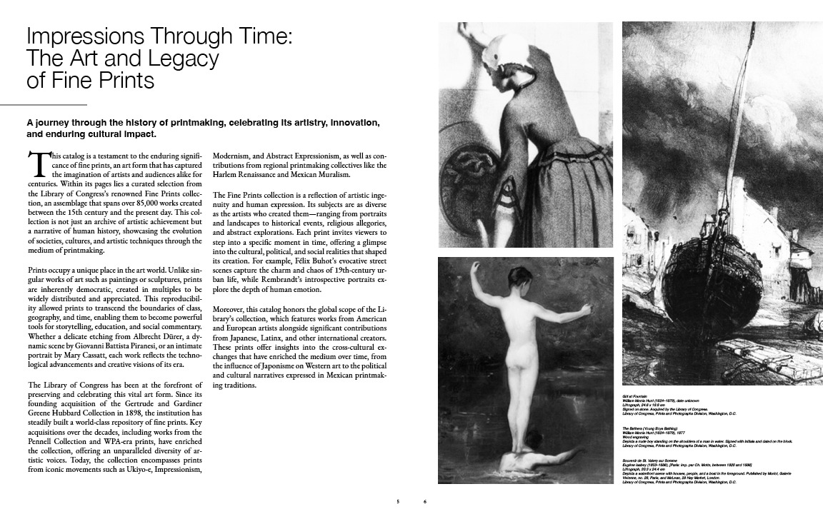
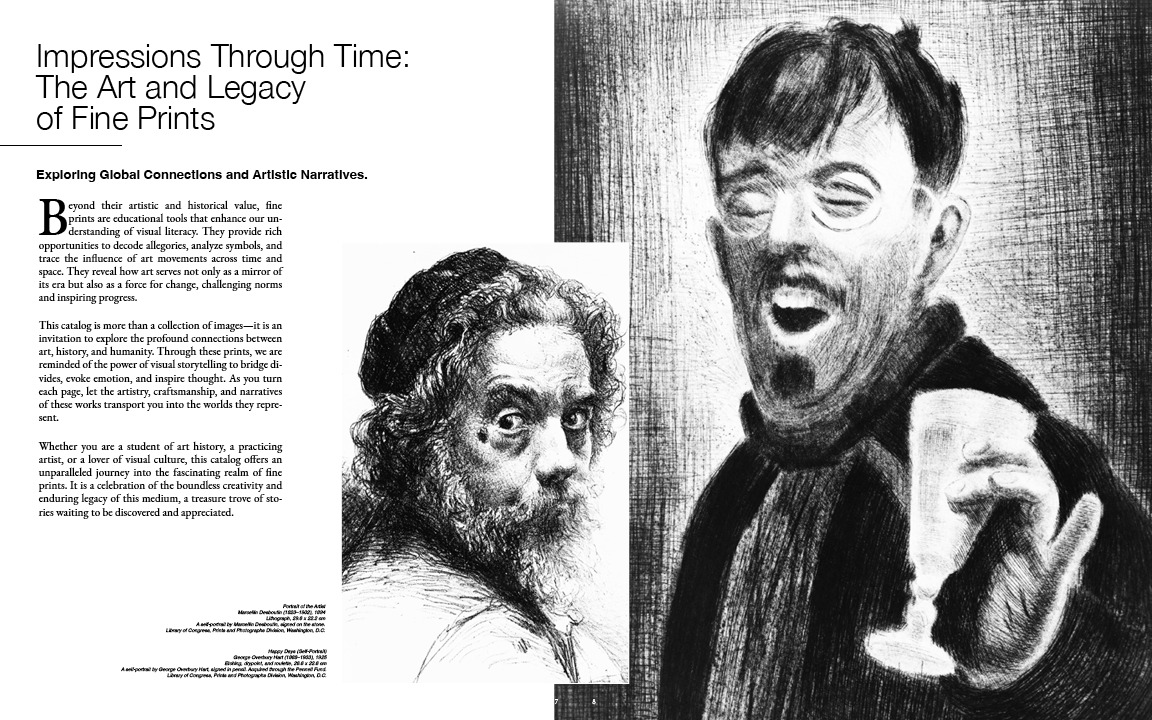
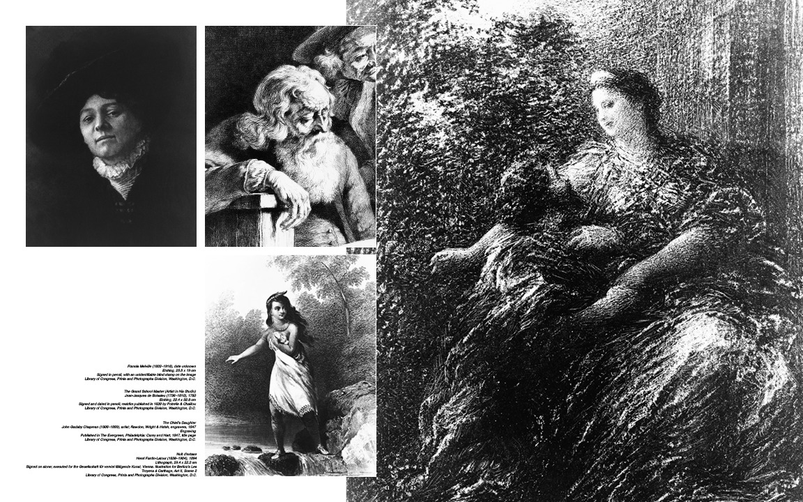
The source material is the Library of Congress Prints and Photographs Division, an archive of roughly eighty five thousand works running from the fifteenth century to now. The problem with material that good is that it does not need help. A Rembrandt self portrait, a Piranesi ruin and a Fantin-Latour lithograph have nothing in common stylistically, and any decorative layer laid over them would only fight for attention with work that has already survived four hundred years.

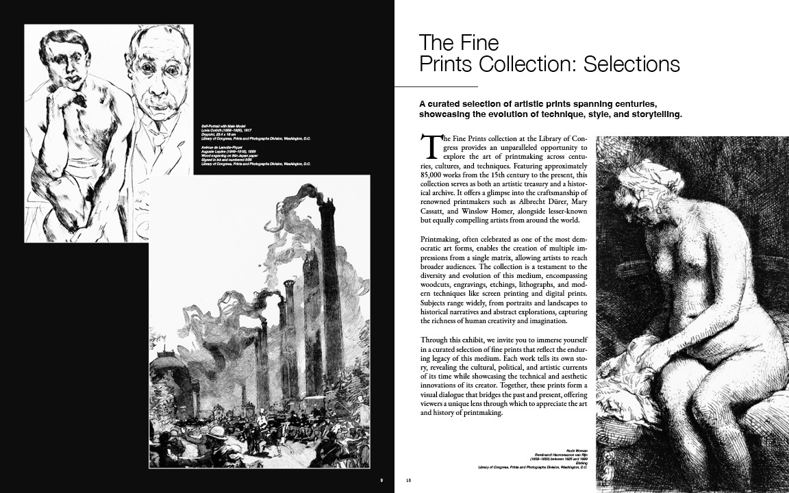
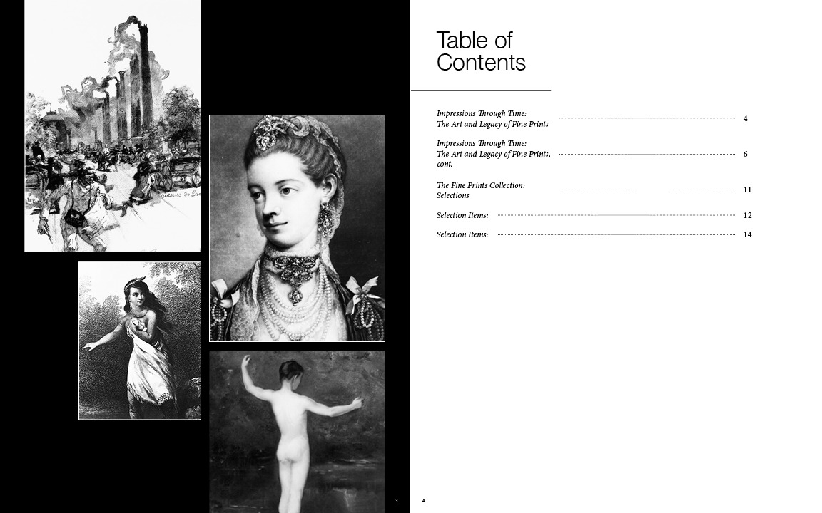
So the design is a container rather than a treatment. Ink and paper, no third color. A neutral grotesque handles titles and captions, a transitional serif carries the running essay, and the grid stays loose enough that a full bleed plate and a two column column of text can sit on the same spread without either one apologising. The black pages exist for one reason: they let a white bordered print float, which is the closest a screen or a page gets to seeing a print matted on a gallery wall.

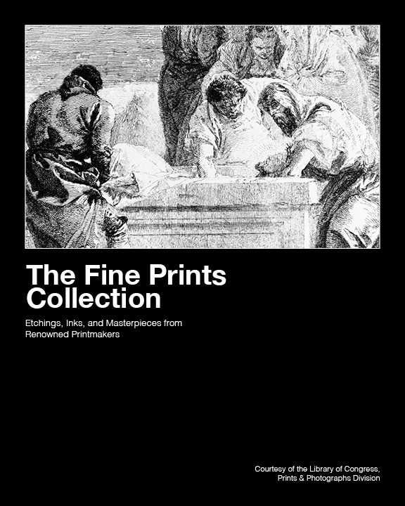
The catalog cover: a Tiepolo etching of figures at a tomb sitting on a black field above the title

Cover

One plate,
held high.

The cover gives its top third to a single Tiepolo etching and leaves the rest black. The title sits directly under the image with no rule between them, so the plate reads as the thing being introduced rather than as decoration behind a title.

The credit line drops to the bottom corner, small. It matters, but it is not what anyone picks the book up for.
The catalog

Read it
spread by spread.

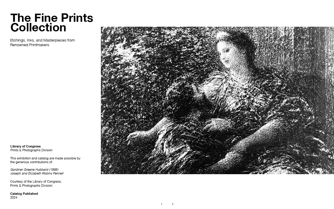
All seven spreads, in order. Click a page to turn it, use the arrows, or swipe. Front matter first, then the essay across two spreads, then the plates.

Ink & paper

Two colors.
That is the palette.

Every print in the collection is monochrome, so the catalog is too. The only decision left is which of the two is doing the holding: black behind a plate makes it an object, white behind text makes it a page.

01

Ink

HEX
#000000
RGB
0, 0, 0
CMYK
0, 0, 0, 100
02

Paper

HEX
#FFFFFF
RGB
255, 255, 255
CMYK
0, 0, 0, 0

The object

Opened, it stays
one black room.

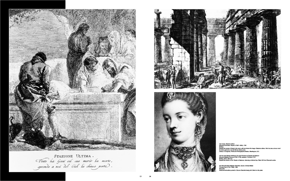
Laid flat, the two dark pages read as a single continuous field and the plates sit in it the way work sits in a vitrine. That is the whole argument for printing the interior black.

A catalog is something people carry home from an exhibition, so it is sized for reading rather than for a coffee table.
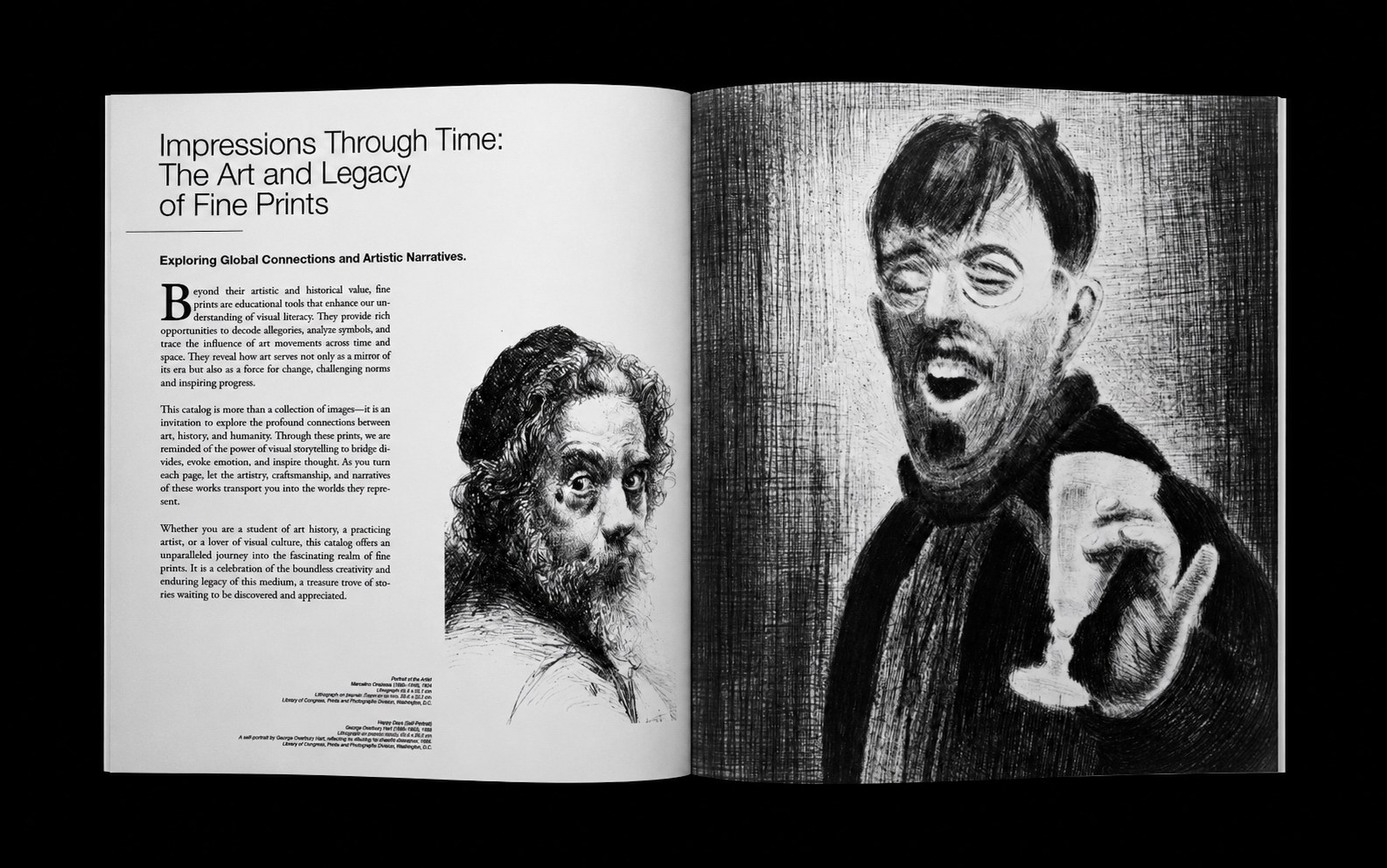
The catalog lying open on black, an essay spread beside two large etched portraits
← All work