Freaky
Cat!
Self-initiated brand identity for a tattoo shop
A tattoo and piercing shop with no interest in being tasteful. The mark had to hold up on a window, a shirt and a projecting sign, and still read from across the street.
Type
Self-initiated concept
Service
Brand identity, print and signage
Year
2026
Designer
Katrina Dodds
Process
Drawn,
not typeset.
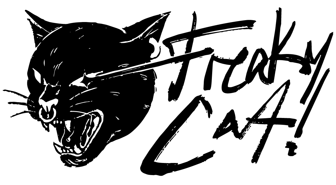
Tattoo shops tend to brand themselves one of two ways: heavy blackletter, or a clean minimal sans that could just as easily belong to a coffee roaster. Freaky Cat! goes the other direction. The mark is a snarling panther head crossed by a single brush stroke, drawn by hand, sitting next to a wordmark lettered with the same brush. Nothing in the logo is set in a typeface, which is the whole point. It should look like something pulled off a flash sheet rather than something opened in a font menu.
The palette is deliberately harsh. Black carries almost all of it, acid lime does the shouting, and violet keeps the whole thing from collapsing into generic black-and-white punk. Cook Conthic Bold handles everything the lettering does not, in a condensed cut tight enough to stack into dense blocks. That is what lets a headline run large on a window without a second typeface coming in to help.
Logo & mark
One cat,
one stroke.
The panther and the wordmark were drawn by hand with the same brush, so the lockup reads as one gesture instead of an illustration parked next to a typeface.
Primary lockup
The stroke through the cat's face does double duty. It ties the illustration to the lettering, and it gives the mark a diagonal so it never sits flat on a layout.
Colorways
The mark holds
on all four.
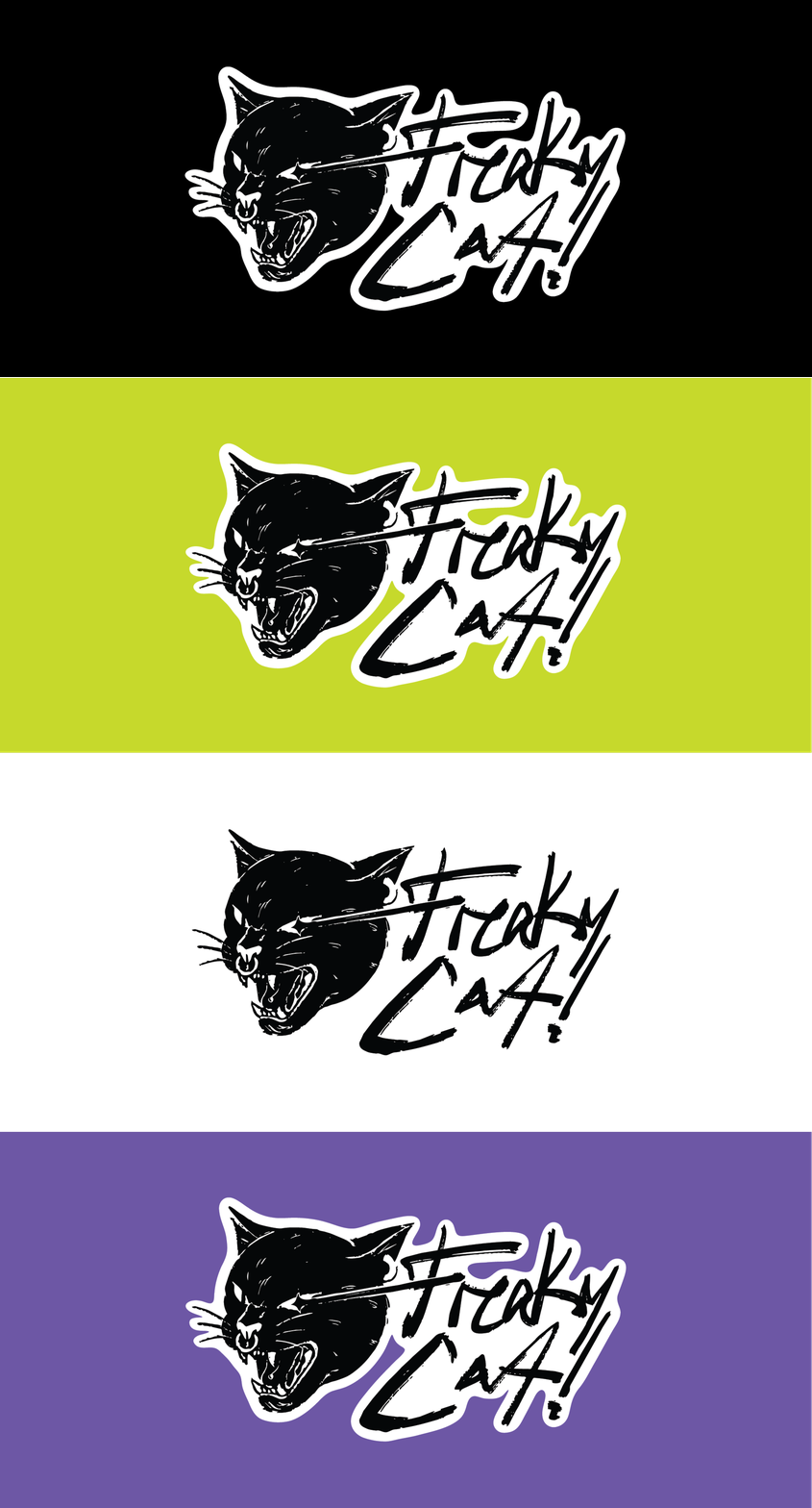
The lockup shown on every color in the palette, cycling as a short GIF so the four versions can be compared without laying them out side by side.
Color variations
The artwork is drawn once and never redrawn per background. On white it drops the keyline entirely; on black, lime and violet the white outline does the separating.
Typography
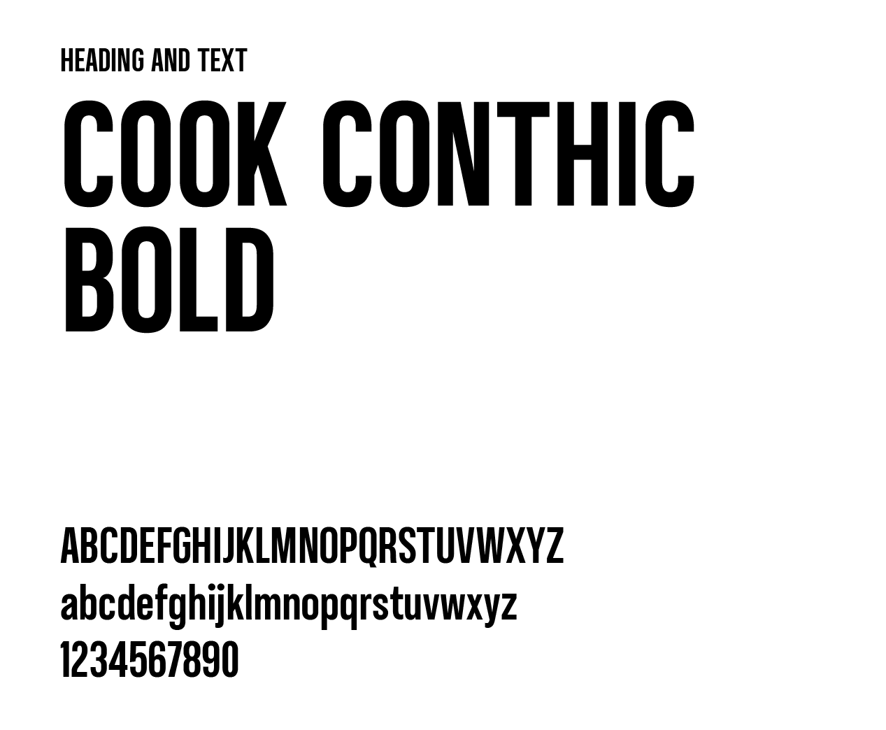
Cook
Conthic Bold
One weight, used for everything that is not the logo. A tight condensed cut with flat terminals that stacks into solid blocks, which is exactly what the headlines needed.
The lettering already carries the personality, so the typeface does not have to. It only has to be loud and legible at distance.
Color palette
Four colors,
mostly black.
Black does the structural work. Lime is the accent that carries the loudest line on any given piece, violet cools it down, and white is the keyline that cuts the mark away from whatever sits behind it.
Lime
- HEX
- #C6D92C
- RGB
- 198, 217, 44
- CMYK
- 9, 0, 80, 15
Black
- HEX
- #010101
- RGB
- 1, 1, 1
- CMYK
- 0, 0, 0, 100
White
- HEX
- #FFFFFF
- RGB
- 255, 255, 255
- CMYK
- 0, 0, 0, 0
Violet
- HEX
- #6D57A5
- RGB
- 109, 87, 165
- CMYK
- 34, 47, 0, 35
Collateral
Black one side,
lime the other.
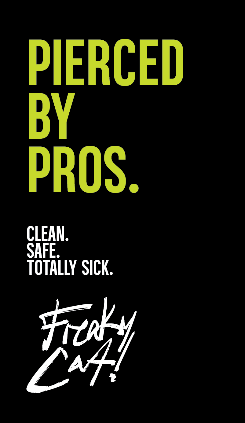
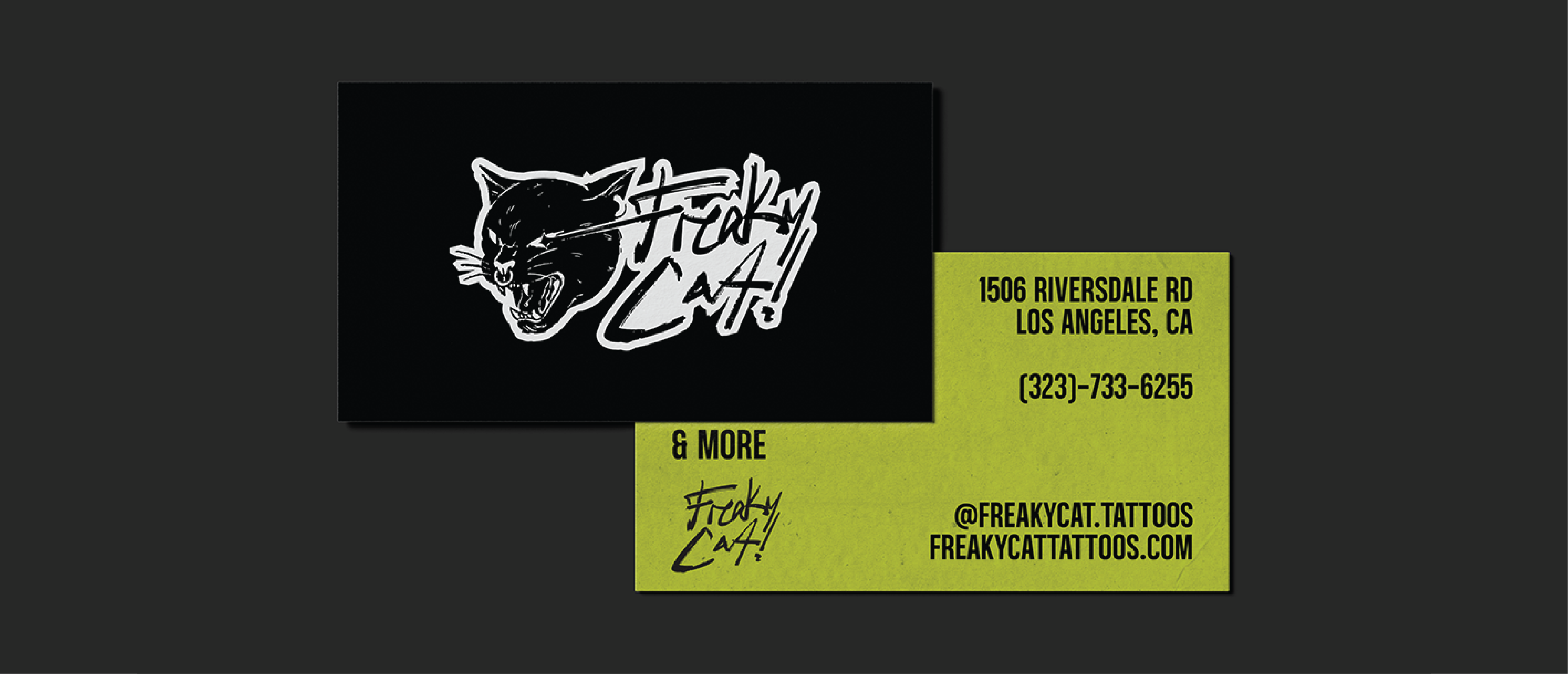
The front of the card is the mark and nothing else, no contact details at all. Everything practical lives on the lime reverse.
Apparel
Merch people
actually want.
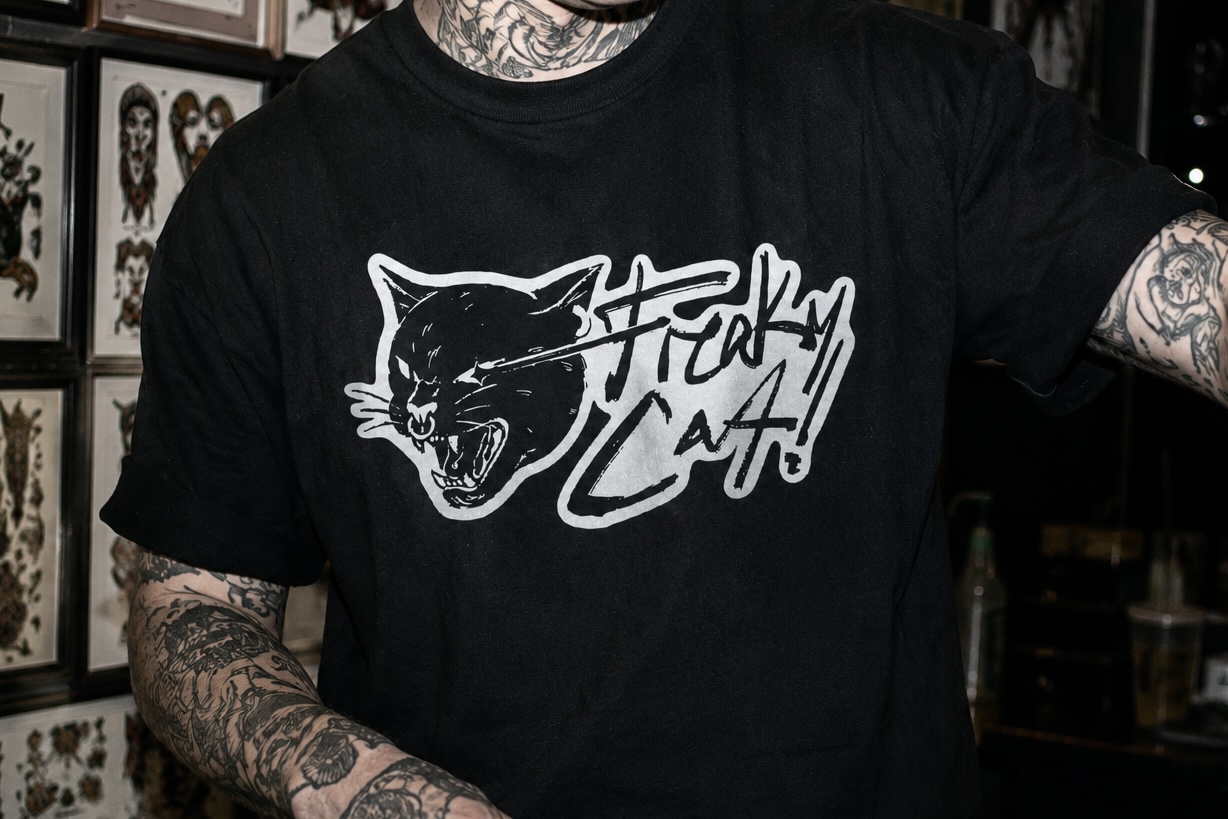
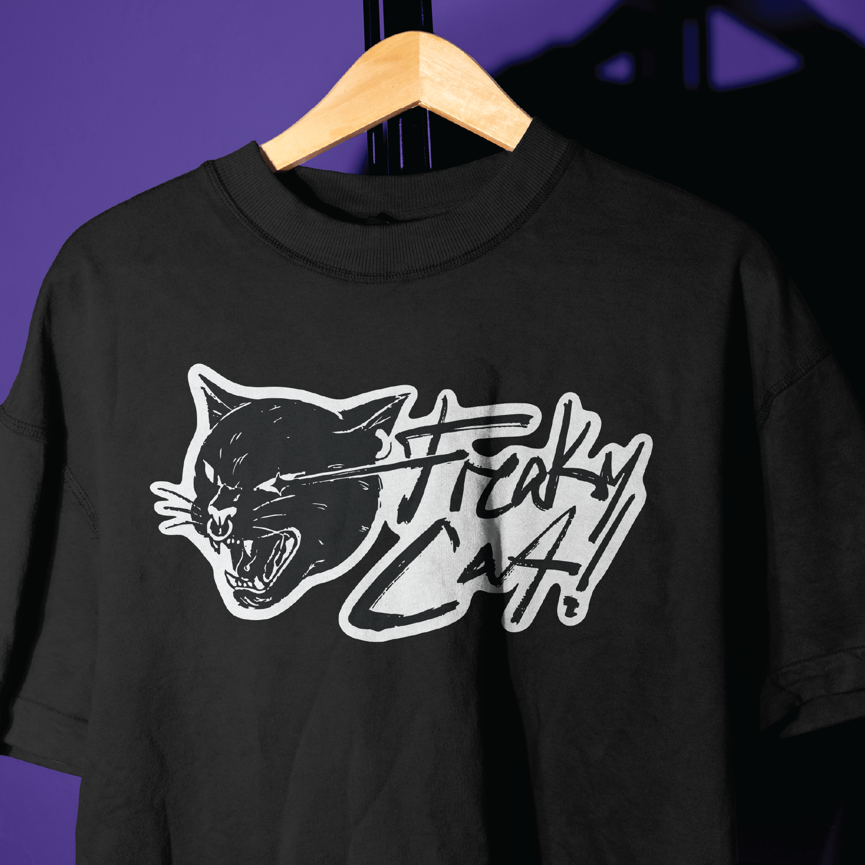
The shirt runs the full lockup at chest width with the white keyline doing the separating against black cotton.
It is the piece someone buys because they like it, not because it was handed to them at a counter.
Digital
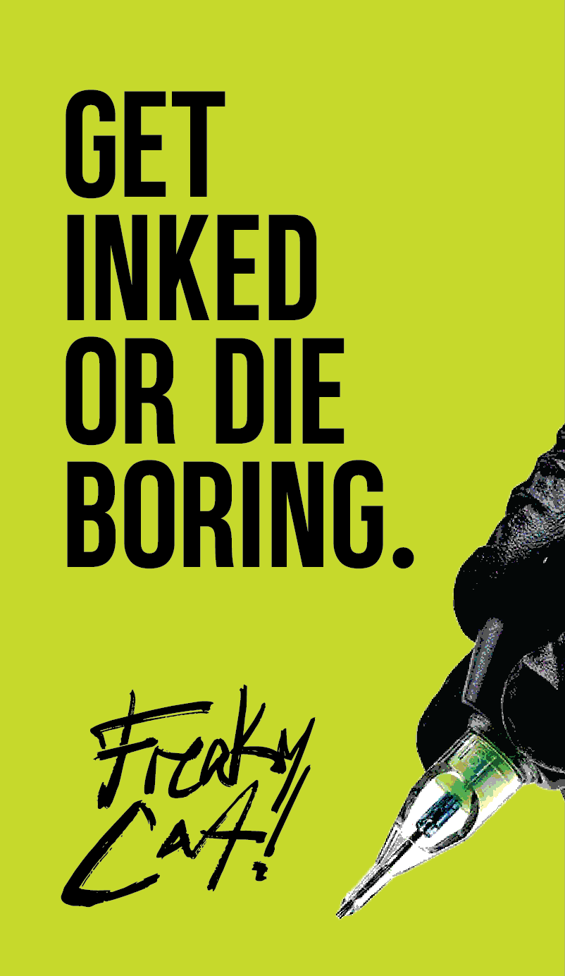
Get inked
or die boring.
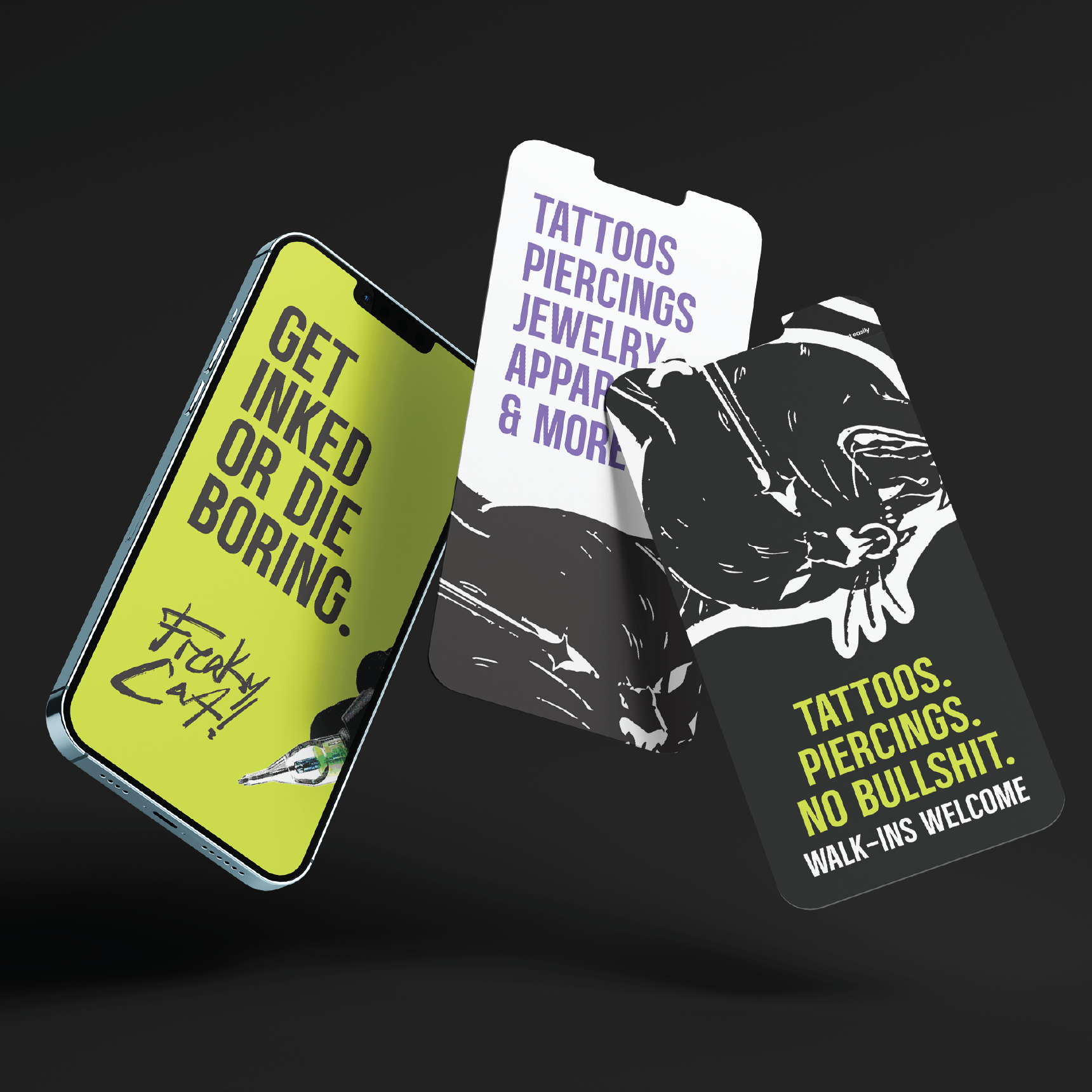
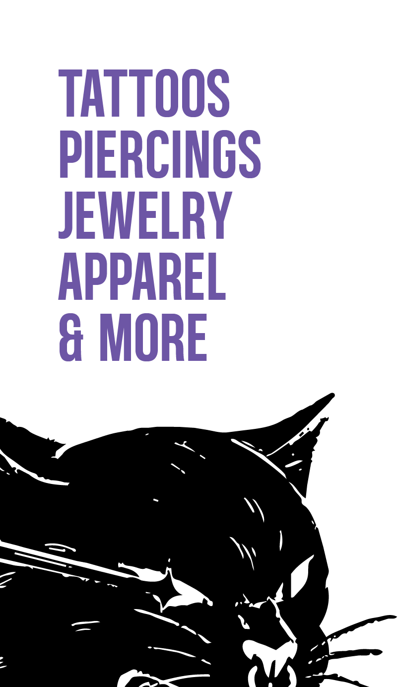
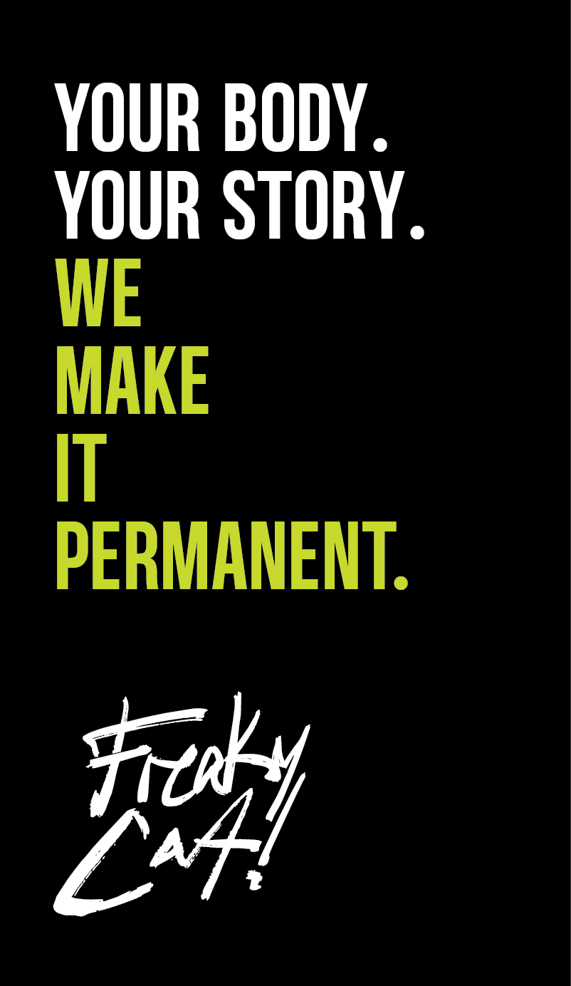
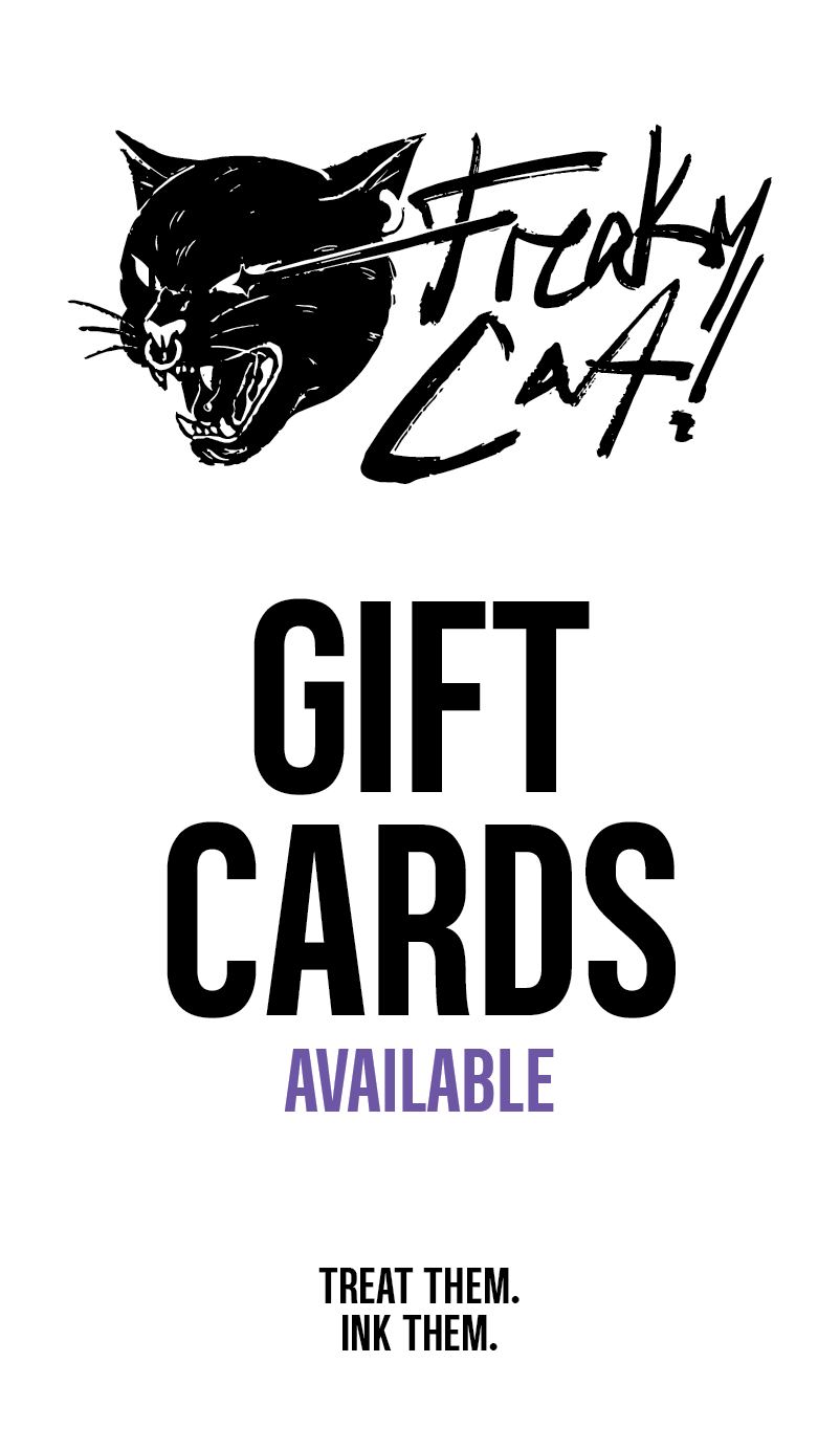
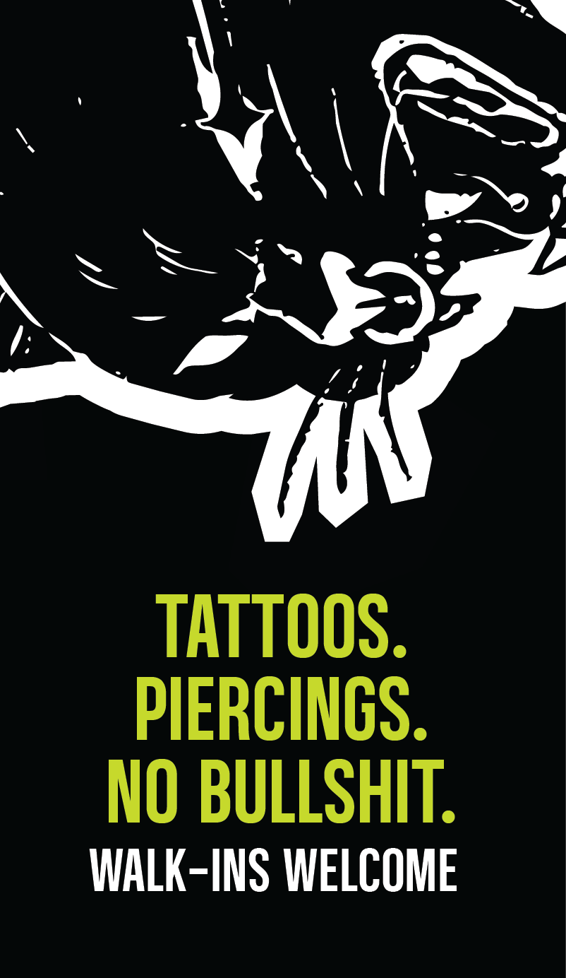
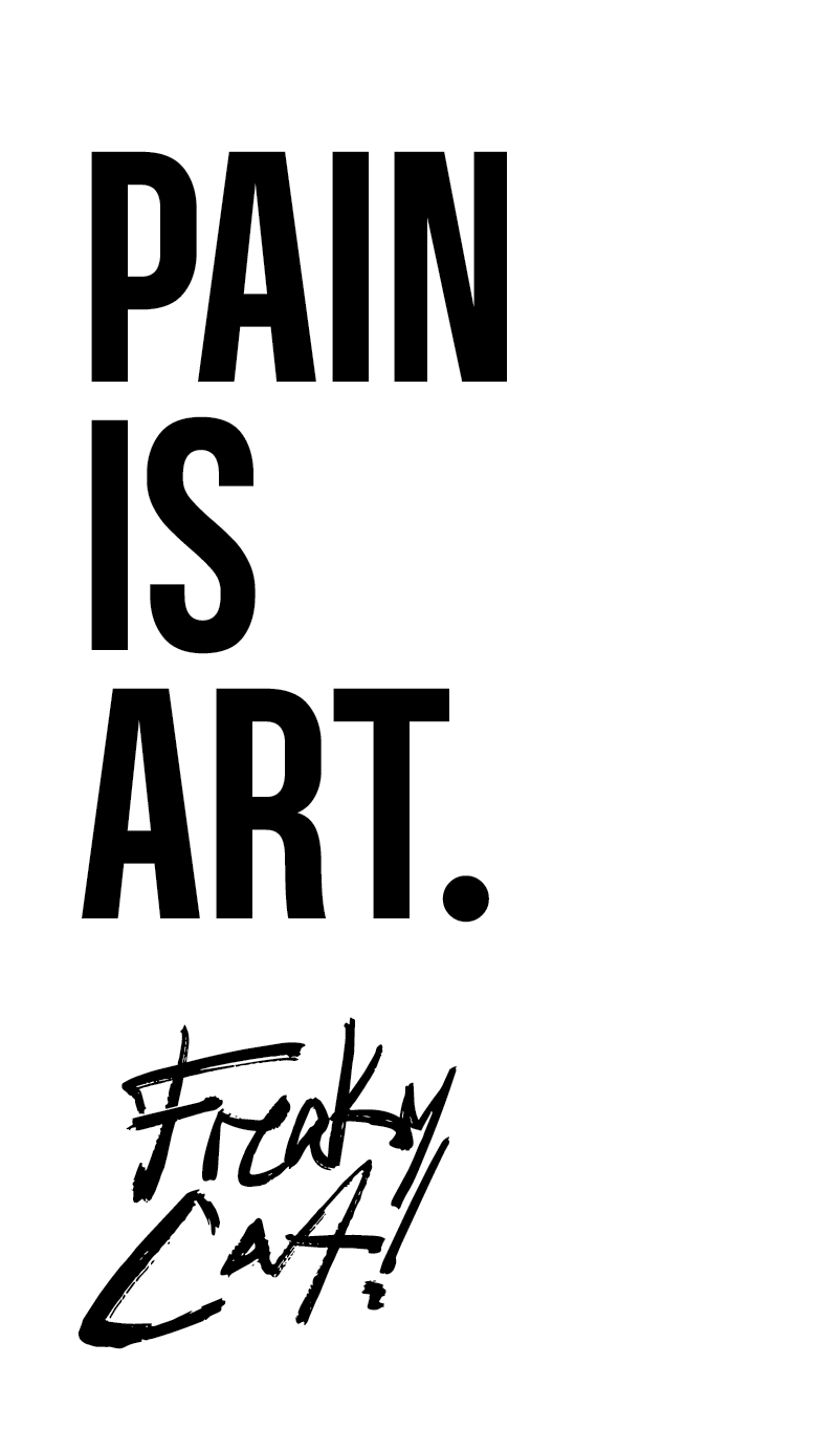
Social templates built from three moves: a lime field carrying one line of copy, a white field carrying the service list, and the cat at full bleed.
No single layout tries to do more than one job, which is what keeps the feed readable at thumbnail size.
Instagram stories
Seven frames,
one voice.
A story set covering the things a shop actually needs to post: what they do, who they are, gift cards, walk-ins. Every frame is one message on one field of color, so none of them need a second read.
01 / 07
Signage
Findable from
the sidewalk.
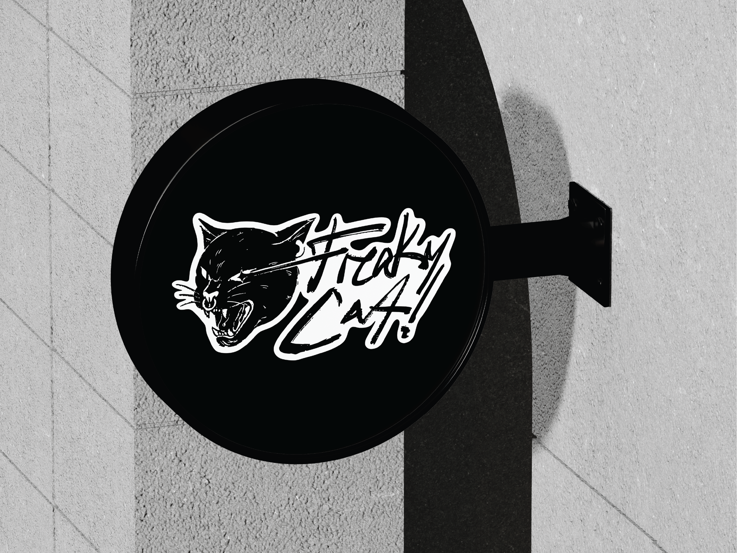
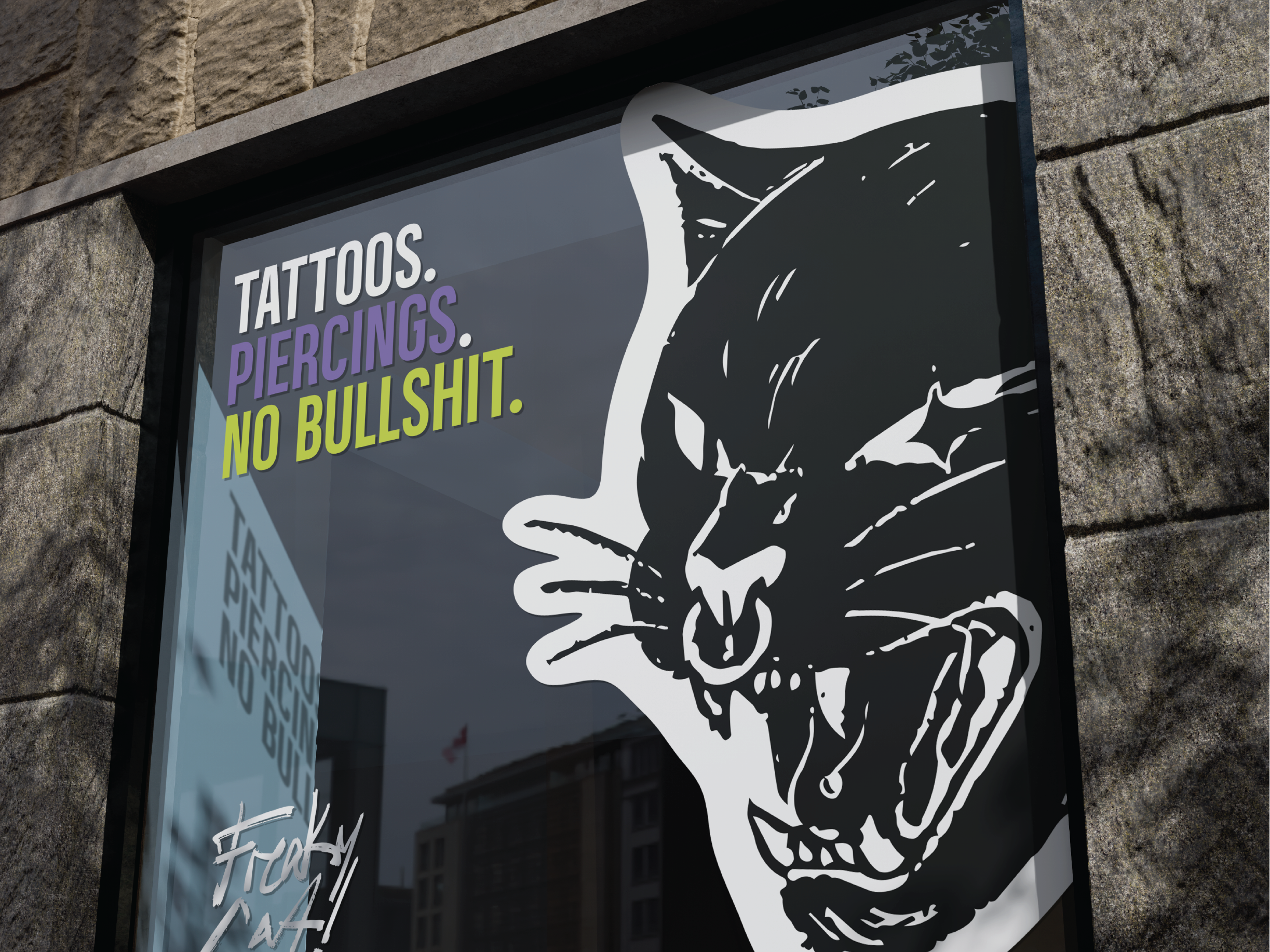
A round projecting sign that reads down the street, and a window poster that leads with the headline and lets the cat run straight off the edge.


Neon
Lettering that
bends into tube.
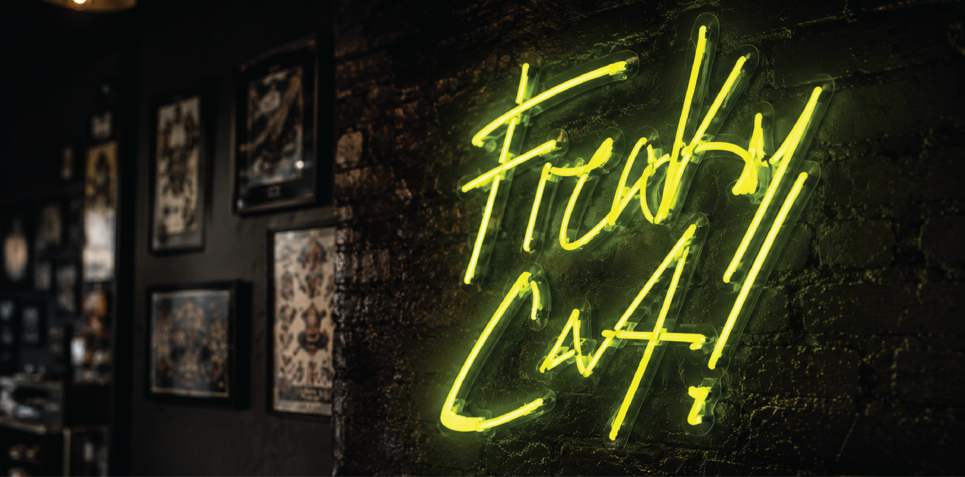
The wordmark was drawn as one continuous stroke from the start, which is what lets it become neon without being redrawn for the medium.