Matcha
Mania
Concept event identity, self-directed academic project
A fictional one-day matcha festival, invented for a university brief. The identity had to work on a ticket, a cup, a tote and a wall, and still feel like a party.
Type
Concept, academic project
Service
Brand identity, print and packaging
Year
2026
Designer
Katrina Dodds
Process
One day to
make an impression.
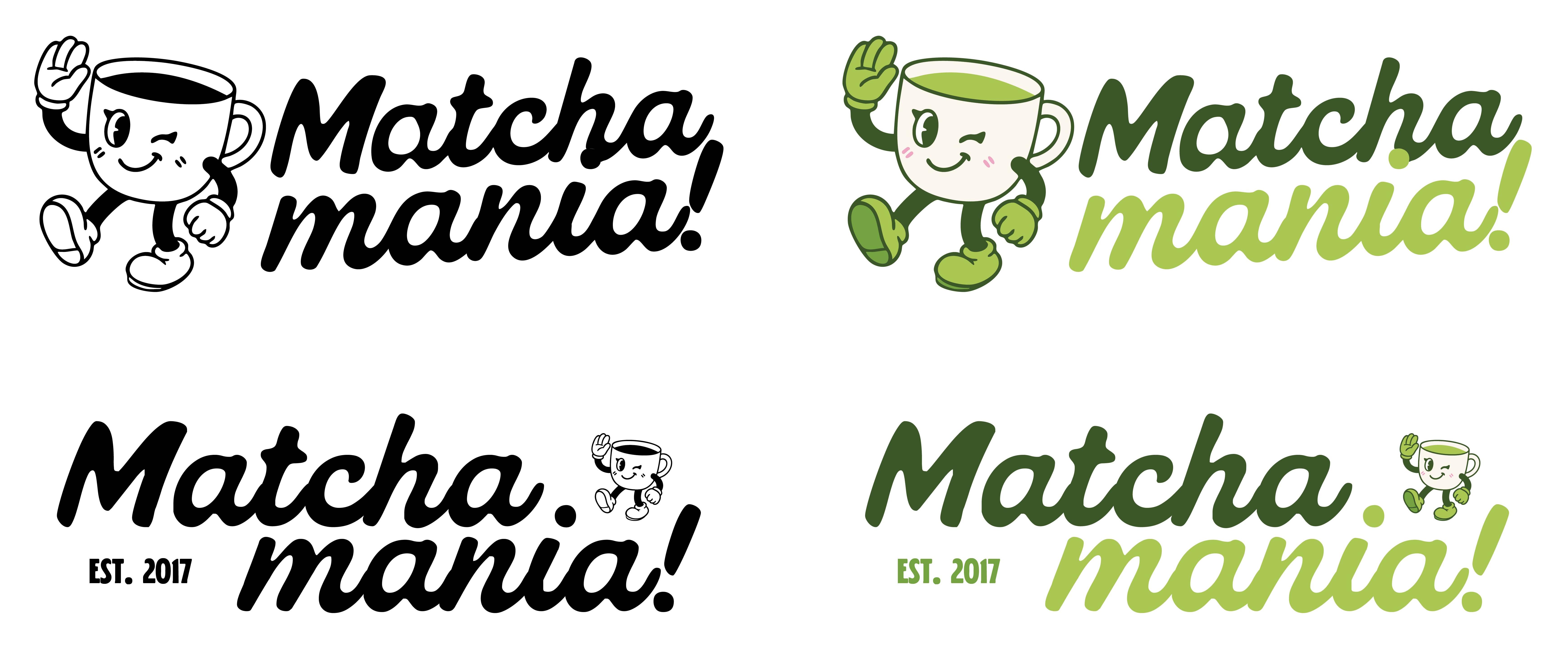
The brief I set myself was a one-day festival, which is a brand with almost no time to work. It gets about three seconds to land: on a poster across the street, on a ticket in someone's hand, on a tote moving through a crowd. So the system starts with a character rather than a logo. A winking matcha cup mid-stride, drawn with the heavy outlines and rubber-hose limbs of 1930s animation, built to read at two inches or twenty feet.
Everything around it stays deliberately narrow. Two greens and a blush pink, one bouncy script for the loud moments and one condensed sans for the practical ones. That restraint is what lets the mascot do the talking. It is also what makes a ticket stub, a cup, a pin-back button and a wheatpasted poster all read as the same event. The Est. 2017 line is part of the fiction: a festival with a few years behind it carries itself differently than a first one.
Logo & mark
One character,
doing the talking.
The primary horizontal lockup pairs the mascot mid-wave with the script wordmark in two weights of green. Everything else in the system is a version of this.
Variations
A stacked lockup with the Est. 2017 mark covers tighter spaces. A single-color line-art cut handles anything that has to print in one ink, like embroidery, stamps and signage.
Motion
It builds itself,
letter by letter.
An animated build of the primary lockup. The letters bounce up into place one at a time, and the mascot fades in once the type has settled.
Animated lockup
A three and a half second loop. Matcha lands first, then mania in lime, then the mascot fades in and the finished lockup holds for a beat before it starts over. The build does the work that the static mark cannot: it makes the logo feel assembled rather than placed.
Typography
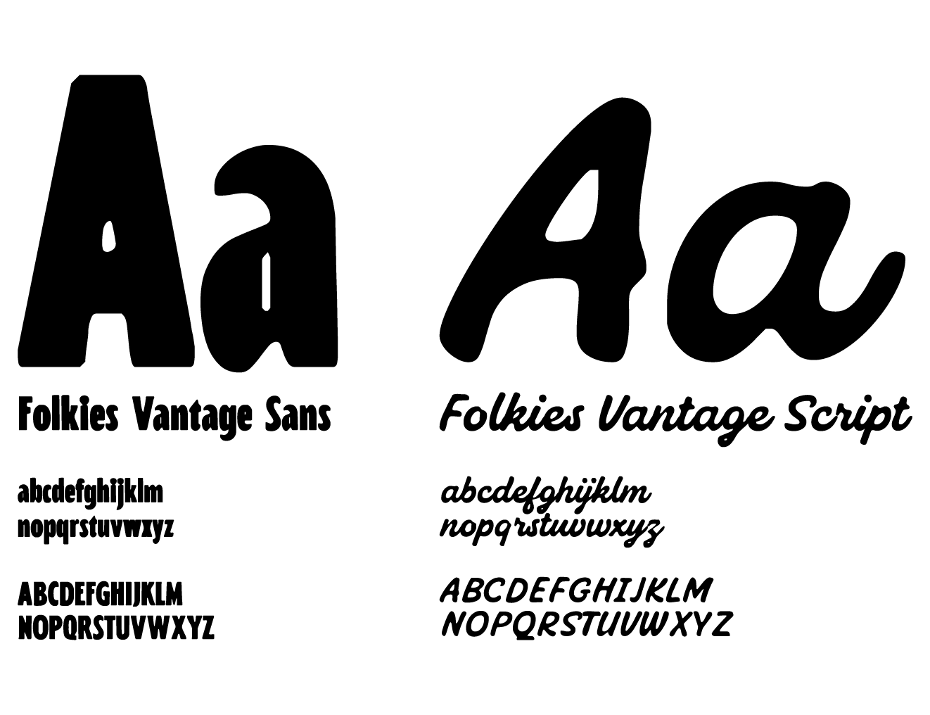
Folkies
Vantage
Folkies Vantage Script carries the wordmark and the emotional moments. It is bouncy, hand-drawn and full of personality.
Folkies Vantage Sans handles everything else: dates, times, admission tiers. Same playful bones, with enough structure to hold up small.
Color palette
Five colors,
no more.
Three greens carry the range from deep and grounded to loud and energetic. Rosette keeps it from reading too earnest, and ivory gives everything room to breathe.
Verdant
- HEX
- #3B5728
- RGB
- 59, 87, 40
- CMYK
- 32, 0, 54, 66
Sprout
- HEX
- #73A240
- RGB
- 115, 162, 64
- CMYK
- 29, 0, 60, 36
Limeleaf
- HEX
- #AAC653
- RGB
- 170, 198, 83
- CMYK
- 14, 0, 58, 22
Rosette
- HEX
- #ECA6C0
- RGB
- 236, 166, 192
- CMYK
- 0, 30, 19, 7
Ivory
- HEX
- #FAF3EB
- RGB
- 250, 243, 235
- CMYK
- 0, 3, 6, 2
Merch
Built to leave
the park.
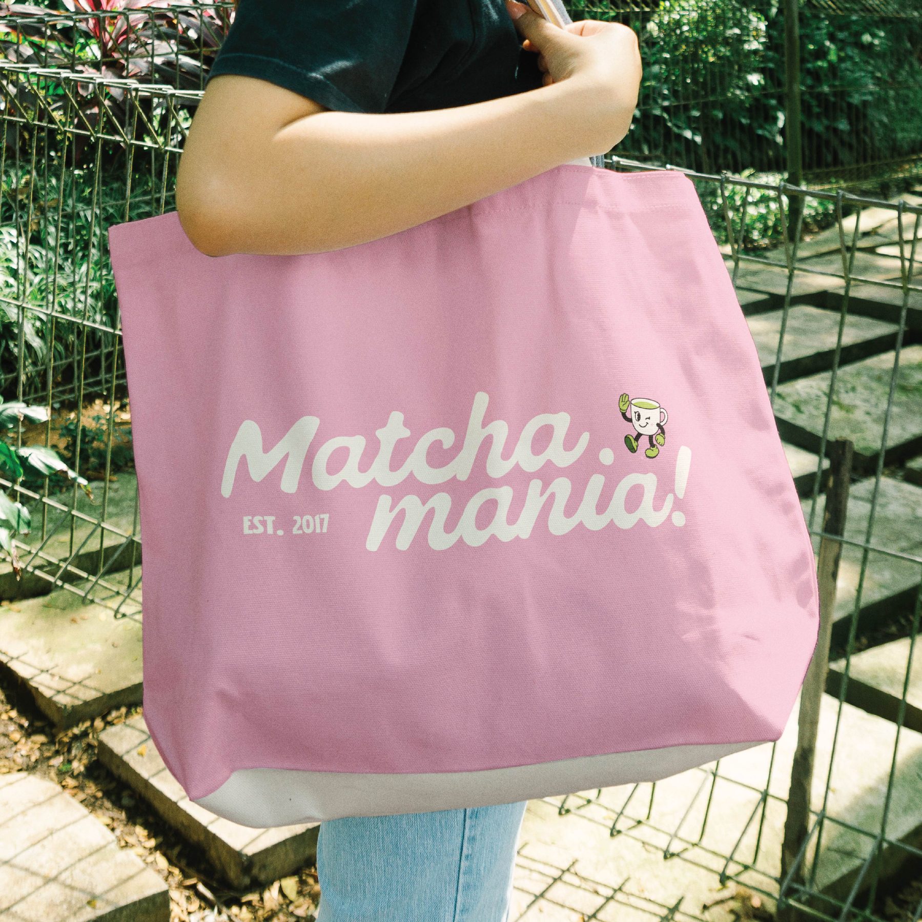
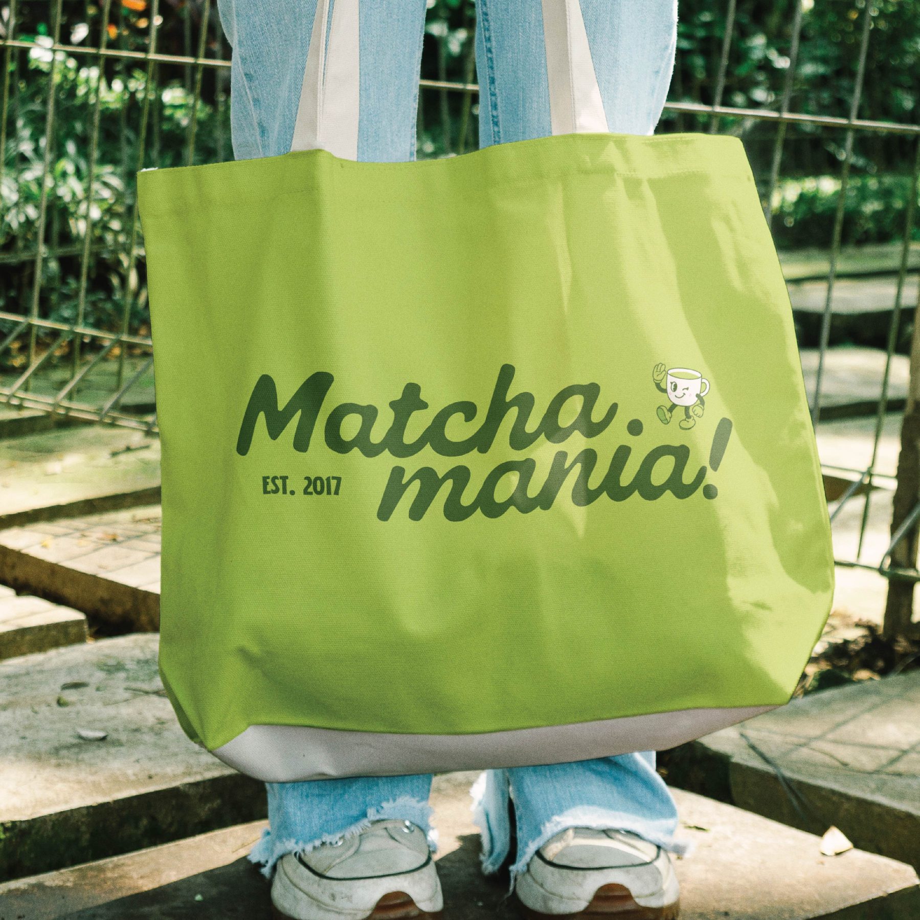
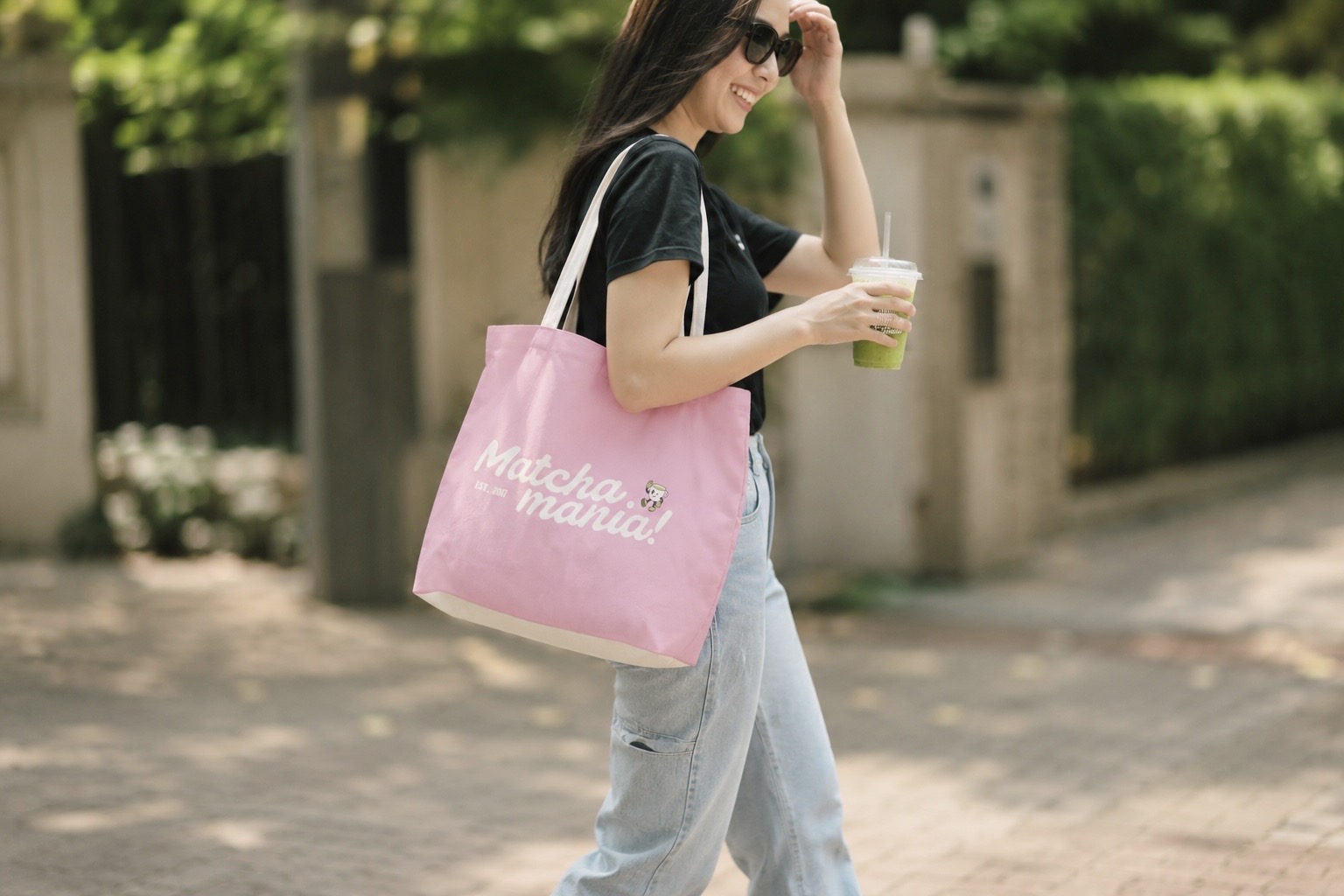
The tote in both colorways. It is the piece most likely to keep working long after the festival is over.


In use
Out of
the park.
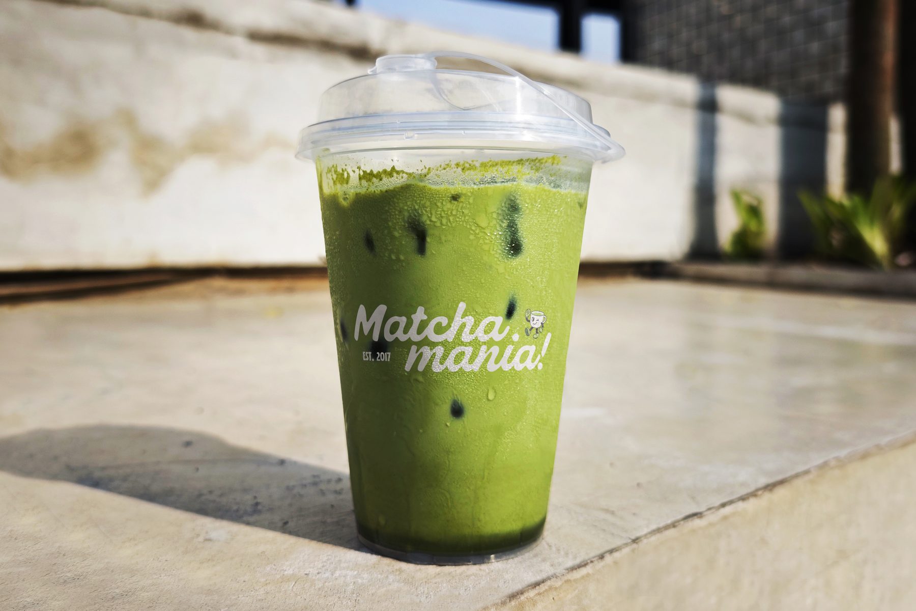
The tote and the cup are the two pieces that leave with people. They are the smallest touchpoints in the system and the ones that travel the farthest, which is why both carry the full lockup rather than a reduced mark.
Tickets
Worth keeping
the stub.
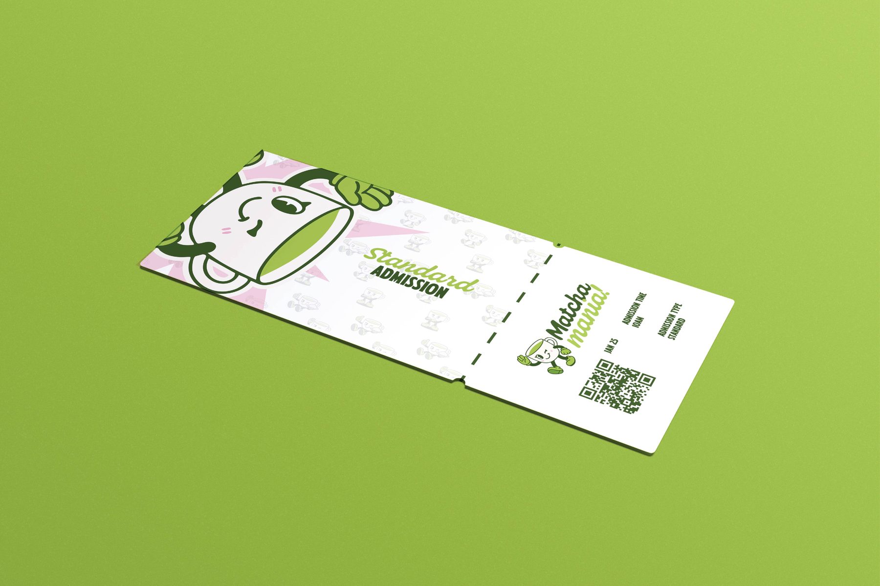
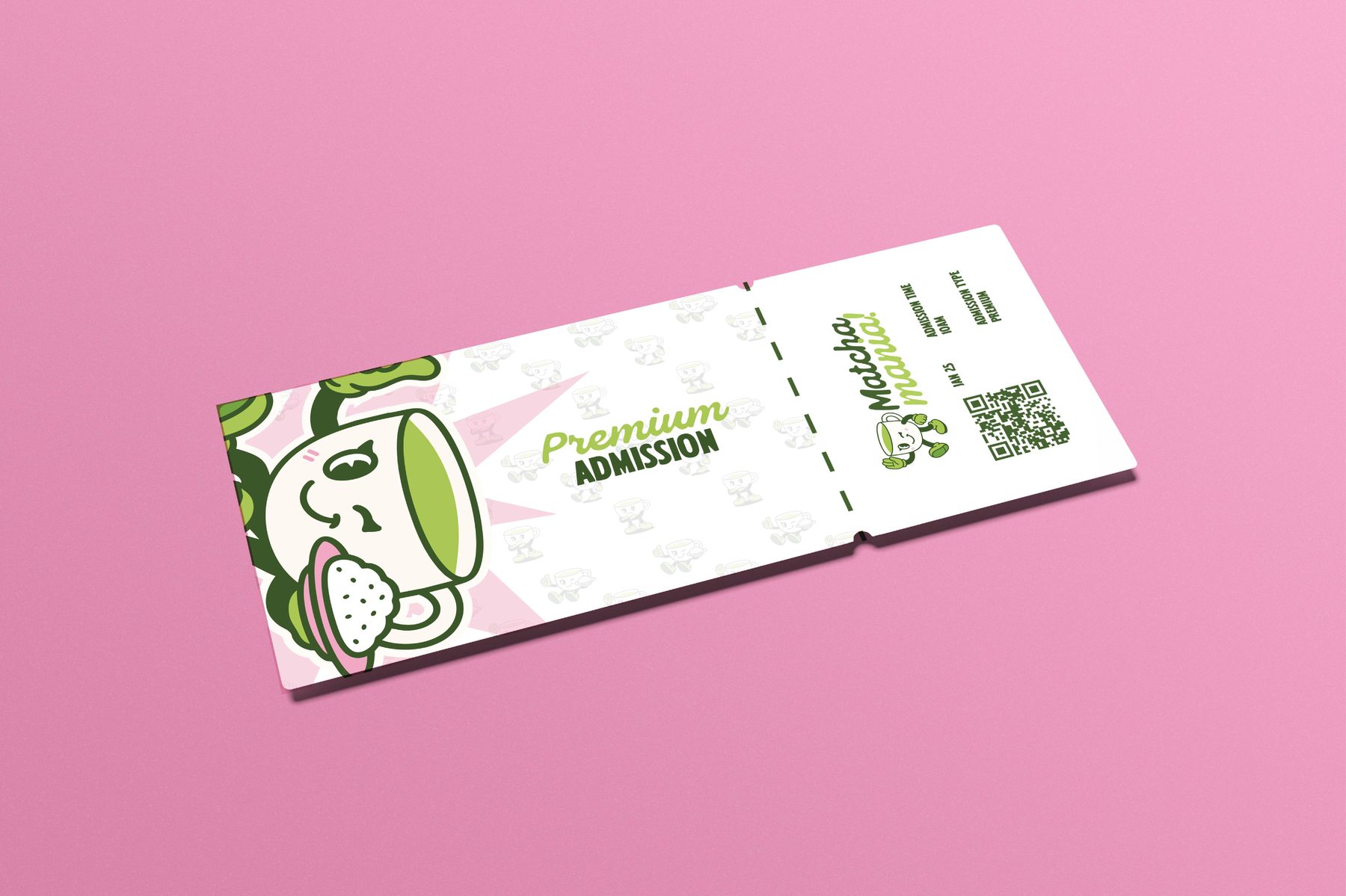
Standard and premium admission. The same two-color system weighted differently, with a mascot pattern on the half people tear off and hold onto.


In the wild
Fifty feet away,
or two inches.
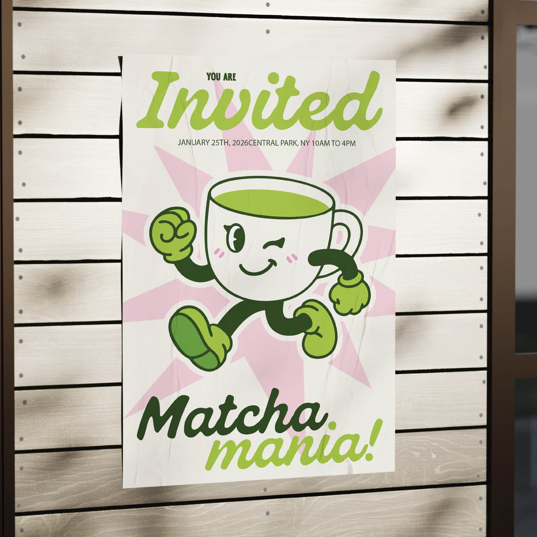
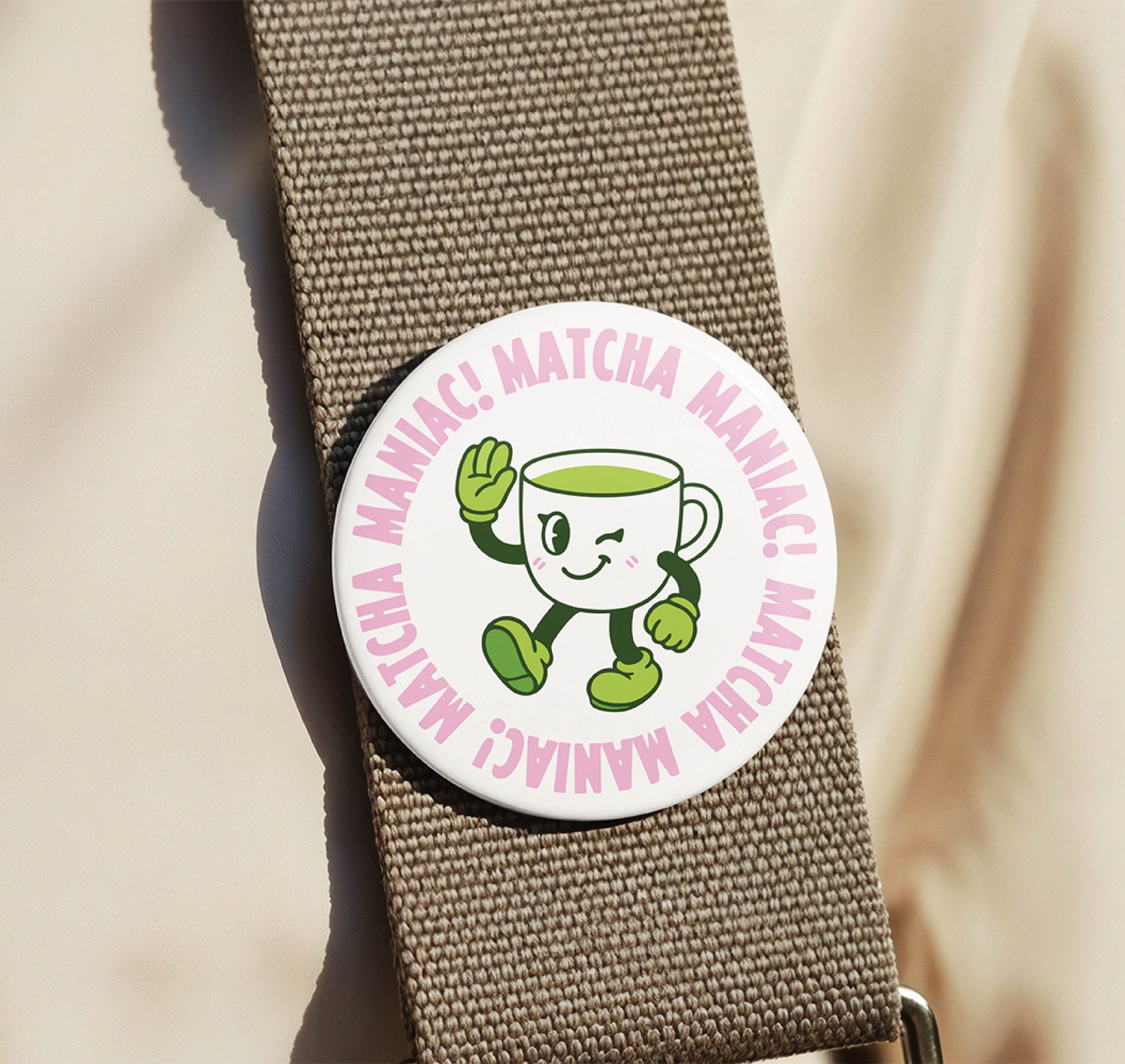
Wheatpasted on a wall and pinned to a bag strap. Two ends of the scale, one identity, legible either way.