Mav
media
Brand identity for a Virginia Beach agency
A videography and advertising agency that needed to look as sharp as the work it sells. The identity had to carry a website, an app icon, an office wall and a rack of team merch without ever getting fussy.
Type
Client work
Service
Brand identity, web and merch
Year
2024
Designer
Katrina Dodds
Process
One word,
two weights.
An agency that makes video for other people cannot afford a loud logo. It has to sit next to a client's work without competing with it. So the wordmark is a single lowercase run of geometric sans, split by color rather than by space: mav in red, media in white. No icon, no monogram, no separator. The break in color does the work a slash or a dot would normally do, and it means the mark still reads when it is reversed, embroidered or cut into acrylic.
Red and black carry the whole system, and the gradient between them is the third asset rather than an afterthought. It gives the brand somewhere soft to sit in digital, where a flat black field would feel dead, while print and merch stay hard black and hard red. The shortened mav lockup handles anything square: the app icon, a hat, a favicon.
Logo & mark
Split by color,
not by space.
The wordmark runs as one word and lets the color change mark the join. No icon, no monogram, and no separator between mav and media.
Primary lockup
Red carries mav, white carries media, and the join between them does the work a slash or a dot would normally do. Because the break is colour rather than space, the mark survives being embroidered, reversed or cut into acrylic without losing the split.
Color palette
Two colors
and a gradient.
Black and red do everything flat. The gradient is a third asset in its own right, used wherever the brand needs depth instead of a hard edge. Move your cursor across it.
Black
- HEX
- #010101
- RGB
- 1, 1, 1
- CMYK
- 0, 0, 0, 100
Red
- HEX
- #DB312B
- RGB
- 219, 51, 41
- CMYK
- 8, 94, 96, 0
Gradient
- FROM
- #DB312B
- TO
- #010101
- USE
- Digital only
Digital
Black page,
one red block.
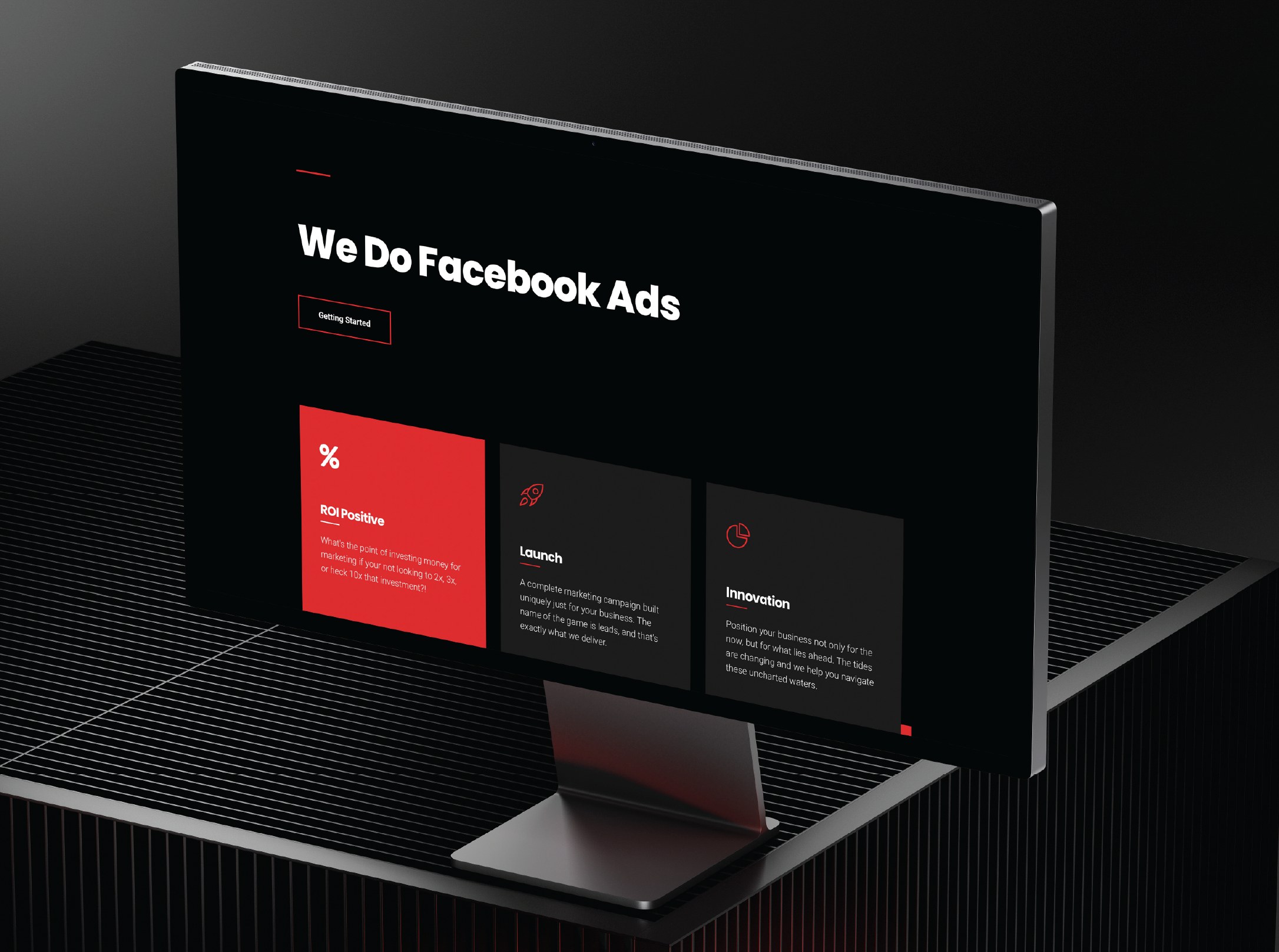
The site runs almost entirely black. Red appears once per screen, on the card that matters most, so the eye lands where the agency wants it to.

At icon size
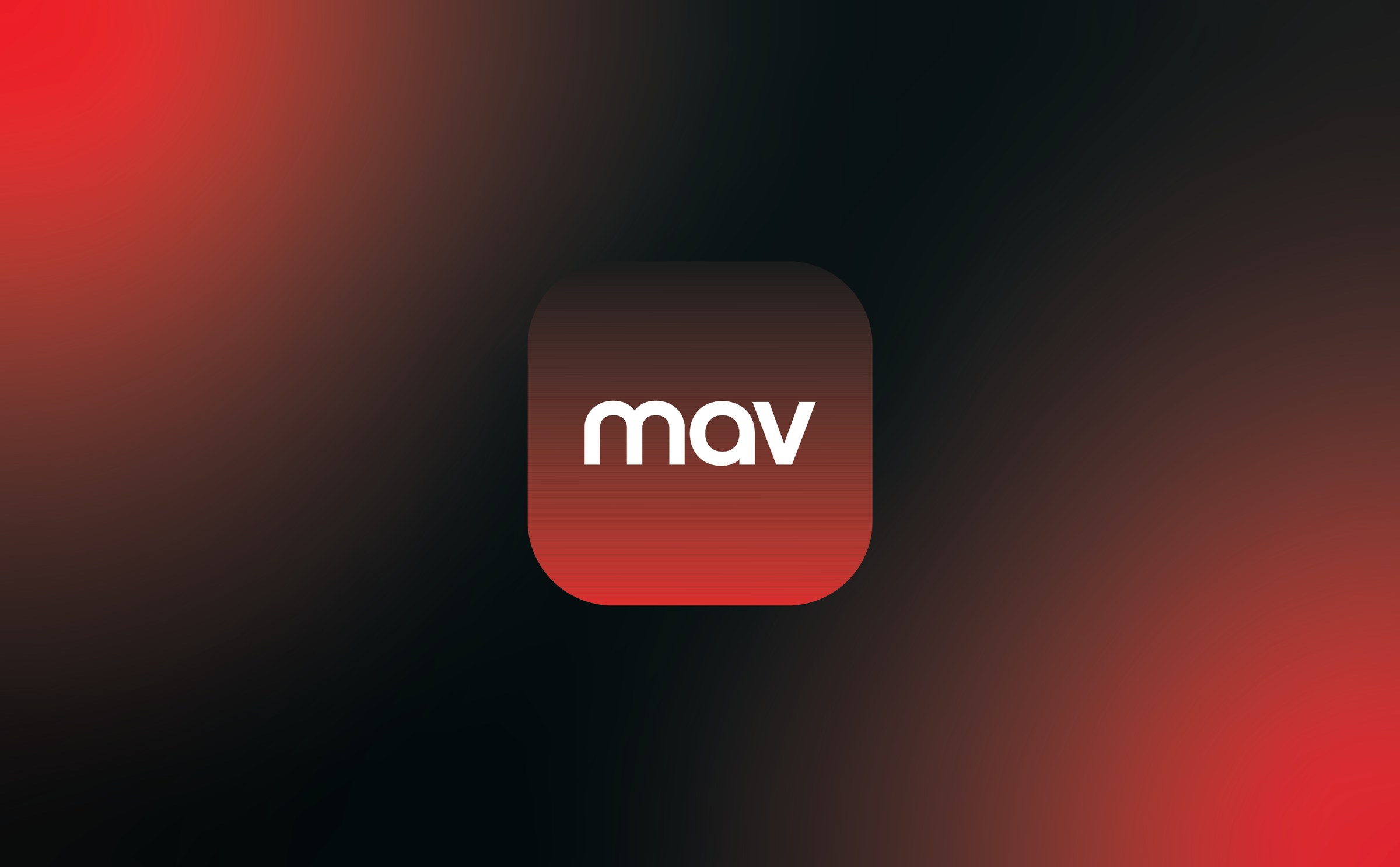
The full wordmark would be unreadable at sixty pixels square, so the icon drops to mav alone and lets the gradient carry the red. It is the one place the brand has to compete for attention directly, sitting on a home screen beside everything else someone has installed.
Same word,
every weight.
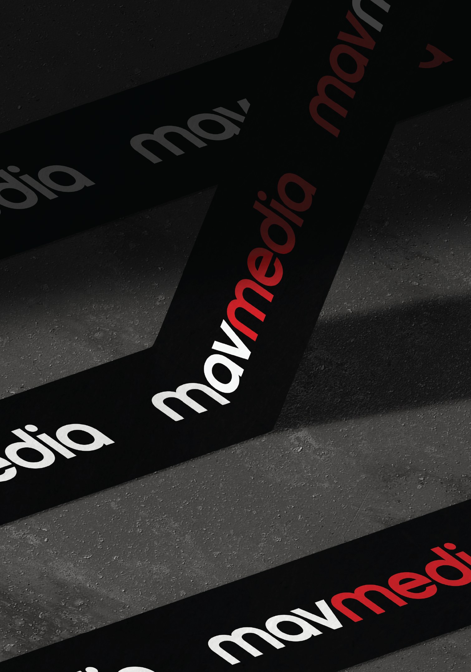
Across the printed set the wordmark cycles through its three states: red on black, white on black, and black tone on tone.
Nothing else changes. There is no secondary pattern and no icon, because the word repeating at different values is already a system.
Merch
Kit the team
actually wears.
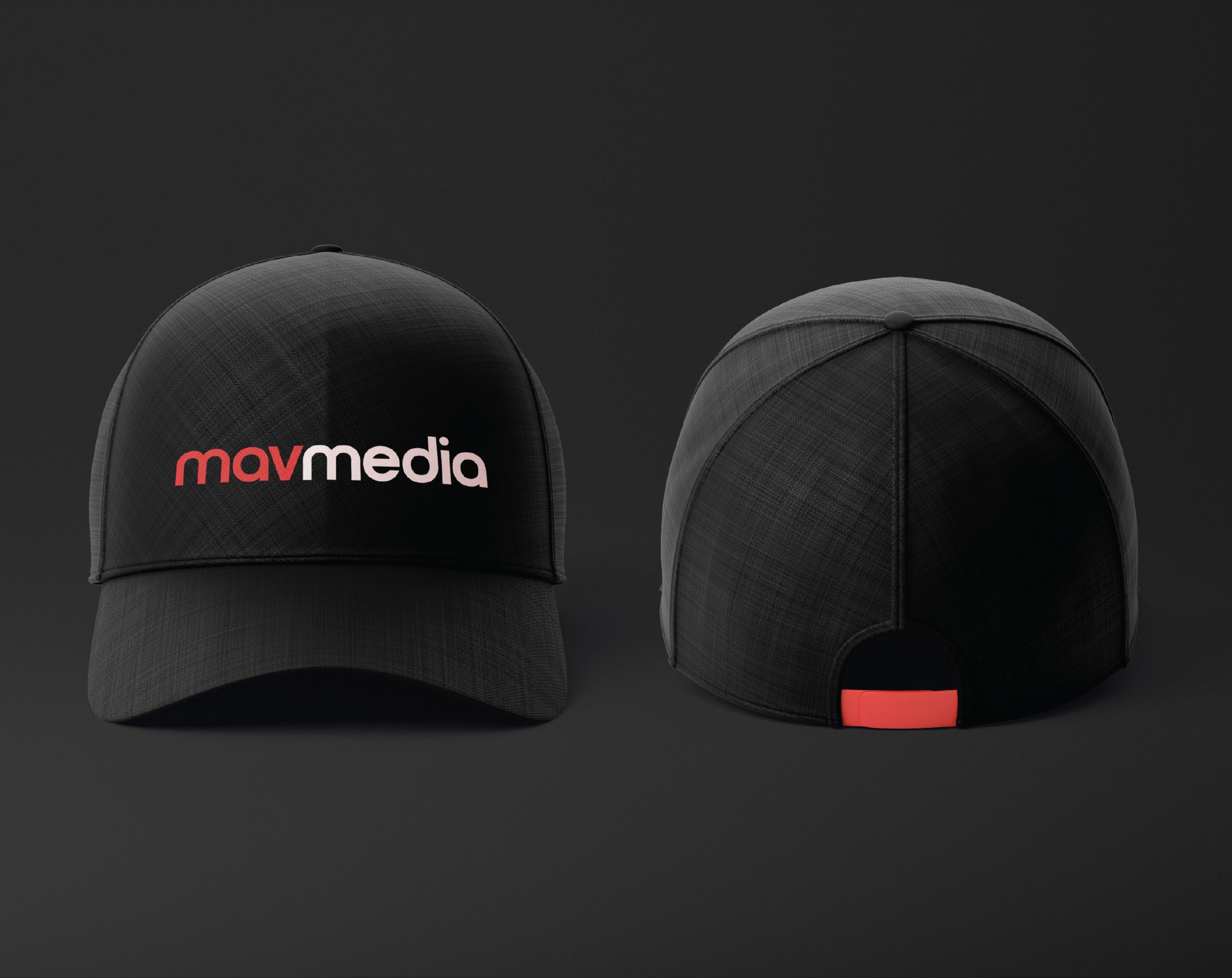
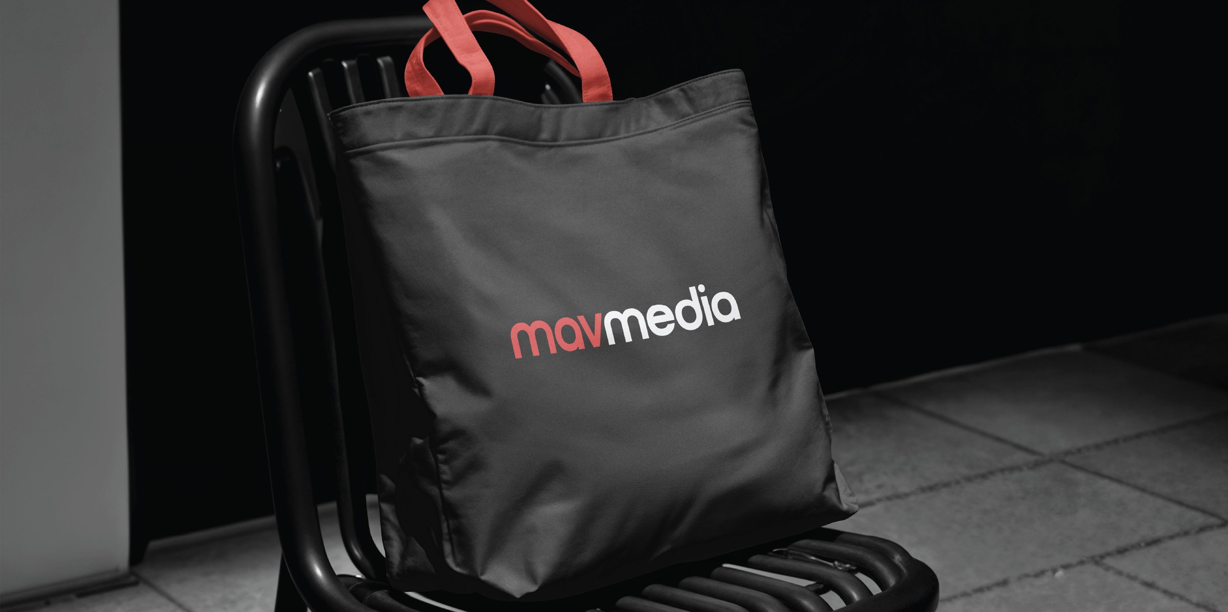
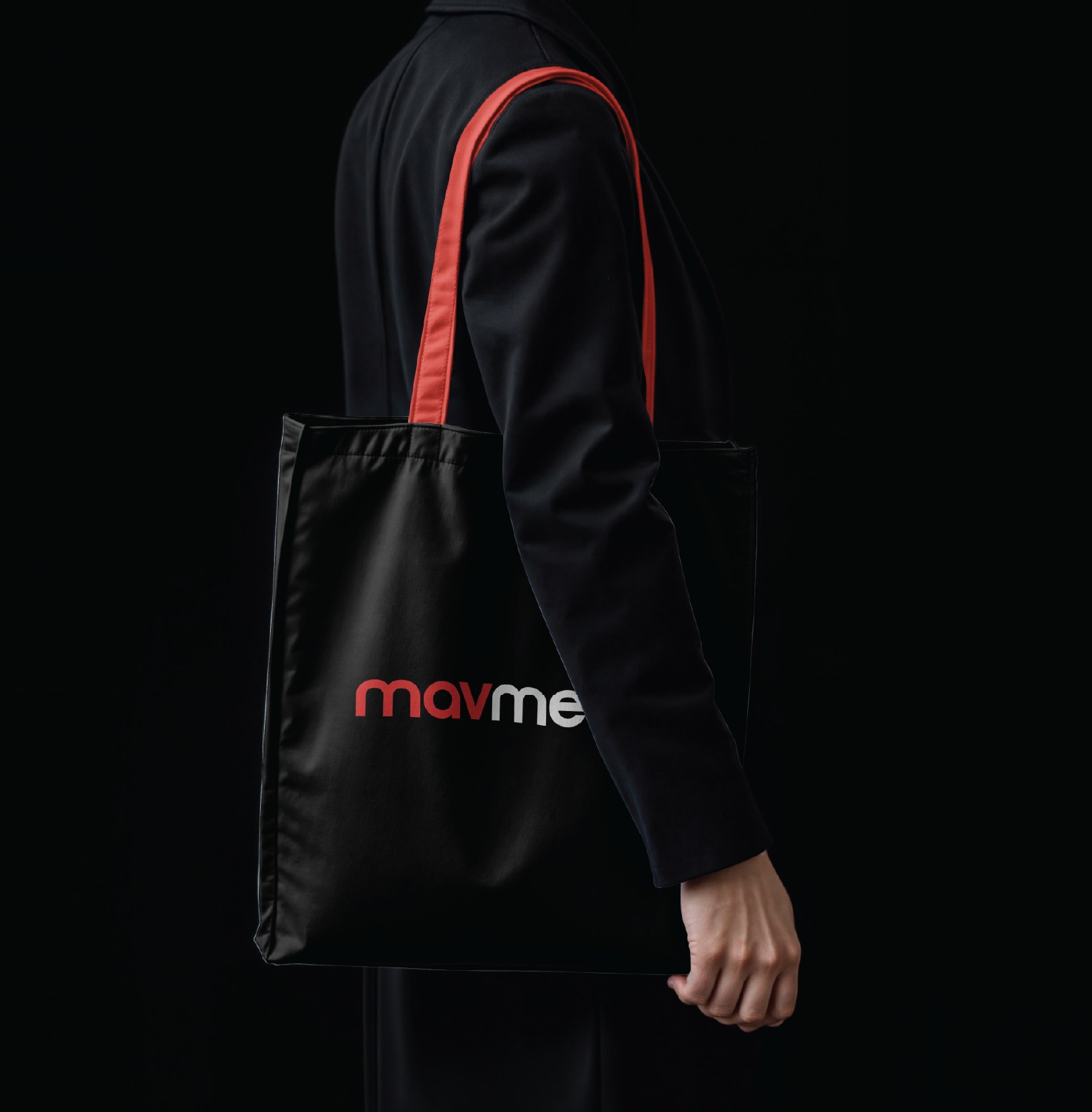
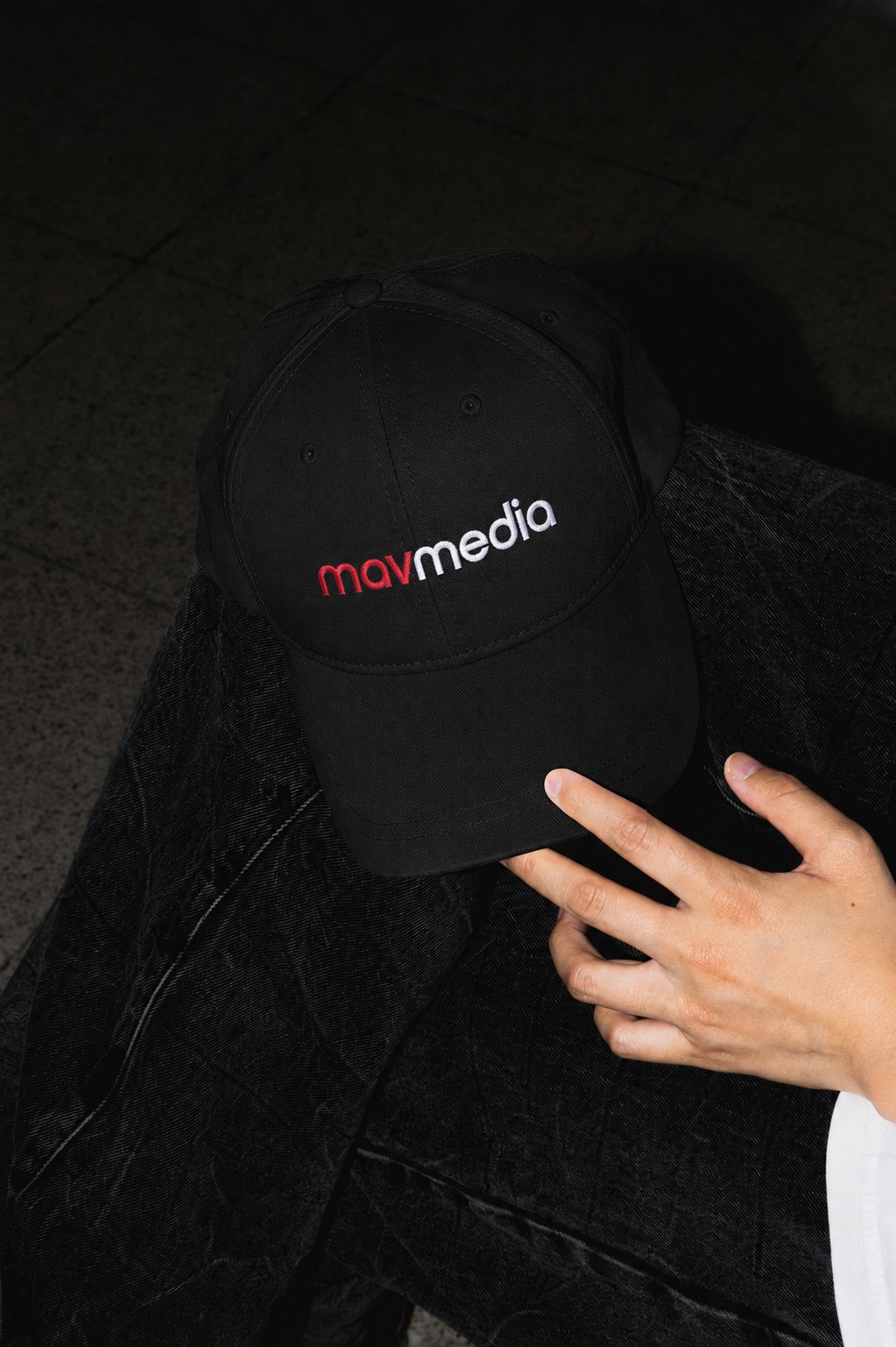
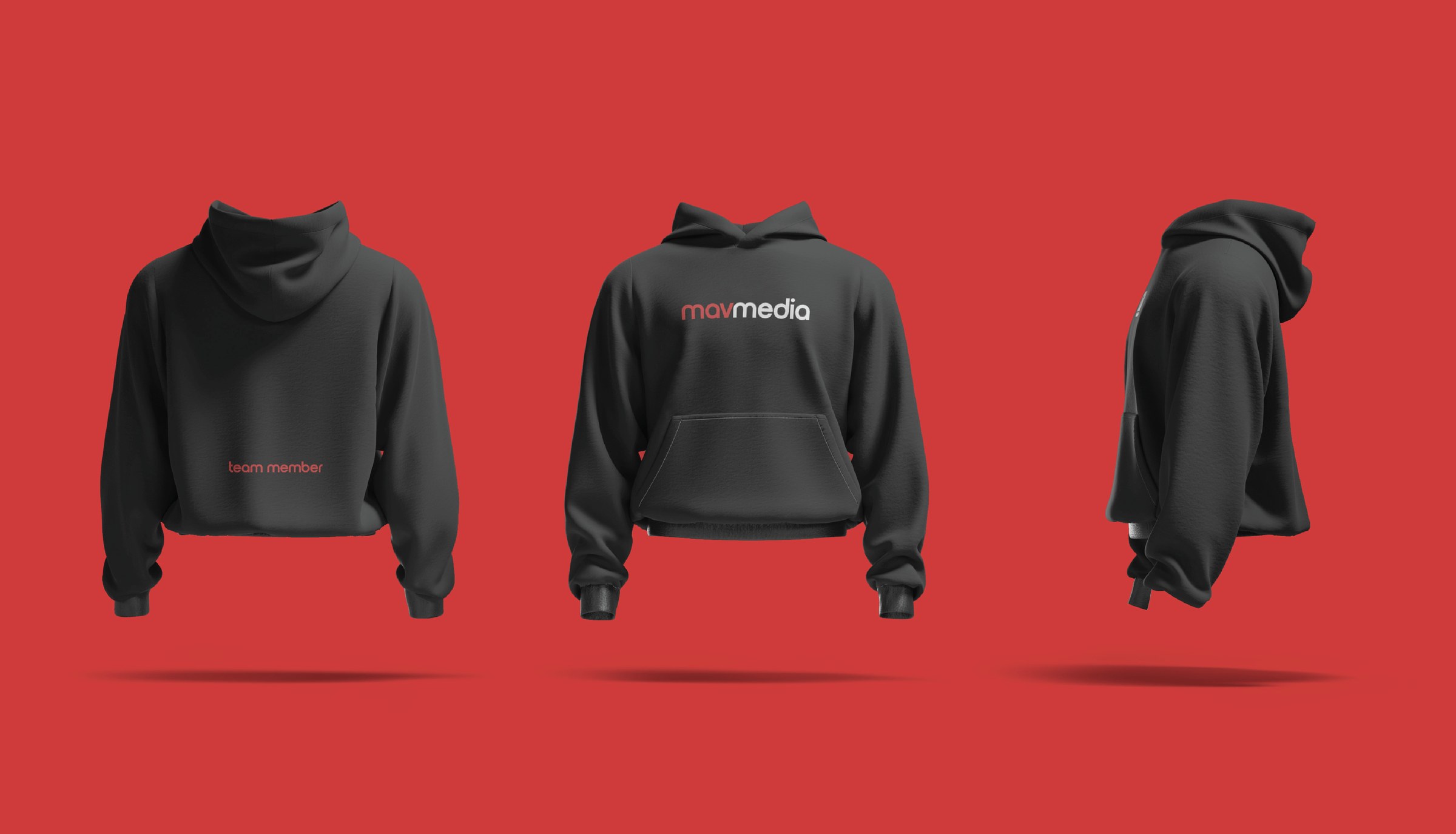
Crew hoodies with the lockup across the back and team member across the front hem, plus caps and totes. All black, all small placements, nothing that reads as a uniform.


Detail
The red only ever appears as an edge: tote handles, the tab at the back of the cap, the hem line on the hoodie. On a black garment that is enough to make the brand legible without printing it large.
Environment
Cut into
the wall.
Dimensional letters on the glass at the front of the office. At this size the two colors stop being a graphic choice and become two materials, which is the point at which a wordmark has to actually be built rather than printed.
Out in the world
Black on black,
red on the strap.
The tote is the piece that leaves the office. Carried against dark clothing it almost disappears, and the red handle is the only thing doing the identifying.
That restraint is the whole brief in one object: confident enough not to shout.